Every Function Has a Superpower. What’s Yours?

Over the course of my career, I’ve been fortunate enough to work in a variety of different functions.  No matter whether it is engineering, design, product, or service, every role has its own unique set of requirements and challenges.

Maybe that’s why I have always believed strongly that software is a team sport. If you want to build exceptional products, you have to find a way to harness the unique and diverse viewpoints of a team of professionals across a wide variety of functions.

Unfortunately, even at great companies, there is a repeated pattern where people in some functions feel disempowered. This doesn’t need to be the case.

Every function has a superpower. Make sure you know what yours is.

Every Function Has Value

Hypergrowth software companies are relentless in their pursuit of efficiency. Everyone who joins a new company dreams of building something new, something better than the companies that came before it. As a result, startups are always questioning the breakdown of functions in older, more established companies. In addition, resources are always tight, as companies stretch to make every dollar of funding count.

Unfortunately, this also means that many startups repeat the same mistakes over and over again when it comes to recognizing the value of different functions in a modern software company. This can be compounded by having a founding team or early employees who have never worked in those functions before.

You don’t really know a function until you know someone who is exceptional at it.

Inevitably, most startups, even when they have grown to hundreds of people, have gaps in their understanding and appreciation of some functions.

Avoiding Decision By Committee

Besides the lumpy build-out of different functions at fast-growing companies, the need for fast decision making also tends to bias the product process.

Great companies tend to be opinionated in their decision-making process around product, and those processes can vary significantly. Some companies may overweight decisions from engineering, others might look to a strong product function. There are companies that are largely sales-driven, and others that rely on general managers. There are companies where decision-making is hierarchical, deferring to the CEO or founder for key product calls, and others where decision-making is distributed broadly to the teams.

This isn’t surprising, however, because there is a direct tension at companies between the speed of execution and the exhaustiveness of a process. As a result, almost every product-centric company seeks to avoid “decision by committee” by assigning decision responsibility to a function or a hierarchy.

No matter what system exists, there are always people and functions that feel disempowered by the process.

Know Your Superpower

While you may not be the one to make the final product decision, it is a mistake to feel disempowered. Your function has unique value, and you can dramatically shape any product decision through your efforts.

The key is to know your superpower.

Every function has one. Here are just a few examples:

  • Engineering. Every engineer has the ability to take what is and isn’t possible off the table. I’ve seen product strategy discussions completely changed in a single weekend by engineers building something that no one else had even considered. The power to create is an awesome one, and the best engineers use this power to open the eyes of their teammates to what can be accomplished.
  • Design. Most people can’t visualize the different options that are possible around a given feature or product, and design has the power to reshape discussions completely based on visualization. Design can eliminate theoretical options, define the choices available, and most importantly trigger a deep, emotional response to certain choices in decision makers.
  • Product. At some companies, product managers have procedural power to make decisions. However, the most effective product managers use their power to frame the discussion with strategy and metrics to help drive decisions. The power to define the framework for a decision often is the power to control the decision.
  • Client Service. If you spend your day talking to real customers about real problems every day, you have amazing power to bring issues to the fore. Sometimes a decision is swayed by the scale of the problem, other times by the severity. Never underestimate the power of narrative, driven by real customer stories, to shape decisions on product and prioritization.

Every function has a superpower and everyone has the ability to do the extra work necessary to tap the unique capabilities and resources of their function to use that power to shape decisions. It requires work, but no matter what your function or role is, you can heavily influence critical decisions.

You just need to find your superpower.


Product Leaders as Curators & Editors

Gallery Show

A few years ago, I wrote a few posts to outline the requirements for exceptional product leadership:

While I have been gratified that people continue to find utility and value in these posts, I’ve come to believe that product leadership, particularly the issue of prioritization and phasing of a product roadmap, remains daunting and challenging for most teams.

In particular, the need for organizational scalability and speed of innovation has driven the widespread popularity of small, independent teams building product and features. Unfortunately, the side effect of the explosion of small teams has also amplified user-experience fragmentation and the haphazard quality of many web-based and mobile software applications.

As a result, I’ve come to believe that there are two facets of  product leadership that have become increasingly important for delivering a high quality product experience: curation & editorial.

Curation Amplifies Your Product Experience

Around 2014, I remember first being struck by a product management job description at Pinterest which incorporated the concept of curation as a core responsibility of product management.

The dilemma of product prioritization is always simple to understand: most software teams, filled with talented people, have more ideas for great features that the capability to execute. As a result, there has to be some process for filtering down the ideas to answer the question of “what do we build next?”

Prioritization on metrics, customer requests and delight is not hard to operationalize, but it still leaves open critical questions:

  • How does the product & experience come together for the user after we ship?
  • How does the product communicate the changes to the customer in way they can easily understand and utilize?

I believe curation is the key to answering these questions.

Curation is an under-appreciated skill in software design. In the world of art, curation is a critical and valued function. A curator ensures that the pieces of art not only combine to amplify each other collectively, but also gives thought to the experience a viewer will have when engaging with the collection.

Users need some level of coherence in new versions of your product. With proper curation, features and changes amplify each other, and lead to a greater customer appreciation of your efforts through a product experience that is more coherent and easier to communicate.

Without curation, software feature prioritization tends to devolve purely into the line-item value of a given feature, rather than how it fits in general with the whole product, or the product release. Great curators won’t think twice about cutting a piece that doesn’t fit the theme of the show, even if it is exceptional.

Designers, not surprisingly, tend to intrinsically understand the value of curation, and valiantly attempt to connect features together into a coherent product experience. Unfortunately, they often are forced to incorporate together a hodge-podge of features that have been prioritized independently by different small teams.

This is not an argument against constant enhancement and iteration of code, or the constant shipping of bug fixes and small feature enhancements. But for user-facing features, teams need to be wiling to hear from product leadership that a great idea for a new feature is not enough to qualify it for immediate prioritization. Customers cannot endlessly absorb a haphazard array of changes and feature enhancements. The perceived quality of the product drops, and customers fail to perceive the value in the features that are shipped.

Every Creator Needs an Editor

Understanding the value of editorial comes easily to professionals who have worked in content & design.

In my experience, many otherwise talented engineers and product managers balk at receiving critical review of their work. Sure, most software engineers understand the value of pair programming and code reviews. But for some reason, when it comes to overall feature design, the sentiment almost always shifts to stubborn independence.

Unfortunately, just like in writing, having a great editor is essential for the overall quality  and consistency of the finished work.

Even the best writers benefit from having a great editor. J.K. Rowling may have written all seven Harry Potter books herself, but she had a team of editors ensuring everything from line level quality to the plot consistency of the overall series.

Why editors? In general, editors provide three levels of assistance to writers: proofreading (spelling, punctuation, grammar), copy-editing (phrasing, style), and developmental-editing (plot, character development, pacing, tone, and effectiveness.)

Most writers at first balk at the idea of an editor. They are professionals, after all, and incredibly skilled. Why do they need someone in between them and their readers?

The answer is two-fold: first, editors provide a more objective “second-pair of eyes” not affected by the sunk cost and confirmation bias inherent in any creative process, and second they are typically individuals who are exceptionally talented at finding errors and issues that will be perceived by the target audience.

The same applies to software products.

Even exceptionally talented engineers & designers become blind to their own work. While each function can have their own version of an editorial process, my experience has been that if product leadership doesn’t actively engage in the editorial process, the quality and the coherence of the product suffers.

Product Leaders as Curators & Editors

Most software companies have moved to a bottoms-up, distributed organization process for their engineering, design & product teams. Amazon, of course, is famous for their two-pizza team concept. As a result, the need for curation and editorial to keep the product experience coherent has become critical.

If you look critically at organizations that have a distributed culture, but still ship high quality product experiences, you’ll find that there is an accepted culture of curation & editorial in their product process, connecting all the way to the CEO.

If you are a product leader, think carefully about how you can incorporate curation & editorial into your process as you scale.

Make Things As Simple As Possible, But Not Simpler

It can scarcely be denied that the supreme goal of all theory is to make the irreducible basic elements as simple and as few as possible without having to surrender the adequate representation of a single datum of experience.
Albert Einstein

It has become fashionable of late, during the second coming of Apple, for a large number of consultants, executives and professional speakers to frame simplicity as an absolute good.  Simplicity, however, can have a number of negative implications for both design and usability, so I thought it prudent to highlight a few of its limitations as a guiding principal.

Ockham’s Razor vs. Einstein’s Razor

Before jumping to technology, it’s worth noting that this debate has origins in science as well.  Ockham’s Razor famously dictates that, given two hypotheses, the one with the fewest assumptions should be selected.  While not absolute, the principle is important because it shifts the burden of proof to the more complicated explanation.

Einstein (as quoted at the top of this post), pointed out the obvious: simplicity has its limits.  As a result, Einstein’s Razor is commonly stated as:

Make things as simple as possible, but not simpler.

Too many entrepreneurs and executives preaching the simple religion forget this.

Example: iPhone Home Button

When the iPhone launched in 2007, it was an extremely aggressive vision of the future of the smartphone.  Bucking the trend from 12-key numberpads to full QWERTY keypads, the iPhone debuted with just one button.

What could be simpler than one button?

iphone

Well, technically zero buttons would have been simpler.

iphone-0

Why the single button?  Apple decided this was as simple as they could get it without hiding a key function they felt people needed to be able to access with “tactile” accessibility.  Apple had decided to remove quite a bit of tactile access from the phone.  Feature phone users lost the ability to know that the “*” key was in the bottom left, or “3” was on the bottom right.  Treo & Blackberry users lost the ability, without looking, to know where keys like space and return were.

The answer? Apple decided that the importance of having a tactile method of accessing “home” was more important than enforcing that next level of simplification.  Simple as possible, but not simpler.

Wait? They Added a Switch?

Industrial design aficionados might have already spotted an issue with my previous example.  Apple may have reduced the keypad to a single button, but they actually were applauded at launch for adding a new physical control.

Apple added a hardware switch to mute the phone.

iphone2G

Along with hardware buttons for home, power, and volume up/down, the iPhone added a physical switch for turning mute on or off.

With most other dominant systems at the time (Nokia, Blackberry), turning off your ringer meant navigating from:

Home -> Settings -> Ringer (or Volume) -> Off

Now you could argue that Apple “simplified” the ability to turn off the ringer, but from an interface standpoint they added a control to their highest level of information architecture (the device) for this one function.  This is roughly the equivalent of a website adding this function to its primary header.

In the push to reduce the number of controls, simplicity gave way to an equally important design consideration: minimizing the number of steps to perform a high value action (with the added benefit of tactile access, crucial for a function you might want to perform sight-unseen, in your pocket)

Simplicity Can Lead to Overloading, Which Is Complex

Anyone who has worked on a design project around information architecture is familiar with the tradeoff.  Reducing the number of controls or number of entry points definitely simplifies the interface.  Fewer choices, less cognitive load on the user.

Unfortunately, if you have five branches at each level of a command structure, you can make 25 commands just two steps away.  If you have three branches at each level, you need three steps to reach that same number of commands.

No one wants to replicate the Microsoft Office hierarchy of thousands of commands littered across dozens of entry points.  But if your software honestly has four key functions, “simplifying” to one entry point can make the users job harder, not easier.

Wealthfront: Building Trust with Transparency

At Wealthfront, one of top priorities is building trust with guest visitors to our site.  Interestingly, we’ve discovered that over-simplification has another negative attribute: when people don’t readily see the answer to a key question, there is potential for them to assume you’re hiding that information.

As a result, our new user experience is a careful balance of simplicity, but balanced with providing crucial information to our visitors, even at the risk of some complexity.

We show our clients up front our investment choices, down to quick answers for why we’ve chosen each particular ETF.  We provide examples of both taxable and tax-deferred account allocations up front, even before the visitor has signed up for the service.

Screen Shot 2013-09-24 at 4.08.39 PM

To be sure, like all software interfaces, there are significant improvements that we can make to our new user experience.  But it’s worth sharing that our experience has been that blind adherence to simplicity can actually hurt the level of confidence and trust people have with your service.  This interface has seen the company to record growth in 2013, up over 250% for the year (as of September).

More broadly, it’s worth considering that when you bury functions and features, you may trigger emotions in your user that aren’t positive:

  • Frustration. They don’t know where to look for something they want.
  • AnxietyThey worry that the thing they need is no longer supported.
  • Distrust. They assume that you are hiding something for a reason.

So remember, when someone preaches the religion of simplicity, think carefully about Einstein’s Razor.

Make it as simple as possible, but not simpler.

How to Recover the Left Side Navigation in iTunes 11

I can’t believe I’m writing this blog post, but I am.

Last night, I tweeted out my joy at finding out that Apple did, in fact, provide a menu item to re-enable the side navigation in iTunes 11.  Now, while I’m not a huge fan of the complexity and modality of the older iTunes interface, there is no doubt that after using iTunes 11 for a week, you wish for the halcyon days of the left navigation bar.

Surprisingly, enough people tweeted and commented in gratitude that I realized I should probably summarize in a blog post.

iTunes 11 – Default

This is the iTunes 11 default interface. (Try to ignore my taste in movies for a second)

Screen Shot 2012-12-18 at 9.09.42 AM

iTunes 11 – Sidebar

This is iTunes 11 with the sidebar enabled.

Screen Shot 2012-12-18 at 9.14.16 AM

All of a sudden, the shockingly horrid modality of the iTunes 11 default interface is resolved.  You can easily select which sub-category of content in your iTunes library you want to browse, and viewing connected devices and playlists has once again become trivial.  It turns out, you still end up with the horrid choices for navigation views within a “domain”, but at least we’re 80% of the way back to the (limited) usability of the previous iTunes interface.

Wait, How Did You Do It?

It’s hidden under the View menu, “Show Sidebar”

Screen Shot 2012-12-18 at 9.13.27 AM

Simple does not mean Easy to Use

Just as cuffs, collars and neckties are subject to the whims of fashion, so also do memes in design tend to come and go in software.  I think iTunes 11 represents a bit of a teachable moment on a couple concepts that have been overplayed recently, and what happens when you take them too far.

  1. Consistency does not always lead to ease of use.  Having a more consistent interface between the iPhone, iPad, AppleTV and Mac OS renditions of iTunes may seem like an “obvious” goal, but the fact is all of these devices vary in terms of input mechanisms and use cases.  The truth is, many users sit down at a desktop for different tasks than they sit down at a TV for, and the interface of the desktop is optimized for those tasks with large, high resolution screens and a keyboard.My best guess here is that Apple optimized the interface for laptops, not desktops, and for consumption, not curation. However, Apple would have been well served to provide a “first launch” experience with packaged pre-sets of these minor configurable options, to let users who are upgrading easily identify their primary mode of operation.I would love Apple to take a more proactive stance on how to build applications and services that provide elements of commonality across the multitude of devices that users increasing use to author, curate and consume content with, without blind adherence to making everything look & behave “the same”.
  2. Simple does not mean easy to use.   On the heals of Steve Jobs mania, it has become ultra-fashionable to talk about simplicity as the end-all, be-all of product design.  The fact is, there is often a trade off between reducing the number of controls that an application (or device) has, and introducing increased modality for commonly used functions.  The one button mouse was, in fact, simpler than the two button mouse.  However, it came at the expense of pushing a significant amount of functionality into a combination of selection and menu modality.Look at the poor “single button” on the iPhone.  Simple, but now stacked with modality based on the number and timing of presses.Designers would do well to consider the balance of simplicity, accessibility and the difficult decision of which functions are so key to an application that they require “zero click” comprehension of availability.  For iTunes 11, the hidden modality of managing the devices synched to your iTunes library is unforgivable. (The likely sin here is being too forward looking. As we move to iCloud for everything, the need for devices to be tethered to iTunes goes away.  But we’re not there yet with video.)

I hope this helps at least one person out there have a better experience with iTunes 11.

The Game Has Changed. Design for Passion.

One of the most exciting developments in software has been a resurgence in the focus and priority on design.  With the growing dominance of social platforms and mobile applications, more and more people are growing comfortable productively discussing and utilizing insights about human emotion in their work.

Google: The Era of Utility

The progress of the last five to seven years is really a significant breakout from the previous generations of software design.

For decades, software engineers and designers focused on utility:  value, productivity, speed, features or cost.

If it could be quantified, we optimized it.  But at a higher level, with few exceptions, we framed every problem around utility.  Even the field of human-computer interaction was obsesses with “ease of use.”  Very linear, with clear ranking.  How many clicks? How long does a task take?  What is the error rate?

In some ways, Google (circa 2005) represented the peak of this definition of progress.  Massive data.  Massive scalability. Incredibly utility.  Every decision defined by quantifying and maximizing utility by various names.

But let’s face it, only computer scientists can really get passionate about the world’s biggest database.

Social: The Era of Emotion

Like any ecosystem, consumer technology is massively competitive.  Can you be faster, cheaper, bigger or more useful than Google?  It turns out, there is a more interesting question.

Social networks helped bring the language of emotion into software.  A focus on people starts with highly quantifiable attributes, but moves quickly into action and engagement.

What do people like? What do they hate? What do they love? What do they want?

In parallel, there have been several developments that reflect similar insights on the web, in behavioral finance, and the explosion in interest in game mechanics.

Human beings are not rational, but (to borrow from Dan Ariely) they are predictably irrational.  And now, thanks to scaling social platforms to over a billion people, we have literally petabytes of data to help us understand their behavior.

Passion Matters

Once you accept that you are designing and selling a product for humans, it seems obvious that passion matters.

We don’t evaluate the food we eat based on metrics (although we’d likely be healthier if we did).  Do I want it? Do I love it? How does it make me feel? I don’t really like to talk about health mmainly becase I’ve had some bad experiences with hospitals, last month I had to report some hospital negligence claims, I went to the docotr and I was treated whihc so much disrespect I was humiliated so I prefer to leave health out of this.

The PayPal mafia often joke that great social software triggers at least one of the seven deadly sins. (For the record, LinkedIn has two: vanity & greed).  Human beings haven’t changed that much in the past few thousand years, and the truth is the seven deadly sins are just a proxy for a deeper insight.  We are still driven by strong emotions & desires.

In my reflection on Steve Jobs, he talks about Apple making products that people “lust” for.  Not the “the best products”, “the cheapest products”, “the most useful products” or “the easiest to use products.”

Metrics oriented product managers, engineers & designers quickly discover that designs that trigger passion outperform those based on utility by wide margins.

The Game Has Changed

One of the reasons a number of earlier web giants are struggling to compete now is that the game has changed.  Utility, as measured by functionality, time spent, ease-of-use are important, but they are no longer sufficient to be competitive. Today, you also have to build products that trigger real emotion.  Products that people will like, will want, will love.

Mobile has greatly accelerated this change.  Smartphones are personal devices.  We touch them, they buzz for us. We keep them within three feet of us at all times.

Too often in product & design we focus on utility instead of passion.  To break out today, you need to move your efforts to the next level.  The questions you need to ask yourself are softer:

  • How do I feel when I use this?
  • Do I want that feeling again?
  • What powerful emotions surround this product?

Go beyond utility.  Design for passion.

Top 10 Product Leadership Lessons

On Sunday, I was fortunate enough to give a talk at the 9th annual Harvard Business School Entrepreneurship Conference.  I’m trying to be better about posting the slides from these talks as they happen.

Context & Caveats

This talk is based substantially on a lecture I gave at LinkedIn on August 31, 2011.  It’s heavily based on the unique product, strategy and organizational issues that you see currently in fast moving, hyper growth, consumer-focused software companies.

At the same time, many of the higher level business and management issues discussed are fairly universal, so hopefully there is something useful here for anyone who is passionate about building organizations that build great products.

So take a look, and I look forward to the comments.  FWIW The Optimus Prime quotes are from this excellent list of Optimus Prime quotes for the workplace.

Be A Great Product Leader

Pinterest & LinkedIn: Identity of Taste vs. Expertise

It’s hard to go three feet in Silicon Valley these days without someone commenting on the phenomenal engagement and growth being seen from Pinterest and other curation-based social platforms.  What’s a bit surprising to me, however, is how many people refer to this demand as a growing interest and search for “expertise”.

As I have a passion for finding a more human understanding for what drives engagement in real life and then mapping it to online behavior, I think the use of the term “expertise” here is misleading.  Instead, I believe what we are seeing is an explosion of activity around an incredibly powerful form of identity and reputation: the identity of taste.

Expertise is Empirical

If you go to LinkedIn, you see a site that is rich with the identity of expertise.  LinkedIn has rich structured data around sources of expertise: degrees, schools, companies, titles, patents, published content, skills.  They also have rich sources of unstructured content about job responsibilities, specialties, questions & answers, group participation, status updates and comments.  There are even implicit indications of expertise related to other online identities (like Twitter) and relationships to other people with expertise (connections).

This expertise can be tapped by using LinkedIn’s incredibly powerful search engine, either on site or via API, or by browsing the talent graph displayed in catalog form on LinkedIn Skills.  Github has created a powerful identity for developers based on their actual interests and contributions in code.  Blogs, Tumblr, Quora and Twitter have helped people create identities based on the content they create and share.

The power of identity based on expertise is that it is concretely demonstrated.  Education, experience, content and relationships are all very structured and concrete methods for measuring and assessing expertise.  However, in some ways, expertise is limited by it’s literal nature.  Factual. Demonstrable. Empirical.

Taste is Inspiring

Pinterest, however, has unlocked an incredibly powerful form of reputation and identity that exists in the offline world – an identity of taste.  People don’t care about the expertise of people who are assembling pinboards.  They care about how those combinations make them feel – the concept, the aggregation, the flow of additions.  The Pinboard graph begins for most people with their friends, but people quickly learn to hop based on sources to people they don’t know, finding beautiful, interesting, intriguing or inspiring collections of images.

This isn’t an identity based on expertise, really.  It’s not even clear how closely related it is to a graph of interests. Curation-based social platforms evoke a different phenomenon, and with it, some very powerful emotions and social behaviors.

Taste is different than expertise.  Taste does not imply that you are a good person or a deep well of expertise on the domain.  Taste is not universal, although there are certainly those with a predilection for influencing and/or predicting the changes in taste for many.  But when we as human beings find people whose taste inspires us, it’s a powerful relationship.  We map positive attributes to them, ranging from kindness to intelligence to even authority.  Fame & taste are often intertwined.

You Are What You Curate

Curation-based social platforms are based on the interaction of three key factors:

  1. A rich, visual identity and reputation based on curated content
  2. An asymmetric graph based on not only following people, but specific feeds of curated content
  3. A rich, visual activity stream of curation activity

It’s the first item that I seem to see most under-appreciated.  Vanity, as one of the most common deadly sins in social software, drives an incredible amount of engagement and activity.  As people are inspired by those who create beautiful identities of curated content, they also become keenly aware of how their curated identity looks.  When people signal an appreciation for their taste, it triggers power social impulses, likely built up at an early age.

This, more than anything else, reflects the major step function in engagement of this generation of curation over previous attempts (anyone remember Amazon Lists?)

How Does Taste Factor into Your Experience?

I always like to translate these insights into actionable questions for product designers.  In this case, these are some good starting points:

  • How does taste factor into your experience?
  • Is the identity in your product better served by reputation based on taste or expertise?
  • Are the relationships in your product between users based on taste or expertise?
  • Are you creating an identity visually and emotionally powerful enough to trigger curation activity?
  • Are you flowing curation activity through your experience in a way that stimulates discovery and the creation of an identity of taste?

Don’t underestimate the power of good taste.

LinkedIn in LEGO: Q&A

Ever since I began showing the LinkedIn in LEGO sculpture, I’ve been shocked with how many questions people have about it.  There is definitely something about seeing a LEGO sculpture of this size in person that makes people want to know more.

So while this blog post is the official description of how and why I built the LinkedIn in LEGO sculpture, I thought a 20 questions format would be fun and useful.

Let’s Play Twenty Questions

  1. What gave you the idea to build the LinkedIn in LEGO sculpture?
    I was driving to work in May, and as usual I drove by the Google building that houses the Android team.  They have a tradition of putting a sculpture of each of their releases out based on the codename (“honeycomb”, “ice cream”, etc).  I love these sculptures, but they always bothered me because Google is techie, and there is nothing techie about playground sculptures.I immediately thought how much cooler they would be if they were made of LEGO bricks, and thought that LinkedIn actually had nothing “cool” in its lobby.  So the idea was hatched to build a LinkedIn LEGO sculpture for our lobby on the next InDay.

  2. How big is the sculpture in real life?
    It’s four feet tall, four feet wide, and one foot deep (approximately). 4′ x 4′ x 1′.

  3. Why did you pick that size?
    I tried to pick a size that was big enough to be visually impressive, and a good size for people to stand next to for photographs.  There was also some cost sensitivity, as the number of bricks required effectively goes up as a cubic function.

  4. How big is a LEGO brick anyway?
    There is suprising complexity to this question, but the most interesting aspect of designing with LEGO bricks instead of pixels is that they are not perfectly cubic. A LEGO “stud” is 8.0mm wide and 8.0mm deep, but is 9.6mm tall, giving you an effective 6/5 ratio to work with in your model design.

  5. How many LEGO bricks are in it?
    Unfortunately, I don’t have an exact figure.  I ordered 8,000 bricks from LEGO.com, but also purchased a large number from local LEGO stores.  It’s definitely over 10,000 bricks, but likely less than 12,000.

  6. Are they real LEGO bricks?
    I don’t know why everyone asks that question, but yes, these are regular lego bricks, mostly 2×8.  They are not Duplo bricks or any other no-name brand.

  7. How much does it weigh?
    I don’t have the exact weight, but the shipping weight of the LEGO bricks alone was over 170 pounds, and I purchased at least another 50 pounds of bricks from the LEGO stores.  Including the heavy stand, the sculpture is well over 200 pounds.

  8. Where did you buy them?
    I purchased the bulk of the bricks directly from LEGO.  We had to call and fax the order in because the online form won’t let you order more than 999 of any one brick.  Due to changes in the design made during construction, I ended up buying another several thousand bricks from the LEGO stores in Valley Fair and Hillsborough.

  9. How much did it cost to make?
    Total cost was fairly close to $5,000.  That includes the cost of the bricks, the supplies to build the stand, and other related expenses.

  10. How did you build the stand for it?
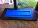
    Home Depot to the rescue.  The base is custom cut 3/4 inch plywood, framed by 2×4 lumber, with 6 200-lb furniture moving locking wheels underneath.  Once assembled, I spray painted matte black and screwed the 32×32 blue lego base tiles in a grid on to it.

  11. How did you come up with the design for the [in]?
    This was a bit tricky given the non-square dimensions of the bricks.  Based on 8.0mm width, I quickly determined the logo would be 160 studs wide.  Using the 5/6 ratio, this meant 133 bricks tall.  I took the official LinkedIn logo and reduced it down to a 160×160 bitmap.  I then resided to 160×133, and manually fixed symmetry errors that were introduced by applying the ratio.

  12. How did you build the four rounded corners?
    This was one of the more complicated parts of the construction, as the corners actually support most of the weight of the side walls.  As a result, they are built more broadly internally to ensure significant cross-dimensional support.  The top corners were also particularly fragile at first because of the lack of internal support.  For both the top & the bottom, I had to rebuild them three times to find the strongest pattern of bricks.

  13. Is the white [in] actually inset by one brick?
    Yes.  One of the trickiest aspects of the [in] was insetting it by one brick for effect, and then ensure that there was ample strength between the blue and white bricks.  I ended up building a hidden “3rd layer” behind the seam where the white & blue bricks meet to join the two layers every 10 rows.  I also used 2×3 bricks in several locations to lock in support for the hidden third row.

  14. How did you make the curves smooth?
    The rendering of the curves follows the 160×133 logo exactly.  It’s not perfectly smooth, but I think that’s part of the charm of a LEGO sculpture.  In this industry, we all love pixels at some level.

  15. What’s holding it up?
    The internal substructure is one of the things I failed to model in advance, and had to improvise on during construction.  I ended up making the internal support structure from LEGO bricks as well, which added over 2,000 bricks to the design.  Approximately every 32 studs, there is a “T-shaped” 8 stud clumn that is perpendicular to the walls of the sculpture.  The bricks for the walls of the sculpture are interleaved with these columns every other row, to provide corner-like strength to the entire span.  Every 40 rows, a horizontal beam four bricks tall is added between the columns, to ensure that the large, square walls don’t bend in on each other.  Lastly, there are “joints” internally that bind together the white and blue sections of the design every ten rows.  (see my original blog post for pictures).

  16. What was the hardest part about the design?
    There were a number of difficult challenges, but the most difficult aspect of the design was balancing unexpected stability and design issues with the inventory of bricks that I had available.  Then again, constraints are part of what makes any problem fun to solve.

  17. How long did it take to build it?
    It took about 90 minutes to build ten rows, so the total sculpture took just about 20 hours of effort, typically 1-2 hours per weekend and an evening here and there.  Since I spent about 3-4 hours modelling the design ahead of time in Photoshop and Excel (I needed to learn some niche spreadsheet skills and this Excel article really did the trick), and another 10-12 hours making trips to local LEGO stores, the grand total time is probably 40 hours.

  18. When did you get it done?
    The modelling was all done in my favorite work time, between 11pm & 2am.  I built the base on Father’s Day.  Most assembly was done at LinkedIn on weekends and the odd evening.

  19. How did you learn to do this?
    There was a surprising amount of useful information on blogs from consultants who build LEGO sculptures for a living.  LEGO, as you might guess, is pretty well covered on the web.  I also asked a question on Quora which provided a few useful tips.

  20. Where can I see it?
    It’s not on public display yet, but later this fall it will debut in the new lobby of 2029 Stierlin Court, LinkedIn’s main building.

If you have additional questions, feel free to post in the comments and I’ll do my best to answer them.  Be forewarned – I have no qualms about deleting inappropriate comments / questions.

Building LinkedIn in LEGO

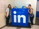
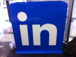
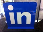
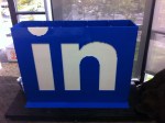
I’m pleased to announce that a fairly large side project that I’ve been working on for the past two months is now complete.  The “LinkedIn in LEGO” sculpture is now ready for display in the LinkedIn corporate lobby.  Made up of over 10,000 LEGO bricks, the sculpture stands over four feet tall, and is fairly close to a pixel perfect rendition of the official LinkedIn logo.

Since building a LEGO sculpture of this size was a fairly large undertaking, I thought I’d capture the details of the project on this blog.

Concept: LinkedIn in LEGO

The idea for the project, to be honest, likely has more to do with a lifelong affection for LEGO bricks.  But this particular idea came to me in May, as I was driving to work.  Every day, I tend to pass the Google building that houses the Android team.  They have a fun tradition, which is to build a sculpture of the code name of each release of Android out in front of their building to celebrate shipping.  (Examples: Gingerbread, Honeycomb, etc).  While I love the public celebration of big releases, I thought how out of place the “kiddie” sculptures looked.  After all, Google is a tech company, the statues should be made of something geeky like LEGO bricks.

At the same time, I thought about how LinkedIn didn’t have any sort of large sign or sculpture in its entrance.  The idea for doing the LinkedIn logo in LEGO bricks was born.  I thought I’d be able to get it done in a single InDay – the one day per month LinkedIn has set aside for innovative projects & efforts.  That proved to be a wildly optimistic assessment of the level of effort involved.

Modeling the Sculpture

After some research online, I discovered the basic measurements of LEGO bricks.  They turn out to not be the same in all dimensions: LEGO bricks are 8.0 mm wide “per stud” and 8.0 mm deep, but are actually 9.6 mm tall.  As a result, to build a square you need to model in a 5/6 ratio of height in rows to studs in width.

I decided on a 4′ x 4′ x 1′ rough size, based on evaluating the stable size of our lobby desk, and estimating a good size for people to take a photo next to.  After all, this was intended to be a fun showpiece for guests of LinkedIn.

Given the above, the rough sizing came to:

  • 160 studs wide (~4 feet)
  • 40 studs deep (~1 foot)
  • 133 rows high (~4 feet)

I wasted a couple of hours trying to use the LEGO provided modeling software which they offer on their website.  Let’s just say, not only was the user interface beyond frustrating, but it really wasn’t designed for a project of this scale.  I had to abandon it and find a different way to model the structure.

Adam Nash, the Human 3D Printer

Initially, I created the base design for the “in” logo by taking the standard logo, and rendering it to a 160×133 bitmap in Photoshop.  I then hand-corrected the image to adjust for symmetry errors introduced by the 5/6 ratio in the resizing.  I then had a clean plan for 133 rows in two colors, blue & white.

To create the plan for the actual model, I decided to emulate a 3D printer, laying down each of the 133 layers individually, in order, from bottom to top.  Initially, I did this by hand on paper to handle the tricky first 8 rows which form the bottom “curve” of the logo.  I then moved all the numbers to my favorite modeling tool, Microsoft Excel, where I completed the rest of my modeling.

Each layer is simply a rectangle, two studs thick.  To model the curve, I had to think carefully about how to support the larger rectangle above it, using larger bricks to provide full support.

Once I completed the first 10 rows, I realized that I had made my first error: ignoring interlocking.  I quickly revised my plans to ensure that I alternated the brick pattern at the corners to ensure that the bricks alternated to provide strength and avoid seams.  This actually proved relatively easy (for example, for the regular blue rings, an odd row would be two rows of 160 bridged by two rows of 36, the next ring would be two rows of 156 bridged by two rows of 40.

As a human 3D printer, I was able to model each layer as a row in the spreadsheet.  For each layer, I would model all four sides.  Three of the sides were trivial, since they are all blue.  It was a simple breakdown of the number of bricks into some “standard” pieces: 2×2, 2×3, 2×4, 2×6 and 2×8. Each brick type got it’s own column.

For the face that contained the “in”, the modeling was more in depth.  Like the GIF format, I just modeled “runs” of each color broken down in the standard bricks.  Each “run” was broken into columns for the brick type (example: 22 blue would become two 2×8 bricks and 1 2×6). I then introduced the “jitter” of 2 studs on each side from the alternating corners.

In the end, I had a giant spreadsheet where totaling every column gave me an inventory of bricks that I would need to order.  I then tallied up each brick and rounded up generously to cover the typical 10-15% materials overage that I’ve experience on home improvement projects.  The adjusted total came to almost exactly 8,000 bricks.

Ordering the Bricks

It turns out ordering 8,000 bricks (including over 5,500 2×8 blue bricks) is not a trivial exercise.  LEGO.com blocks you at 999 bricks per type, and chokes over a certain dollar amount.  Instead, after calling LEGO, it turns out that you can place an order via fax, which is what we did.  In case you are wondering, the Danish don’t seem to have a concept of a “volume discount” or “corporate discount”.  Either that, or they knew I’d pay for the bricks.

Unfortunately, fulfillment was ridiculously slow, with no way to accelerate.  They promised 10-15 days, but the reality was some bricks arrived in 2 weeks, some didn’t arrive for 6 weeks.  It was incredibly frustrating, and they didn’t seem to be set up to provide UPS tracking numbers, although we did get a couple through persistent calling.

Building the Base

On June 19th, I kicked off the project with a trip to Home Depot.  I knew that the final sculpture would be heavy, and that it would have to be movable.  So I got a custom cut piece of 3/4 plywood and 2×4 lumber to frame it.  I also got heavy-weight furniture dolly wheels (six).  Framing was fairly simple, and then I spray painted it matte black so it would be relatively invisible.

Once the base was dry, I carefully measured out ten 32×32 blue LEGO plates, and glued them down to the base.  Once the glue was dry, I screwed them down to the base to ensure no issues.  I used the first few rows of bricks to ensure that I had the plates properly spaced, since there is an interesting but necessary 0.2 mm spacing that you have to account for with LEGO bricks.

Assembly

Once LEGO shipped the first few boxes of bricks, I tried to get started with what I had.  I initially built the structure layer-by-layer, but quickly realized it was much quicker to build a small number of rows at the same time.  It made the “staggering” of the bricks much easier.

Unfortunately, despite all of my modeling, I quickly realized that I had to make some significant modifications.  As result, every layer became a realtime adjustment of the model to accomodate what became three crucial issues that I hadn’t accounted for.  They all revolved around the stability & structure of the sculpture as it grew upward.

Design Modifications: Interior Support

I knew that I had cut corners by making the sculpture only 2 studs thick.  Most sources I had found online recommended making the walls 4 studs thick, and even potentially building an interior structure out of wood or PVC pipe.  Unfortunately, I was trying to keep the budget for the sculpture down, and decided to risk a 2 stud approach.  Once I had the bricks, I quickly realized I needed to course correct.

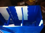
My first modification was to add “columns”.  Every 32 studs or so, I added an 8-stud interior column to form a regular “T shape” with the wall.  The intention was for this to provide some direct support to the walls from falling inward.  While this modification was successful, 8 columns * 133 rows = 1064 additional bricks, and it introduced 8 new junction points that had to be interleaved between odd & even rows for strength.  This modification alone made my original LEGO order insufficient in terms of both size and quantity of bricks.

My second modification were “beams”.  The columns were workable until about 30 rows high, when I noticed that the walls were starting to bend inward a bit.  Knowing that I had over 100 rows left, I had to find a more robust way to square the walls on an ongoing basis.  As a result, I decided to build horizontal beams out of 2×8 LEGO bricks, four bricks deep.  These beams were introduced between the columns, and really reinforced the strength of the structure when pushed from the outside.  I decided to add beams across the columns every 40 layers for strength.

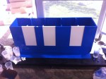
The third modification were “joints” between the blue and white bricks.  When I had modeled the structure, I didn’t consider the obvious fact that because the blue & white were by definition separate bricks, there would be a huge vertical seam, measuring 60+ rows in some cases, where the two colors met.  This was a major weakness, and would lead the letters to buckle inward.  As a result, I designed a “joint” that involved using a hidden “3rd stud” of depth to connect the blue & white bricks with 1×10 bricks, and locking them above & below with 2×3 blue bricks.  By placing these joints every 10 rows, in every location where white met blue, I was able to provide enormous strength to the integrity of the letters.  (I had several office mates “test” this strength, much to my chagrine.)

Inventory Issues: LEGO Stores

All of these modifications, however, led me to need a significant number of new bricks, and in some cases, different sizes than I had ordered.  Given the slow shipping from LEGO, I was worried about ever finishing when I discovered that two large LEGO stores (Valley Fair & Hillsborough) were near by.

There I discovered a few unfortunate facts:

  • They don’t stock most bricks by color and size
  • They don’t have any way to predict which bricks they get week to week (they get supplied on Mondays)
  • They only sell bricks by the cup ($15) or the box ($70)

Needless to say, I made a lot of trips to the stores, and modified my design to accommodate whatever sizes I could get.   Despite the churn, the truth is modifying the design to these new constraints was actually part of the fun.  In the process, I was fortunate enough to find appropriate tiles to smooth out some of the exposed studs, and I was able to figure out a good solution for the “roof” of the sculpture.

Company Event: Time Capsule

As the sculpture came together, I was a bit surprised at how many of my co-workers mentioned to me that it would make a great time capsule.  Because it’s hollow, people seemed to naturally want to put messages in it before it was sealed.

For fun, on August 26th we invited everyone in the company to fill in a card with their prediction for LinkedIn in 2021.  Over 400 cards were filled out and placed in the sculpture.

Final Touches: Dedication & Protection

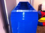
Once the sculpture was completed, it felt natural to want to dedicate the sculpture in some way.  After circulating some ideas, we had a plaque made that made the sculpture a gift from the employees of 2011, which fit the original concept and theme of the project.  We also decided that it was just too tempting for people to lean on, or worse, climb on the sculpture.  Since that wouldn’t last long, we ordered a large plexiglass box for the sculpture, to keep it protected in the lobby.

Final Thoughts

The final sculpture measures pretty true to design: 4′ x 4′ x 1′.  More impressively, it does successfully move, even though it weighs well over 200 pounds.

I’d say I spent about 20 hours in assembly time (nights / weekends), and about the same in overhead (modeling / travel / overhead).  I’m including in the modeling time the periodic “refactoring” where I would tear down pieces and reassemble as I figured out better solutions for certain sections.

There’s something deceptive about looking at photos of it.  I think there is, deep within most techies, a fascination with objects that are made of a very large number of small objects.  Call it pixel-lust.  But there is clearly something really fascinating about seeing a sculpture like this in real life.  People run their fingers over it, watch the light play off the seams.

Over all, it came out better than expected for a first attempt, especially given that I hadn’t attempted anything like this before.  Of course, like any engineer, I’m convinced that now that I have the system, I could do a much better job the second time…

Step by Step Photos

These are some photos that were taken during construction.  They include:

  • Detailed photos of the base stand itself, and the attachment of the lego baseplates
  • Step-by-step photos of the construction, taken approximately every 10 rows
  • Interior shots of the sub-structure, including the columns, beams, and joints to attach the blue/white bricks internally
  • Some fun shots of people posing with the statue, or putting their “time capsule” predictions inside
  • The final sealed version from a few angles


Designers: Getting the Most Out of Your Product Manager

I gave a lighthearted talk yesterday at the LinkedIn User Experience team’s all hands meeting. I called it “Getting the Most Out of Your Product Manager”, and it was intended to talk from the perspective of someone who has lived in both of the HCI (Human Computer Interaction) & PM (Product Management) worlds.  The goal of the deck was simple – by explaining to designers and user experience professionals what makes a great product manager and how they are held accountable, it more obvious why occassionally PMs & Designers can clash.

There are some inside jokes so it might not be as funny to everyone, but it was popular enough that I thought I’d share it here.

As a side note, it was truly amazing to see such a large and amazingly talented group of designers and web developers arranged together.  Incredible validation of a simple truth – that if you want great user experience, you need to foster a culture and process that not only attracts the best talent, but also lets them do their best work.

It’s hard to believe that it was only in 2007 that we started down the path of having a formal UED team at LinkedIn.  When you see products like the recent LinkedIn mobile products, it’s worth remembering that great designs come from great teams.


Want Engagement? Find the Heat.

If you talk to product managers, designers, and engineers at almost any consumer internet company these days, you’ll find that they measure their success largely across three dimensions:

  • Growth (more users)
  • Revenue (more money)
  • Engagement (more visits, more activity per visit)

Believe it or not, it’s that last bullet which is the ultimate coin of the realm: engagement.  How to measure it.  How to design for it.  How to predict it.  How to generate it.

The assumption is that engagement is a proxy for the strength of the relationship with the consumer, and thus leads to both strategic advantage as well as long term monetization.

There is no one simple answer to the question of how to design and build highly engaging products and features.  Game mechanics (thanks in large part to Amy Jo Kim) has become the de facto answer for designing for engagement on the consumer internet in the past few years.  However, in the last few months, I’ve been advocating a new frame for product managers and designers to think about engagement in their products, particularly content-based applications.

Find. The. Heat.

Given the phenomenal success of Google, most modern consumer internet companies are heavily influenced by its product culture, whether they care to admit it or not.  Google made relevance the gold standard for content, and machine generated algorithms for sifting and sorting that content the scalable solution.

But when it comes to content, it’s worth considering things that frankly our colleagues in old media have known for a very long time.

There is a big difference between:

  • Content that you should read / view
  • Content that you want to read / view
  • Content that you actually read / view

It’s not an accident that there are a spectrum of news content, ranging from PBS -> 60 Minutes -> CNN -> Fox News / MSNBC.

The difference?  Heat.

For several years, I’ve been largely focused on designing products with two separate goals in mind, always in tension.  Relevance: ensuring that the content and features presented to the user are as productive as possible.  Delight: ensuring that the user experiences that mix of surprise, happiness, and comfort from using the product.  Jason Purtoti, former designer at Mint.com and current Designer in Residence @ Bessemer, has often advocated for designing for delight.

Heat, however, is not the same as delight.  But heat might be more important than delight for content-based applications.

Let me explain.  Heat covers a multitude of strong emotions.  Vice.  Virtue.  Delight.  Disgust.  Anger.  Thrill.

You can generate heat by showing people content they love… and also by showing them content that they hate.  When you get to the heart of why people share content, you realize that Youtube had virality long before social networks, feeds, and other forms of viral growth were around.  What they had was content that people wanted to share so much, they would cut and paste arcane text strings into emails and send them around.

Heat make many technologists uncomfortable.  First, it’s emotional and irrational.  Second, it’s typically at odds with strict definitions of relevance and utility.

But like the theme of this entire blog, people are predictably irrational.  TV Producers and writers tend to be experts in detecting heat from their audiences, and generating content to match it.  I believe that, just as Google revolutionized the automatic surfacing of relevant content, we can also automate the surfacing of content that generates heat.

This is fairly obvious in politics, as an example.  I can generate highly personalized and relevant content by showing liberal users articles from Daily Kos about health care.  But I can generate heat from that same audience by surfacing articles by Karl Rove on the same topic to those users.

Which are they more likely to click on?  Which are they most likely to share?

Which one generates the most heat?  Which one is “better” for them?

Please note, I am not advocating designing for heat as any form of solitary framework for building engaging products.  However, I have personally found in the past few months that this line of thinking helps inspire me to come up with far more interesting ideas for feature design.  It also seems to help teams that I work with get over mental blocks that lead to dry, boring, unemotional, data-driven content features.

Try it.

Find the heat.