Daffy: From Acorns to LinkedIn

This blog post was also published on Daffy.org

Steve Jobs famously talked about connecting the dots of your life in his now well-known commencement speech in 2005. There’s something incredibly insightful and at the same time humbling about that framing as a founder when you look at the differences between the product you set out to build, and where the journey takes you once you launch.

Daffy was based on a number of fairly simple, but powerful, inspirations:

When Alejandro & I raised our $4.8M seed round in 2020 to help build what is now known as Daffy, the Donor-Advised Fund for You™, it was very much based on the idea that we would build the Acorns for Charity. That’s what we pitched.

A little over one year ago, on September 30, 2021, we launched the service. Launching a new product is always both a triumphant and humbling process. It’s so powerful to see people using and enjoying something new that you and your team brought into the world. At the same time, the initial launch is almost always the beginning of the learning process, because real customers have a way of showing you the truth about where they see value in your creation.

So, not surprisingly, it quickly became obvious that we had missed something fundamental in our initial concept of the product.

Giving is not like saving on one very important dimension. Unlike saving, giving is fundamentally better with other people. We discover new causes and charities through other people. We are inspired to give by other people. Most importantly, we support the causes and charities we care deeply about with other people.

The more we learn from our members, the more we’ve come to realize that Daffy is meant to be more than just the best donor-advised fund on the market.

We set out to build the Acorns of Charity, but the future of Daffy may look much more like LinkedIn.

Giving is Better Together

The best software product clues tend to come from the organic actions of customers, and this has definitely been true with Daffy. In this case, our first clue came from people sharing their inspiration around giving with others. 

Every DAF allows their members to include a note to the charity with their donation, and when we designed Daffy, we included this feature. However, with every Daffy donation, the member is given the option to add a public note about why they give. For an optional feature, we weren’t expecting heavy adoption, but in our first year, over 36% of our donations had a public note.

These notes are not like typical internet posts. In many cases, they reflect emotional and deeply personal motivations for supporting causes and organizations.

It might be hard to believe, but in the early days of LinkedIn, there was a lot of public debate about what identity online would look like. Would people have a single profile that represented them on the web, or would we have multiple, reflecting the different slices of our lives? Mark Zuckerberg argued for the former, while Reid Hoffman argued for the latter.

What we believe we have discovered at Daffy is that there is another identity that is meaningful to people, and yet does not seem to have a home online: our charitable identity.

Our Charitable Identity

Even at LinkedIn, it was clear that there were going to be more than just social and professional profiles. Our identities and relationships are often compartmentalized based on context: think about what you ask someone you just meet at a party vs. a conference vs. a school event. At a little league game, I’m not even sure that I have a name — I’m just Julia’s Dad! These identities flourish and wane over the course of our lives, sometimes merging, sometimes fading.

Over the past few decades, it has become clear that there is a resurgence in how people think about themselves philanthropically. The causes you believe in, the organizations you support, the people you work with to make a difference — all of these matter increasingly to people. Perhaps it is a reflection of the times we live in, or perhaps it is an aspect of maturing generations. Whatever the cause, however, it is clear that people are eager to share this part of themselves with friends and colleagues, and also seek this information about others. We are proud of the roles and responsibilities we take on with charitable organizations and the people who work for these organizations.

DiscoveryInspirationSupport.

These seem to be some of the major emotional drivers behind the activity we see from our early Daffy members, and yet this seems to get lost on existing platforms. It’s so hard to compete with dating, news, shopping, and careers.

Fulfilling Our Series A Vision

2022 has not been a kind year for technology companies in general and has definitely been a tough fundraising environment for venture-backed startups. However, when Alejandro & I realized what we needed to do, we also knew we needed to raise our Series A sooner rather than later.

We know that building out this platform will take years, and we are grateful to Ribbit Capital and XYZ Ventures for supporting this vision, and we are especially grateful to the dozens of leaders and luminaries who have individually invested in our efforts.

Today, on Giving Tuesday, we are starting to roll out our first features that will help bring this vision to life. A place where people can not only share the causes and charities they personally support, but also spotlight a charity they are working to support right now. A way to learn who our friends and colleagues give to, and the opportunity to be inspired by their generosity and support their efforts. 

All of these features are layered over our ground-breaking, modern donor-advised fund platform, built from the ground up to help people be more generous by setting their own personal giving goals and then helping them achieve them.

All throughout November, our #BeMoreGenerous campaign gathered 30 notable leaders including Reid Hoffman (co-founder of LinkedIn)Charles Best (Founder of DonorsChoose), and Amy Chang (Board of Directors at the Walt Disney Co.) to use our new “Charity Spotlight” feature to share the charities they support this holiday season — and inspire others to give.

As of today, that feature is now available to every Daffy member.

Together, we believe that we can increase giving by over $1.2 Trillion dollars over the next decade in the United States alone, with an even larger opportunity globally.

If you are one of the 60-70 million households in the United States who give to charity every year, go to daffy.org now and set up an account. It’s completely free for members just starting out with a balance of under $100.

Connect with your trusted friends and colleagues. Share the causes and organizations you believe in. Inspire others to give, and more importantly, connect more people to organizations that desperately need more support. Include your family, and foster real discussions about the causes and organizations you support.

Daffy launched just a little over a year ago, and we are grateful to the thousands of people who have already signed up for the service. But our aspirations are audacious.

Our vision is a world where everyone puts something aside regularly for those less fortunate than themselves. A community of millions, not thousands.

Come join us.

Silicon Valley Home Prices, Stock Prices & Bitcoin (2021)

A little less than four years ago, I wrote a post about home prices in Silicon Valley and how they relate to stock prices and Bitcoin. It was one of the most popular posts on my blog from 2017.

The original compared housing prices in Palo Alto to a few of the largest technology companies in Silicon Valley, with Bitcoin added just for fun. Given the incredible rise in technology stock prices and Bitcoin in the past few years, it seemed worthwhile to update the data in the original post.

Talking about home prices in Silicon Valley is always a sensitive topic, because the lack of affordable housing continues to be a both difficult and heavily political topic. As someone who grew up here, it seems painfully obvious that the primary problem is the overwhelming resistance of local city councils to approve housing unit construction that meets ever increasing demand.

This post isn’t about that issue.

Instead, this is an attempt to look at the housing market through another lens. Most financial estimates of housing cost tend to compare the price of housing to incomes, which makes sense since for most people in most places, the affordability of a home is directly related to the size of the mortgage that they can obtain for that home. In general, houses are purchased based on income, not assets.

In Silicon Valley, of course, income looks a bit different since many people in Silicon Valley work for technology companies, and most technology companies compensate their employees with equity.

Palo Alto Home Prices

I chose Palo Alto as a proxy for Silicon Valley home prices because it is historically “ground zero” for Silicon Valley tech companies, and it has relatively close proximity to all of the massive tech giants (Apple, Google, Facebook).

The original post started the data sets in June 2012, since this was roughly when Facebook became a public company. For this post, I’ve extended the data sets all the way to March 2021.

All housing prices have been sourced from Zillow. All stock prices have been sourced from Yahoo Finance, and reflect the price adjusted for dividends. All Bitcoin prices have been sourced from Investing.com.

This is what Zillow looks like today for Palo Alto:

As you can see, in June 2012, the average Palo Alto home cost $1.44M. Roughly five years later, in June 2017, that average price was up 84.6% to $2.55M. Now, in March 2021, that price has risen a total of 117.9% to $3.15M.

That’s certainly a much faster increase than any normal measure of inflation, whether looking at changes in prices or wages. But what happens if we look at those increases in comparison to the stocks of some of the largest technology employers in Silicon Valley?

Apple ($AAPL)

Apple is the most valuable public company in the world right now, measured by market capitalization ($2.023 Trillion as of March 18, 2021), and second most profitable ($55.256B in 2020). Thanks to their exceptional financial performance, Apple stock ($AAPL) has increased significantly since June 2012, rising (split-adjusted) from $18.79 per share to $124.76 in March 2021. That’s a gain of over 565.8%.

Wow. 😳

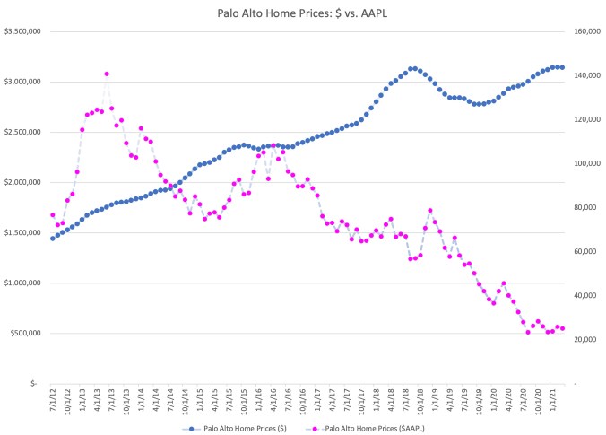
Let’s look at Palo Alto home prices as measured in dollars, and then let’s look at them in comparison priced in shares of $AAPL.

This chart tells a very different story than the one from 2017.

In the five years from June 2012 to June 2017, Apple stock was volatile, but over the entire time period almost exactly matched the growth in Palo Alto home prices. However, the run up since 2017 has been incredible.

Split-adjusted, it took 76,839 shares of $AAPL to purchase the average home in Palo Alto. By March of 2021, that number had dropped to only 25,216 shares.

This isn’t surprising, since Palo Alto home prices are only up 117.9% over that time period, and Apple shares are up 564%. But what this means from a practical viewpoint is that for people converting one asset (Apple stock) into another (Palo Alto housing), it has become easier, not harder, to purchase the average home.

Google ($GOOGL)

Google tells a similar story to Apple in 2021, even though that wasn’t the case in the original post. Since 2017, Apple stock has clearly outperformed Google, leaving them with almost identical price increases from June 2012. (By itself, that’s somewhat of an amazing fact given the relative ages of the two companies).

As of March 2021, Google has a market capitalization of $1.37 Trillion, significant less than Apple’s. However, they have seen price appreciation of 557.3% since June 2012, rising from a split-adjusted $316.80 per share to an amazing $2,082.22 per share in March 2021.

Let’s look at Palo Alto home prices as measured in dollars, and then let’s look at them in comparison priced in shares of $GOOGL.

If you compare this chart to the one for Apple, it tells a different story but has a similar ending. Google shares are clearly more volatile than Palo Alto housing, but they have fairly consistently appreciated over the past decade.

In June of 2012, it would have taken 4,557 shares of Google stock to purchase the average home in Palo Alto. By March 2021, that number had dropped to only 1,511 shares.

So while Palo Alto home price appreciation has been tremendous by any historical measure, Palo Alto housing has become cheaper in the past decade for people holding Google stock, and more expensive for people holding dollars.

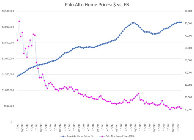
Facebook ($FB)

Facebook, the youngest of the massive tech giants, already has one of the largest market capitalizations in the world. As of today, Facebook is valued at $793.4 Billion. Facebook stock has risen an incredible 1208.2% since June of 2012, from a price of $21.71 per share to a price of $284.01 in March 2021.

At this point, you know how this story goes. With growth of over 1200%, Facebook stock goes a lot further in 2021 than it did in 2012, even against daunting Palo Alto housing prices.

In June of 2012, it would have taken 66,500 share of Facebook to purchase the average home in Palo Alto. By March of 2021, that number was down to just 11,077 shares. Quite incredible.

Bitcoin ($BTC)

While I realize that Bitcoin isn’t a large employer in Silicon Valley, nor is it a stock, the original idea for this post came from a joke I made on Twitter back in 2017.

Most of you likely already know the story here. Bitcoin price appreciation in the past 12 months has been unbelievably high, so looking back to June 2012 is going to be somewhat jarring.

In June of 2012, the price of Bitcoin was about $9.40. By March of 2021, it had risen to $57,326.20. That’s a gain of over 609,753%.

The growth rate in Bitcoin prices, as measured in US dollars, has been so incredible, this chart is almost impossible to read in recent years.

For context, in June of 2012, it took about 153,586.2 Bitcoin to purchase the average home in Palo Alto. By March of 2021, that number had dropped to just 54.9 Bitcoin.

This, of course, has a number of dramatic implications. As measured in US dollars, or in real assets like Palo Alto real estate, the wealth of Bitcoin holders has increased dramatically. As measured in US dollars, the average price of a house in Palo Alto has increased by 117.9% in less than 10 years. However, as measured in Bitcoin, the average price of a house in Palo Alto has decreased by 99.96%.

There aren’t many people who invested in Bitcoin back in 2012, but a disproportionate number of them were in Silicon Valley. However, even based on recent numbers, the story is similar.

In March of 2019, you could have purchased the average house in Palo Alto for 702.0 Bitcoin. Just two years later, in March 2021, the average house in Palo sold for 54.9 Bitcoin. That means the average home in Palo Alto, as measured in Bitcoin, has decrease by 92.2% in just the past two years alone.

Silicon Valley Is Seeing Significant Asset Inflation

These charts are not meant to imply direct causality, but in many ways they confirm several economic facts about Silicon Valley that may not be obvious when looking at nationwide statistics.

Because technology employers in Silicon Valley compensate most employees with equity, it is very likely that asset inflation in stock (and crypto) markets has some impact on the housing market. This is likely exacerbated by the lack of new housing construction in Silicon Valley.

The fact is, if you are fortunate enough to have equity in one of the tech giants, or if you have been an investor in Bitcoin, houses might actually look cheaper in 2021 than they did in 2012, or even in 2020.

What is most surprising about the data refresh is the apparent detachment of equity and crypto prices from the prices of Palo Alto real estate. There are a number of potential reasons why this might have happened. One theory is that real estate markets move relatively slowly compared to equities and crypto, and so the rapid price increases of 2020 have not yet worked their way into the market. A second theory is that large technology company compensation has been shifting away from stock options to RSUs, leading employees to hold less stock as they convert their shares to cash on vesting. A third theory is that we’re seeing complicated effects from COVID, as windfall money from equity and crypto markets may be flowing into other places rather than local real estate.

(Before the San Francisco crowd gets too rowdy, there is absolutely no evidence yet that more money is flowing into San Francisco real estate instead of Palo Alto this cycle.)

In any case, whatever the reasons may be, it is always worth checking the actual data to see whether it confirms or contradicts our intuition.

Let’s check back in another four years.


Silicon Valley Home Prices, Stock Prices & Bitcoin

I’m writing this post with a bit of trepidation, because talking about Silicon Valley home prices these days is a bit dicey. The surge of the last five years has been shocking, and almost no one I know feels good about how difficult it is for people to buy a new home in Silicon Valley in 2017. Some houses are pretty bad but others arae actually at a reasonable price, because they come with furniture and some even come with shutters from plantation shutters installation Sydney. They are actually really good quality.

So if you need a trigger warning, this is it. Stop reading now.

The truth is, as shocking as the rise in Silicon Valley home prices has been, there has also been an asset boom in other dimensions as well. Total compensation for engineers is up considerably and stock prices at the big tech companies continue to rise.

To visualize this, I thought I’d put together a few charts based on real market data. As a proxy for Silicon Valley, I pulled the last 5 years of home prices from Zillow, and monthly stock price data from Yahoo.

Palo Alto Home Prices

Two days ago, the Mercury News reported that a home in Palo Alto sold for $30 million.  A quick check on Zillow seems to confirm this.

I chose Palo Alto as a proxy for Silicon Valley home prices because it is historically “ground zero” for Silicon Valley tech companies, and it has relatively close proximity to all of the massive tech giants (Apple, Google, Facebook).

I picked June 2012 – June 2017, not only because it is roughly five years, but also it also happens to mirror the time that Facebook has spent as a public company. For many in the local real estate market or online sites as SafeguardProperty.com, correctly or incorrectly, the Facebook IPO still looms as a transformational event.

As you can see, in June 2012 the average Palo Alto home cost $1.38 million. Five years later, the estimate for June 2017 is up 84.6% to $2.55 million.

Apple (AAPL)

Apple is the most valuable company in the world, as measured either by market capitalization ($810B as of 6/7/2017) or by profitability ($45.7B in 2016).  Thanks in part to this exception financial performance, Apple stock (AAPL) has risen 84.5% in the last five years, from $83.43 per share to $153.93 per share.

84.5%? Where have I heard that number before?

That’s right, the increase in Apple stock over the last five years is almost exactly the same increase as the average home price in Palo Alto over the same time period.

In June 2012, it took 16,555 shares of Apple stock to purchase the average Palo Alto home. In June 2017, it took 16,566 shares. (Of course, with dividends, you’re actually doing a little better if you are a shareholder.)

If you look at the chart, the pink line shows clearly the large rise in price for the average Palo Alto home. The blue line is the number of AAPL shares it would take to by the average Palo Alto home in that month. As you can see, AAPL stock is volatile, but five years later, that ratio has ended up in almost the exact same place.

Alphabet / Google (GOOG)

Alphabet, the company formerly known as Google, may not be as large as Apple in market capitalization ($686B), but it has seen far more share appreciation in the past five years. Since June 2012, Alphabet has seen its stock price rise 240.4%, from $288.95 in June 2012 to $983.66 per share.

What does this mean? Well, it means that if you have been fortunate enough to hold Google equity, the rise in Palo Alto home prices doesn’t look as ominous. It took 4,780 shares of Google to purchase the average Palo Alto home in June 2012, but it only took 2,592 to purchase the average Palo Alto home in June 2017.

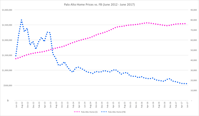
Facebook (FB)

Facebook, the youngest of the massive tech giants, already has one of the largest market capitalizations in the world. As of today, Facebook is valued at $443B. Facebook stock has risen 394% in the past five years, from $31.10 in June 2012 to $153.63 in June 2017.

To state the obvious, it has been a good five years for owners of Facebook stock. Not many assets could make owning Palo Alto real estate look slow, but 394% growth in five years is unbelievable. In June 2012, you would have needed 44,412 shares to buy the average Palo Alto home. In June 2017, that number had dropped significantly to just 16,598 shares.

Bitcoin (BTC)

While I realize that Bitcoin is not a stock, the original idea for this post came from a joke I made on Twitter recently given all of the buzz about Bitcoin, Ethereum and ICOs over the past few weeks.

I couldn’t resist running the numbers.

For the small number of readers of this blog that haven’t been following the price of Bitcoin, the increase in value over the past five years has been unbelievable.The total value of all Bitcoin outstanding is currently about $44.5B. Since June 2012, Bitcoin has risen approximately 4,257%, from $6.70 per Bitcoin to a current value of $2,858.90.

You can see why there has been so much buzz.

In June of 2012, it would have taken 260,149 Bitcoin to buy the average home in Palo Alto. In June of 2017, that number is now down to 892.

Needless to say, anyone who sold Bitcoin to buy a house in 2012 is likely not loving these numbers. But to people who have held Bitcoin for the past five years, Palo Alto is looking cheaper by the day.

Silicon Valley Is Seeing Significant Asset Inflation

To be clear, I’m not attempting to attribute causality to these charts. I believe the real driver of home prices in Silicon Valley is the lack of sufficient building of new supply at pace with the economy, combined with a significant increase in compensation for technology employees and historically low interest rates.

But the fact is, if you are fortunate enough to have equity in one of the tech giants (or in Bitcoin), houses might actually be looking cheaper now relatively than they did five years ago.

I always find it enlightening to look at real data and compare it to intuition. Hope you find this data and these charts as interesting as I did.

Spend Time Thinking About The People Who Don’t Use Your Product

on-the-outside-looking-in

This is an extension to my original three post series on user acquisition.

Today, AirBnB announced that it had reached a settlement with the city of San Francisco on how to effectively register and monitor legal listings in the city. I am a huge fan of the company, and it seems like a positive outcome for both San Francisco and AirBnB.

For many, the issues around many of the sharing economy companies, including AirBnB, are examples of regulators trying to find a way to both control and incorporate rapid, disruptive innovation.  There is, of course, some truth to this point of view.

However, as a product leader, there is another important takeaway that seems to be too often forgotten. Most of us spend too little time thinking carefully about the people who don’t use our products. 

The people who don’t use your product often won’t show up in your core metrics. But if you don’t spend time understanding them, you will eventually feel the negative effects in your growth and your brand.

It’s Natural for Companies to Obsess About Their Users

When a startup launches a new product, it is natural to obsess with every user it touches. Every click, every tap, every piece of data is precious feedback about your features. The data is one of the most objective sources of information about what your users are doing with your product and when they are doing it. In the early days, before finding product/market fit, a huge amount of time tends to be spent on the people you touch but who don’t convert. In fact, that may be where most people at the company spend their time.

As consumer products find product/market fit and hit escape velocity, more and more engineers and designers spend a disproportionate amount of time on users. The people who work on growth & marketing will still often continue to look at the data on leads, trying to find ways of converting those non-users to users. However, as a percentage of the company, fewer and fewer engineers, designers & product managers will be looking at data from non-users.

This makes sense, of course, because as your product grows, almost all feature development is focused on your users. In 2008, when we established the Growth team at LinkedIn, we discovered that of the hundreds of features on linkedin.com, only three features reliably touched non-users. (For those of you who are curious, those features were the guest invitation (email), the public homepage (linkedin.com), and the public profile (in search.))

Customer obsession, of course, is generally a good thing. But as we learned at LinkedIn, if you want to grow a viral product, you have to spend a considerable amount of time thinking about the non-user, where they touch your brand and your service, and find ways to both reach them and convert them to users.

You Have More Non-Users Than Users

Few brands and products could ever claim that their conversion rate for everyone they touch is over 50%. It is even possible that Facebook, with nearly 2 billion users, still has more people in the world who have heard of the company than who use it.

In 2011, I remember talking to the great founders at CardMunch about a new email they were proposing to add to their service. CardMunch was a wonderful app that made it effortless to scan a business card and then have it automatically entered into your address book, with almost no errors. The proposal was to add an email so that the person whose business card you scanned (non-user) received an email from the CardMunch user with their business card in electronic form.

The team was ready to whip something together quickly and test the idea, and the concept was good in principle. But given some of the experience of Plaxo a decade before, it was prudent to ask the simple question: “How many people will see this new email?” Within a few minutes, we figured out that the number of people who would receive this email within the first three months would be 30 to 50 times the total user base of the application.

Some of you are probably thinking, “sounds like a great growth feature!” Others are likely venting about why we have so many emails cluttering our inboxes. Both reactions are fair.

The guidance I gave the team, however, was to consider the fact that, once they launch this feature, most people who have ever heard of CardMunch will have only heard of it through this email. The product and the brand. I asked them to spend a bit more time on the design on the email, in that context, to ensure that all of their hard work on a wonderful product wouldn’t be drowned in an avalanche of poor experience.

In the end, Sid Viswanathan & team did a great job brainstorming ways that they could show the value of a connected addressbook in the email, including LinkedIn features like people you know in common. Once framed properly, it was simple to think about what they wanted non-users to think about their brand and their product.

Non-Users Matter

Marketers, of course, have known this for decades. It is a brand marketing staple that it takes at least three touches of a brand before it will stick with a potential customer.

Somewhere along the way, software companies lost touch with the basic idea that every piece of content that contains their brand is a potential touch. It is not just the users of the core product that matter for long term growth.

Market research and customer development are often essential for discovering and understanding new potential users for your product. The case can be made that viral systems can, in fact, spread to these new pockets automatically. However, truly viral products are few and far between, and in most cases these new markets will not be in the data sets that your product & engineering teams are focused on.

Brand will also impact your company well beyond new user acquisition. With AirBnB, we now know the many ways in which their service and brand touch non-users. Neighbors, for example, have natural questions and concerns when a house or a unit near by is available on the platform.

Software companies, especially successful ones, tend to have passionate and talented designers and product leaders who are eager to find clever solutions to real user problems. Given the right data and focus, there is no question that these teams can also design and build features that address non-user concerns.

Tesla spends time thinking both about the feeling a driver has in the car, as well as the experience of a non-Tesla owner who is watching that car drive by.

Spend more time thinking about all of the people who touch your product & your brand, not just your users.


The Future of Social Networking at Singularity U

Last week, I was asked to give a guest lecture at Singularity University on the topic “The Future of Social Networking

To frame the discussion, I chose to walk through the following structure:

  • Web 1.0 vs. Web 2.0
  • Social Networking as a disruptive platform
  • LinkedIn as an example of a social platform
  • Mobile as a disruptive accelerator for social platforms
  • Thoughts on future disruptions

On a personal note, I hadn’t actually been back to visit NASA Ames Research Center since my internship during my senior year in high school (21 years ago).  Back then, I was helping develop simulation software for fluid dynamics simulations in Fortran.  Thankfully, no one asked me to code in Fortran during the Q&A.

The team at Singularity U was incredibly gracious, and I appreciated the opportunity to talk to the class.

User Acquisition: Mobile Applications and the Mobile Web

This is the third post in a three post series on user acquisition.

In the first two posts in this series, we covered the basics of the five sources of traffic to a web-based product and the fundamentals of viral factors.  This final post covers applying these insights to the current edge of product innovation: mobile applications and the mobile web.

Bar Fight: Native Apps vs. Mobile Web

For the last few years, the debate between building native applications vs. mobile web sites has raged.  (In Silicon Valley, bar fights break out over things like this.) Developers love the web as a platform.  As a community, we have spent the last fifteen years on standards, technologies, environments and processes to produce great web-based software.  A vast majority of developers don’t want to go back to the days of desktop application development.

Makes you wonder why we have more than a million native applications out there across platforms.

Native Apps Work

If you are religious about the web as a platform, the most upsetting thing about native applications is that they work.  The fact is, in almost every case, the product manager who pushes to launch a native application is rewarded with metrics that go up and to the right.  As long as that fact is true, we’re going to continue to see a growing number of native applications.

But why do they work?

There are actually quite a few aspects to the native application ecoystem that make it explosively more effective than the desktop application ecosystem of the 1990s.  Covering them all would be a blog post in itself.  But in the context of user acquisition, I’ll posit a dominant, simple insight:

Native applications generate organic traffic, at scale.

Yes, I know this sounds like a contradiction.  In my first blog post on the five sources of traffic, I wrote:

The problem with organic traffic is that no one really knows how to generate more of it.  Put a product manager in charge of “moving organic traffic up” and you’ll see the fear in their eyes.

That was true… until recently.  On the web, no one knows how to grow organic traffic in an effective, measurable way.  However, launch a native application, and suddenly you start seeing a large number of organic visits.  Organic traffic is often the most engaged traffic.  Organic traffic has strong intent.  On the web, they typed in your domain for a reason.  They want you to give them something to do.  They are open to suggestions.  They care about your service enough to engage voluntarily.  It’s not completely apples-to-apples, but from a metrics standpoint, the usage you get when someone taps your application icon behaves like organic traffic.

Giving a great product designer organic traffic on tap is like giving a hamster a little pedal that delivers pure bliss.  And the metrics don’t lie.

Revenge of the Web: Viral Distribution

OK. So despite fifteen years of innovation, we as a greater web community failed to deliver a mechanism that reliably generates the most engaged and valuable source of traffic to an application.  No need to despair and pack up quite yet, because the web community has delivered on something equally (if not more) valuable.

Viral distribution favors the web.

Web pages can be optimized across all screens – desktop, tablet, phone.  When there are viral loops that include the television, you can bet the web will work there too.

We describe content using URLs, and universally, when you open a URL they go to the web.  We know how to carry metadata in links, allowing experiences to be optimized based on the content, the mechanism that it was shared, who shared it, and who received it.  We can multivariate test it in ways that border on the supernatural.

To be honest, after years of conversations with different mobile platform providers, I’m still somewhat shocked that in 2012 the user experience for designing a seamless way for URLs to appropriately resolve to either the web or a native application are as poor as they are.  (Ironically, Apple solved this issue in 2007 for Youtube and Google Maps, and yet for some reason has failed to open up that registry of domains to the developer community.)  Facebook is taking the best crack at solving this problem today, but it’s limited to their channel.

The simple truth is that the people out there that you need to grow do not have your application.  They have the web.  That’s how you’re going to reach them at scale.

Focus on Experience, Not Technology

In the last blog post on viral factors, I pointed out that growth is based on features that let a user of your product reach out and connect with a non-user.

In the mobile world of 2012, that may largely look like highly engaged organic users (app) pushing content out that leads to a mobile web experience (links).

As a product designer, you need to think carefully about the end-to-end experience across your native application and the mobile web.  Most likely, a potential user’s first experience with your product or service will be a transactional web page, delivered through a viral channel.  They may open that URL on a desktop computer, a tablet, or a phone.  That will be your opportunity not only to convert them over to an engaged user, in many cases by encouraging them to download your native application.

You need to design a delightful and optimized experience across that entire flow if you want to see maximized self-distribution of your product and service.

Think carefully about how Instagram exploded in such a short time period, and you can see the power of even just one optimized experience that cuts across a native application and a web-based vector.

Now go build a billion dollar company.

User Acquisition: Viral Factor Basics

This is the second post in a three post series on user acquisition.

In the first post in this series, we covered the basics of the five sources of traffic to a web-based product.  This next post covers one of the most important, albeit trendy, aspects of user acquisition: virality.

Lot-of-Rabbits

It’s About Users Touching Non-Users

Look at your product and ask yourself a simple question: which features actually let a user of your product reach out and connect with a non-user?   The answer might surprise you.

At LinkedIn, we did this simple evaluation and discovered that out of thousands of features on the site, only about a half-dozen would actually let a user create content that would reach a non-user. (In fact, only a couple of these were used in high volume.)

I continue to be surprised at how many sites and applications are launched without having given careful thought to this exactproblem.  Virality cannot easily be grafted onto a service – outsized results tend to be reserved for products that design it into the core of the experience.

Useful questions to ask, from a product & design perspective:

  • How can a user create content that reaches another user?
  • How does a users experience get better the more people they are connected to on it?
  • How does a user benefit from reaching out to a non-user?

Understanding Viral Factors

One of the most useful types of metrics to come out of the last five years of social software is the viral factor.  Popularized by the boom of development on the Facebook platform in 2007, a viral factor is a number, typically between 0.0 and 1.0.  It describes a basic business problem that affects literally every business in the world:

“Given that I get a new customer today, how many new customers will they bring in over the next N days?”

“N” is a placeholder for a cycle time that makes sense for your business.  Some companies literally track this in hours, others 3 days, or even 30.  Let’s assume for now that 7 is a good number, since it tells you given a new customer today, how many new customers will they bring in over the next week.

Basic Viral Math

The good news is, once you identify the specific product flows that allow users to reach non-users, it’s fairly easy to instrument and calculate a viral factor for a feature or even a site.  But what does the number really mean?

Let’s assume a viral factor of 0.5, and an N of 7.  If I get a new user today, then my user acquisition will look like this over the next few weeks:

1 + 0.5 + 0.25 + 0.125 ….

It’s an infinite series that adds up to 2.  By getting a new user, the virality of this feature will generate a second user over time.

Two obvious epiphanies here:

  • A viral factor is a multiplier for existing sources of user acquisition.  0.5 is a 2x, 0.66 is a 3x, etc.
  • Anything below 0.5 looks like a percentage multiplier at best.

What about a viral factor of 1.1?

One of the memes that started to circulate broadly in 2008 was getting your viral factor to “1.1”.  This was just a proxy for saying that your product or service would explode.  If you do the math, you can easily see that any viral factor or 1.0 or higher will lead to exponential growth resulting in quickly having every human on the planet on your service.

I don’t want to get into a Warp 10 debate, but products can in fact have viral factors above 1.0 for short periods of time, particularly when coming off a small base.

Learning from Rabbits

The key to understanding viral math is to remember a basic truth about rabbits.  Rabbits don’t have a lot of rabbits  because they have big litters.  Rabbits have a lot of rabbits because they breed frequently.

When trying to “spread” to other users, most developers just focus on branching factor – how many people they can get invited into their new system.  However, cycle time can be much more important than branching factor.

Think of a basic exponential equation: X to the Y power.

  • X is the branching factor, in each cycle how many new people do you spread to.
  • Y is the number of cycles you can execute in a given time period.

If you have a cycle that spreads to 10 people, but takes 7 days to replicate, in 4 weeks you’ll have something that looks like 10^3.  However, if you have a cycle that takes a day to replicate, even with a branching factor of 3 you’ll have 3^27.  Which would you rather have?

In real life, there is decay of different viral messages.  Branching factors can drop below 1.  The path to success is typically the combination of a high branching factor combined with a fast cycle time.

As per the last blog post, different platforms and traffic channels have different engagement patterns and implicit cycle times.  The fact that people check email and social feeds multiple times per day makes them excellent vectors for viral messages.  Unfortunately, the channels with the fastest cycle times also tend to have the fastest decay rates.  Fast cycle times plus temporary viral factors above 1 are how sites and features explode out of no where.

Executing on Product Virality

To design virality into your product, there really is a three step process:

  1. Clearly articulate and design out the features where members can touch non-members.  Wireframes and flows are sufficient.  Personally, I also recommend producing a simple mathematical model with some assumptions at each conversion point to sanity check that your product will produce a strong viral factor, layered over other traffic sources (the multiplier).
  2. Instrument those flows with the detailed metrics necessary for each step of the viral cycle to match your model.
  3. Develop, release, measure, iterate.  You may hit success your first time, but it’s not unusual to have to iterate 6-8 times to really get a strong viral factor under the best of conditions.  This is the place where the length of your product cycles matter.  Release an iteration every 2 days, and you might have success in 2 weeks.  Take 3-4 weeks per iteration, and it could be half a year before you nail your cycle.  Speed matters.

You don’t need hundreds of viral features to succeed.  In fact, most great social products only have a few that matter.

What about mobile?

Now that we’ve covered the five scalable sources of web traffic and the basics of viral factors, we’ll conclude next week with an analysis of what this framework implies for driving distribution for mobile web sites vs. native applications.

User Acquisition: The Five Sources of Traffic

This is the first post in a three post series on user acquisition.

The topic of this blog post may seem simplistic to those of you who have been in the trenches, working hard to grow visits and visitors to your site or application.  As basic as it sounds, however, it’s always surprising to me how valuable it is to think critically about exactly how people will discover your product.

In fact, it’s really quite simple.  There are only really five ways that people will visit your site on the web.

The Five Sources of Traffic

With all due apologies to Michael Porter, knowing the five sources of traffic to your site will likely be more important to your survival than the traditional five forces.  They are:

  1. Organic
  2. Email
  3. Search (SEO)
  4. Ads / Partnerships (SEM)
  5. Social (Feeds)

That’s  it.  If someone found your site, you can bet it happened in those five ways.

The fact that there are so few ways for traffic to reach your site at scale is both terrifying and exhilarating.  It’s terrifying because it makes you realize how few bullets there really are in your gun.  It’s exhilarating, however, because it can focus a small team on exactly which battles they need to win the war.

Organic Traffic

Organic traffic is generally the most valuable type of traffic you can acquire.  It is defined as visits that come straight to your site, with full intent.  Literally, people have bookmarked you or type your domain into their browser.  That full intent comes through in almost every produto metric.  They do more, click more, buy more, visit more, etc.  This traffic has the fewest dependencies on other sites or services?

The problem with organic traffic is that no one really knows how to generate more of it.  Put a product manager in charge of “moving organic traffic up” and you’ll see the fear in their eyes.  The truth is, organic traffic is a mix of brand, exposure, repetition, and precious space in the very limited space called “top of mind”.  I love word of mouth, and it’s amazing when it happens, but Don Draper has been convincing people that he knows how to generate it for half a century.

(I will note that native mobile applications have changed this dynamic, but will leave the detail for the third post in this series.)

Email Traffic

Everyone complains about the flood of email, but unfortunately, it seems unlikely to get better anytime soon.  Why?  Because it works.

One of the most scalable ways for traffic to find your site is through email.  Please note, I’m not talking about direct marketing emails.  I’m referring to product emails, email built into the interaction of a site.  A great example is the original “You’ve been outbid!” email that brought (and still brings) millions back to the eBay site every day.

Email scales, and it’s inherently personal in its best form.  It’s asynchronous, it can support rich content, and it can be rapidly A/B tested and optimized across an amazing number of dimensions.  The best product emails get excellent conversion rates, in fact, the social web has led to the discovery that person to person communication gets conversion person over 10x higher than traditional product emails.  The Year In Review email at LinkedIn actually received clickthroughs so high, it was better described as clicks-per-email!

The problem with email traffic generally is that it’s highly transactional, so converting that visit to something more than a one-action stop is significant. However, because you control the user experience of the origination the visit, you have a lot of opportunity to make it great.

Search Traffic

The realization that natural search can drive traffic to a website dates back to the 90s.  However, it really has been in the past decade in the shadow of Google that search engine optimization scaled to its massive current footprint.

Search clearly scales.  The problem really is that everyone figured this out a long time ago.  First, that means that you are competing with trillions of web pages across billions of queries.  You need to have unique, valuable content measured in the millions of pages to reach scale.  SEO has become a product and technical discipline all it’s own. Second, the platform you are optimizing for (Google, Microsoft) is unstable, as they constantly are in an arms race with the thousands of businesses trying to hijack that traffic. (I’m not even going to get into their own conflicts of interest.)

Search is big, and when you hit it, it will put an inflection point in your curve.  But there is rarely anysuch thing as “low hanging fruit” in this domain.

Advertising (SEM)

The fourth source of traffic is paid traffic, most commonly now ads purchased on Google or Facebook.  Companies spend billions every year on these ads, and those dollars drive billions of visits.  When I left eBay, they were spending nearly $250M a year on search advertising, so you can’t say it doesn’t scale.

The problem with advertising is really around two key economic negatives.  The first is cash flow.  In most cases, you’ll be forced to pay for your ads long before you realize the economic gains on your site.  Take something cash flow negative and scale it, and you will have problems.  Second, you have solid economics.  Most sites conjure a “lifetime value of a user” long before they have definitive proof of that value, let alone evidence that users acquired through advertising will behave the same way. It’s a hyper-competitive market, armed with weapons of mass destruction.  A dangerous cocktail, indeed.

While ads are generally the wrong way to source traffic for a modern social service, there are exceptions when the economics are solid and a certain volume of traffic is needed in a short time span to catalyze a network effect.  Zynga exemplified this thinking best when it used Facebook ads to turbocharge adoption and virality of their earlier games like FarmVille.

Social Traffic

The newest source of scalable traffic, social platforms like Facebook, LinkedIn and Twitter can be great way to reach users.  Each platform is different in content expectations, clickthrough and intent, but there is no question that social platforms are massively valuable as potential sources of traffic.

Social feeds have a number of elements in common with email, when done properly.  However, there are two key differences that make social still very difficult for most product teams to effectively use at scale.  The first is permission.  On social platforms, your application is always speaking through a user.  As a result, their intent, their voice, and their identity on the platform is incredibly important.  Unlike email, scaling social feed interactions means hitting a mixture of emotion and timing.  The second issue is one of conversion.  With email, you control an incredible number of variables: content, timing, frequency.  You also have a relatively high metrics around open rates, conversion, etc.  With social feeds, the dynamics around timing and graph density really matter, and in general it always feels harder to control.

The Power of Five

Eventually, at scale, your site will likely need to leverage all of the above traffic sources to hit its potential.  However, in the beginning, it’s often a thoughtful, deep success with just one of these that will represent your first inflection point.

The key to exponential, scalable distribution across these sources of traffic is often linked to virality, which is why that will be the topic of my next post.

Why Zynga is a Great Business

With the Zynga IPO filing rumored to be hours away, I thought a light hearted blog post might be in order.

There are many aspects to economics behind video games that have been largely unchanged over the past two decades.  Fundamentally, Zynga lept to an opportunity to take advantage of a social platform (Facebook) to challenge some of the fundamental limitations of distribution and monetization that plagued the software giants who dominated desktop and platform gaming.If you need a new gaming mouse check out the best gaming mouse for small hands that might fit you perfectly.

Obviously, I am a fan of the company.  The number of blog posts here about Zynga games should tell you that.  But when people ask me in real life why I’m such a big fan of Zynga, I give them a simple tongue-in-cheek thesis.

Selling Things You Don’t Need

It’s a well know fact that selling people things they don’t need is a great business.   Some might say it’s when retailers and/or products rise higher in the Maslow hierarchy of needs.  By definition, when items rise up that motivation chain, more powerful emotions come into play.  Fundamentally, no one needs a cotton candy tree.  But Zynga gets to the emotions of why you might want one.

In the end, the willingness to pay for things you don’t need is shockingly high in an economy where people have disposable income.

Selling Things You Don’t Need that Don’t Exist

Hundreds of years ago, this was what selling “snake oil” was all about.  Selling something that you don’t need, and that doesn’t exist has always been a great way to make money.  Unfortunately, it also used to be a sure fire path to getting run out of town (and perhaps tarred & feathered in the process).

A little computer icon of a purple cow does not exist, and you don’t need it.  But that doesn’t change the fact that Zynga has found a way not only to make you want it, but deliver it to you with an effective cost of goods sold of approximately zero.

So now we have a high willingness to pay, combined with low friction and low cost of goods sold.

Selling Things You Don’t Need, That Don’t Exist, and That Are Addictive

This might be called the holy trinity of virtual goods, but in the end, this is the most amazing part of the Zynga model.  Certain types of social interaction are clearly pleasurable to people at a fundamental level.  We love the inherent stimulation in getting a response, recognition or even just insight into another human being.  Once we find a path for these interactions, we want more of it.  By leveraging a social platform for its games, Zynga has integrated social stimulation into their economics with outstanding results.

So now we have a high willingness to pay, combined with low friction and low cost of goods sold, with relatively low distribution costs and a high propensity for repeat activity.

Any wonder that I wish I owned Zynga stock?

Congratulations (in advance) to all of my great friends on the Zynga team.

Café World Economics: Spiceonomics

I really didn’t think I was going to write another blog post about the economics of Café World.  However, the rollout of the spice rack was just begging for some financial analysis, and so here we are.

gameBig_cafeworld

Since I’ve written three previous articles on the topic:

The Economics of the Spice Rack

The “Spice Rack” is a concept I have advocated previously for Farmville.   A mechanism to purchase items that would accelerate / change the equations for existing actions.  (My original request was for increased levels in Farmville to actually accelerate the length of time it would take you to harvest any crop, like a 10% cut in time, etc.)

Café World has rolled out 7 spices:

  • Mystery Spice – Random improvement (reduce time by 1,2,5 min, +5 or +20 CP, +5% or +10% servings)
  • Super Salt – Increase the number of servings by 5%
  • Power Pepper – Increase the number of servings by 10%
  • One hour Thyme – Speed a dish by one hour
  • Six Hour Thyme – Speed a dish by six hours
  • Instant Thyme – Make a dish ready immediately
  • Salvage Sage – Rescue a spoiled dish

For this analysis, I’ve started with the simplest spices: Super Salt and Power Pepper.

For each dish, I calculated the increase (or decrease) in profit for buying the spice and applying it to one dish for the cycle.  I assume that Café World rounds down when you apply the 5% or 10% increase in number of servings. I express the number as an “Return on Investment” percentage (ROI) on the cost of the spice.

So, for example, if spending 600 coins on Power Pepper yield an extra 150 coins of profit after subtracting the cost of the pepper, I describe that as a “25% ROI” for Pepper for that dish.

Results of Spiceonomics

There are a few very interesting takeaways from the table below:

  • Spices are rarely worth it. Salt & Pepper have negative ROIs for almost all dishes.  In fact, in the history of the game, only 9 dishes are profitable when using the spices.  Interestingly, Grand Tandoori Chicken is net neutral (ROI = 0%).
  • Spices help more advanced players. Almost all the dishes with positive ROI are at the higher levels.
  • Spices help infrequent players more. The way the numbers work out, all the dishes where spices help are longer cooking time dishes.  This is good for players that might only play the game once a day (say, in the evening).

The Spiceonomics Table

Here is the summary table.  As usual, you can find all the supporting data in my Café World Economics spreadsheet on Google Docs.

Dish Salt ROI Pepper ROI
Chinese Candy Box 200.00% 200.00%
Impossible Quiche 153.33% 153.33%
Gingerbread House 124.00% 133.33%
Chicken Pot Pie 84.00% 85.00%
Giant Dino Egg 80.00% 80.00%
V.I.P. Dinner 32.00% 48.50%
Martian Brain Bake 30.00% 30.00%
Ginger Plum Pork Chops 30.00% 30.00%
King Crab Bisque 9.67% 10.83%
Grand Tandoori Chicken 0.00% 0.00%
Steak Dinner -4.00% -2.50%
Homestyle Pot Roast -5.00% -4.17%
Seafood Paella -6.67% -6.67%
Mystical Pizza -8.33% -8.33%
Veggie Lasagne -10.00% -10.00%
Chicken Adobo -18.33% -18.33%
Delicious Chocolate Cake -21.67% -20.83%
Herbed Halibut -25.00% -25.00%
Overstuffed Peppers -28.33% -28.33%
Loco Moco -30.67% -30.00%
Savory Stuffed Turkey -40.00% -40.00%
Crackling Peking Duck -40.00% -40.00%
Lavish Lamb Curry -45.33% -45.33%
Spitfire Roasted Chicken -46.67% -46.67%
Dino Drumstick -50.00% -50.00%
Lemon Butter Lobster -55.00% -55.00%
Voodoo Chicken Salad -56.67% -55.83%
Rackasaurus Ribs -57.33% -56.67%
Stardust Stew -58.00% -58.00%
Bacon and Eggs -58.00% -58.00%
Smoked Salmon Latkes -60.00% -60.00%
Tostada de Carne Asada -60.00% -60.00%
Valentine Cake -60.00% -60.00%
Sweet Seasonal Ham -60.00% -60.00%
Shu Mai Dumplings -61.33% -61.33%
Corned Beef -63.33% -62.50%
Fish n Chips -67.00% -67.00%
White Raddish Cake -68.00% -67.00%
Vampire Staked Steak -68.00% -67.00%
Triple Berry Cheesecake -73.00% -72.50%
Kung Pao Stir Fry -73.33% -73.33%
Tony’s Classic Pizza -78.33% -78.33%
Spaghetti and Meatballs -78.33% -77.50%
Fiery Fish Tacos -80.00% -80.00%
Eggs Benedict -82.00% -81.00%
Pumpkin Pie -82.67% -82.67%
Atomic Buffalo Wings -84.00% -84.00%
Crème Fraiche Caviar -89.33% -89.33%
French Onion Soup -90.00% -90.00%
Belgian Waffles -90.67% -90.00%
Macaroni and Cheese -92.00% -91.50%
Buttermilk Pancakes -93.33% -93.33%
Tikka Masala Kabobs -94.67% -94.00%
Caramel Apples -95.00% -95.00%
Hotdog and Garlic Fries -98.00% -98.00%
Powdered French Toast -98.00% -97.00%
Jammin’ Jelly Donuts -98.00% -98.00%
Super Chunk Fruit Salad -98.33% -98.33%
Chicken Gyro and Fries -98.67% -98.67%
Jumbo Shrimp Cocktail -98.67% -98.00%
Bacon Cheeseburger -100.00% -99.33%
Chips and Guacamole -100.00% -99.50%

Updated Tables for Profits, Café Points, and Real Hourly Wages

Have trouble figuring out whether Mystical Pizza is a good dish?  Deciding on whether to make the Dino Egg or Rackasaurus Ribs?  My Google Doc is now updated with tables for all 62 Cafe World dishes for data, and color coded based the cooking time of each dish, to help make picking the right dish easy.  Rather than cut & paste everything here, I’m going to just link to the doc.

Click here to view the Google Doc

Café World Economics: Alien Invasion & Google Docs

So I take the time to create a whole new post for Café World in 2010, and what does Zynga do?  They roll out some new crazy dishes based on an alien invasion, and now I’m 1.6M Café coins poorer.  Oh well.

gameBig_cafeworld

Since I’ve written three previous articles on the topic:

I find it fairly interesting that Zynga is clearly mapping the same thematic variants from Farmville to their other games.  I remember when they did the space theme for Farmville (I still have 5 alien cows that produce Milktonium as proof…)

I won’t repeat the previous analysis. As a reminder, all of these numbers assume:

  • The numbers are per dish, per stove
  • The numbers assume the cost (15 coins) and experience (+1) of cleaning the stove each cycle
  • Profit & Cafe Points tables assume “instant” cleaning time.
  • Real World Hourly Wages assumes a cleaning time of 1 minute per stove.

You can read my previous posts for the rational behind these assumptions.

Profit per Dish

Here are the dishes, sorted by profitability as measured by profit per dish per day.

Dish Profit / Cycle Cycle Time Profit / Day
V.I.P. Dinner 9,786.00 1,080.00 13,048.00
Bacon Cheeseburger 22.00 5.00 6,336.00
Overstuffed Peppers 2,985.00 720.00 5,970.00
Kung Pao Stir Fry 985.00 240.00 5,910.00
Delicious Chocolate Cake 3,435.00 840.00 5,888.57
Fiery Fish Tacos 490.00 120.00 5,880.00
Lemon Butter Lobster 485.00 120.00 5,820.00
Martian Brain Bake 5,585.00 1,440.00 5,585.00
Shu Mai Dumplings 1,355.00 360.00 5,420.00
King Crab Bisque 5,370.00 1,440.00 5,370.00
Lavish Lamb Curry 1,785.00 480.00 5,355.00
Chips and Guacamole 11.00 3.00 5,280.00
Impossible Quiche 10,185.00 2,880.00 5,092.50
Powdered French Toast 67.00 20.00 4,824.00
Super Chunk Fruit Salad 50.00 15.00 4,800.00
Atomic Buffalo Wings 595.00 180.00 4,760.00
Jammin’ Jelly Donuts 65.00 20.00 4,680.00
Smoked Salmon Latkes 385.00 120.00 4,620.00
Tostada de Carne Asada 1,485.00 480.00 4,455.00
Buttermilk Pancakes 135.00 45.00 4,320.00
Tony’s Classic Pizza 885.00 300.00 4,248.00
Stardust Stew 1,535.00 540.00 4,093.33
Chicken Gyro and Fries 28.00 10.00 4,032.00
Grand Tandoori Chicken 3,985.00 1,440.00 3,985.00
Voodoo Chicken Salad 1,960.00 720.00 3,920.00
Chicken Pot Pie 7,585.00 2,880.00 3,792.50
Herbed Halibut 3,785.00 1,440.00 3,785.00
Sweet Seasonal Ham 1,885.00 720.00 3,770.00
Crackling Peking Duck 2,685.00 1,080.00 3,580.00
Jumbo Shrimp Cocktail 68.00 30.00 3,264.00
Savory Stuffed Turkey 2,885.00 1,320.00 3,147.27
Tikka Masala Kabobs 130.00 60.00 3,120.00
Macaroni and Cheese 245.00 120.00 2,940.00
Crème Fraiche Caviar 57.00 30.00 2,736.00
Spaghetti and Meatballs 910.00 480.00 2,730.00
Gingerbread House 13,485.00 7,200.00 2,697.00
Spitfire Roasted Chicken 2,585.00 1,440.00 2,585.00
French Onion Soup 425.00 240.00 2,550.00
Triple Berry Cheesecake 1,235.00 720.00 2,470.00
Caramel Apples 195.00 120.00 2,340.00
Homestyle Pot Roast 3,935.00 2,880.00 1,967.50
Vampire Staked Steak 1,695.00 1,440.00 1,695.00
Pumpkin Pie 845.00 720.00 1,690.00

Café Points per Dish

Here are the dishes, sorted by café points per dish per day.

Dish Café Points / Cycle Cycle Time Café Points / Day
Bacon Cheeseburger 7.00 5.00 2,016.00
Chicken Gyro and Fries 14.00 10.00 2,016.00
Chips and Guacamole 4.00 3.00 1,920.00
Powdered French Toast 21.00 20.00 1,512.00
Super Chunk Fruit Salad 14.00 15.00 1,344.00
Jammin’ Jelly Donuts 15.00 20.00 1,080.00
Crème Fraiche Caviar 22.00 30.00 1,056.00
Jumbo Shrimp Cocktail 21.00 30.00 1,008.00
Buttermilk Pancakes 31.00 45.00 992.00
Lemon Butter Lobster 68.00 120.00 816.00
Smoked Salmon Latkes 63.00 120.00 756.00
Shu Mai Dumplings 156.00 360.00 624.00
Lavish Lamb Curry 200.00 480.00 600.00
Fiery Fish Tacos 49.00 120.00 588.00
Atomic Buffalo Wings 68.00 180.00 544.00
Tikka Masala Kabobs 22.00 60.00 528.00
Macaroni and Cheese 41.00 120.00 492.00
Delicious Chocolate Cake 273.00 840.00 468.00
Kung Pao Stir Fry 75.00 240.00 450.00
Savory Stuffed Turkey 403.00 1,320.00 439.64
Caramel Apples 35.00 120.00 420.00
Overstuffed Peppers 206.00 720.00 412.00
Grand Tandoori Chicken 403.00 1,440.00 403.00
Stardust Stew 139.00 540.00 370.67
Tostada de Carne Asada 123.00 480.00 369.00
French Onion Soup 61.00 240.00 366.00
Voodoo Chicken Salad 168.00 720.00 336.00
Tony’s Classic Pizza 68.00 300.00 326.40
Martian Brain Bake 314.00 1,440.00 314.00
Spaghetti and Meatballs 100.00 480.00 300.00
Triple Berry Cheesecake 140.00 720.00 280.00
King Crab Bisque 252.00 1,440.00 252.00
V.I.P. Dinner 175.00 1,080.00 233.33
Herbed Halibut 225.00 1,440.00 225.00
Crackling Peking Duck 166.00 1,080.00 221.33
Gingerbread House 1,063.00 7,200.00 212.60
Spitfire Roasted Chicken 210.00 1,440.00 210.00
Sweet Seasonal Ham 102.00 720.00 204.00
Impossible Quiche 351.00 2,880.00 175.50
Chicken Pot Pie 307.00 2,880.00 153.50
Pumpkin Pie 76.00 720.00 152.00
Homestyle Pot Roast 279.00 2,880.00 139.50
Vampire Staked Steak 113.00 1,440.00 113.00

Real World Hourly Wage per Dish

Here are the dishes, sorted by the real world hourly wage for each dish per day, in US dollars.

Dish $ / Hour (Low) $ / Hour (High)
Gingerbread House 121.35 264.23
Impossible Quiche 91.66 199.57
V.I.P. Dinner 88.07 191.75
Chicken Pot Pie 68.26 148.62
Martian Brain Bake 50.26 109.43
King Crab Bisque 48.33 105.22
Grand Tandoori Chicken 35.86 78.08
Homestyle Pot Roast 35.41 77.10
Herbed Halibut 34.06 74.16
Delicious Chocolate Cake 30.91 67.31
Overstuffed Peppers 26.86 58.49
Savory Stuffed Turkey 25.96 56.53
Crackling Peking Duck 24.16 52.61
Spitfire Roasted Chicken 23.26 50.65
Voodoo Chicken Salad 17.64 38.40
Sweet Seasonal Ham 16.96 36.94
Lavish Lamb Curry 16.06 34.98
Vampire Staked Steak 15.25 33.21
Stardust Stew 13.81 30.08
Tostada de Carne Asada 13.36 29.10
Shu Mai Dumplings 12.19 26.55
Triple Berry Cheesecake 11.11 24.20
Kung Pao Stir Fry 8.86 19.30
Spaghetti and Meatballs 8.19 17.83
Tony’s Classic Pizza 7.96 17.34
Pumpkin Pie 7.60 16.56
Atomic Buffalo Wings 5.35 11.66
Fiery Fish Tacos 4.41 9.60
Lemon Butter Lobster 4.36 9.50
French Onion Soup 3.82 8.33
Smoked Salmon Latkes 3.46 7.54
Macaroni and Cheese 2.20 4.80
Caramel Apples 1.75 3.82
Buttermilk Pancakes 1.21 2.65
Tikka Masala Kabobs 1.17 2.55
Jumbo Shrimp Cocktail 0.61 1.33
Powdered French Toast 0.60 1.31
Jammin’ Jelly Donuts 0.58 1.27
Crème Fraiche Caviar 0.51 1.12
Super Chunk Fruit Salad 0.45 0.98
Chicken Gyro and Fries 0.25 0.55
Bacon Cheeseburger 0.20 0.43
Chips and Guacamole 0.10 0.22

Special Bonus: I’ve now moved my spreadsheet over to this Google Spreadsheet.  Now you can see all the rows of calculation for some insight into Café World Economics.  As usual, let me know if you find mistakes or have questions…

Updates:

I’ve added the following posts on Café World Economics since this one.

Café World Economics: Profit & Cafe Points (2010 Edition)

What better way to spend the waning hours of the first day of the new decade than to update all of the tables for the new dishes on Café World?  Zynga has added a number of new dishes over the past few weeks, so it’s about time for updated data on all the dishes.

gameBig_cafeworld

Since I’ve written three previous articles on the topic:

I won’t repeat the previous analysis.  As a reminder, all of these numbers assume:

  • The numbers are per dish, per stove
  • The numbers assume the cost (15 coins) and experience (+1) of cleaning the stove each cycle
  • Profit & Cafe Points tables assume “instant” cleaning time.
  • Real World Hourly Wages assumes a cleaning time of 1 minute per stove.

You can read my previous posts for the rational behind these assumptions.

How to use these tables. For me, I use the tables as follows:  If I know I won’t be able to check on my Café for the next 24 hours, I go down the table I’m trying to optimize for (money or experience) and I look for the first dish in the list that is 1440 minutes AND that I have enough experience to cook.  For example, I’m currently at level 42, so if I’m looking for a “1 day” dish, the first one for experience is Grand Tandoori Chicken.  But since I can’t buy that yet, I have to keep going down until I hit King Crab Bisque.

Table #1:  Profit per dish

Dish Profit / Day Profit / Hour Min Per Cycle
Bacon Cheeseburger 6336.0 264.0 5.0
Overstuffed Peppers 5970.0 248.8 720.0
Kung Pao Stir Fry 5910.0 246.3 240.0
Delicious Chocolate Cake 5888.6 245.4 840.0
Fiery Fish Tacos 5880.0 245.0 120.0
Lemon Butter Lobster 5820.0 242.5 120.0
Shu Mai Dumplings 5420.0 225.8 360.0
King Crab Bisque 5370.0 223.8 1440.0
Lavish Lamb Curry 5355.0 223.1 480.0
Chips and Guacamole 5280.0 220.0 3.0
Impossible Quiche 5092.5 212.2 2880.0
Powdered French Toast 4824.0 201.0 20.0
Super Chunk Fruit Salad 4800.0 200.0 15.0
Atomic Buffalo Wings 4760.0 198.3 180.0
Jammin’ Jelly Donuts 4680.0 195.0 20.0
Smoked Salmon Latkes 4620.0 192.5 120.0
Tostada de Carne Asada 4455.0 185.6 480.0
Buttermilk Pancakes 4320.0 180.0 45.0
Tony’s Classic Pizza 4248.0 177.0 300.0
Chicken Gyro and Fries 4032.0 168.0 10.0
Grand Tandoori Chicken 3985.0 166.0 1440.0
Voodoo Chicken Salad 3920.0 163.3 720.0
Chicken Pot Pie 3792.5 158.0 2880.0
Herbed Halibut 3785.0 157.7 1440.0
Sweet Seasonal Ham 3770.0 157.1 720.0
Crackling Peking Duck 3580.0 149.2 1080.0
Jumbo Shrimp Cocktail 3264.0 136.0 30.0
Savory Stuffed Turkey 3147.3 131.1 1320.0
Tikka Masala Kabobs 3120.0 130.0 60.0
Macaroni and Cheese 2940.0 122.5 120.0
Crème Fraiche Caviar 2736.0 114.0 30.0
Spaghetti and Meatballs 2730.0 113.8 480.0
Gingerbread House 2697.0 112.4 7200.0
Spitfire Roasted Chicken 2585.0 107.7 1440.0
French Onion Soup 2550.0 106.3 240.0
Triple Berry Cheesecake 2470.0 102.9 720.0
Caramel Apples 2340.0 97.5 120.0
Homestyle Pot Roast 1967.5 82.0 2880.0
Vampire Staked Steak 1695.0 70.6 1440.0
Pumpkin Pie 1690.0 70.4 720.0

Table #2: Café Points per dish

Dish CP / Day CP / Hour Min Per Cycle
Chicken Gyro and Fries 2016.0 84.0 10.0
Bacon Cheeseburger 2016.0 84.0 5.0
Chips and Guacamole 1920.0 80.0 3.0
Powdered French Toast 1512.0 63.0 20.0
Super Chunk Fruit Salad 1344.0 56.0 15.0
Jammin’ Jelly Donuts 1080.0 45.0 20.0
Crème Fraiche Caviar 1056.0 44.0 30.0
Jumbo Shrimp Cocktail 1008.0 42.0 30.0
Buttermilk Pancakes 992.0 41.3 45.0
Lemon Butter Lobster 816.0 34.0 120.0
Smoked Salmon Latkes 756.0 31.5 120.0
Shu Mai Dumplings 624.0 26.0 360.0
Lavish Lamb Curry 600.0 25.0 480.0
Fiery Fish Tacos 588.0 24.5 120.0
Atomic Buffalo Wings 544.0 22.7 180.0
Tikka Masala Kabobs 528.0 22.0 60.0
Macaroni and Cheese 492.0 20.5 120.0
Delicious Chocolate Cake 468.0 19.5 840.0
Kung Pao Stir Fry 450.0 18.8 240.0
Caramel Apples 420.0 17.5 120.0
Overstuffed Peppers 412.0 17.2 720.0
Grand Tandoori Chicken 403.0 16.8 1440.0
Tostada de Carne Asada 369.0 15.4 480.0
French Onion Soup 366.0 15.3 240.0
Voodoo Chicken Salad 336.0 14.0 720.0
Tony’s Classic Pizza 326.4 13.6 300.0
Spaghetti and Meatballs 300.0 12.5 480.0
Triple Berry Cheesecake 280.0 11.7 720.0
King Crab Bisque 252.0 10.5 1440.0
Savory Stuffed Turkey 235.6 9.8 1320.0
Herbed Halibut 225.0 9.4 1440.0
Crackling Peking Duck 221.3 9.2 1080.0
Gingerbread House 212.6 8.9 7200.0
Spitfire Roasted Chicken 210.0 8.8 1440.0
Sweet Seasonal Ham 204.0 8.5 720.0
Impossible Quiche 175.5 7.3 2880.0
Chicken Pot Pie 153.5 6.4 2880.0
Pumpkin Pie 152.0 6.3 720.0
Homestyle Pot Roast 139.5 5.8 2880.0
Vampire Staked Steak 113.0 4.7 1440.0

Table #3: Real World Hourly Wages per dish

Dish Hourly Wage (high) Hourly Wage (low)
Gingerbread House $264.23 $121.36
Impossible Quiche $199.57 $91.66
Chicken Pot Pie $148.62 $68.26
King Crab Bisque $105.22 $48.33
Grand Tandoori Chicken $78.08 $35.86
Homestyle Pot Roast $77.10 $35.41
Herbed Halibut $74.16 $34.06
Delicious Chocolate Cake $67.31 $30.91
Overstuffed Peppers $58.49 $26.86
Savory Stuffed Turkey $56.53 $25.96
Crackling Peking Duck $52.61 $24.16
Spitfire Roasted Chicken $50.65 $23.26
Voodoo Chicken Salad $38.40 $17.64
Sweet Seasonal Ham $36.94 $16.96
Lavish Lamb Curry $34.98 $16.06
Vampire Staked Steak $33.21 $15.25
Tostada de Carne Asada $29.10 $13.36
Shu Mai Dumplings $26.55 $12.19
Triple Berry Cheesecake $24.20 $11.11
Kung Pao Stir Fry $19.30 $8.86
Spaghetti and Meatballs $17.83 $8.19
Tony’s Classic Pizza $17.34 $7.96
Pumpkin Pie $16.56 $7.60
Atomic Buffalo Wings $11.66 $5.35
Fiery Fish Tacos $9.60 $4.41
Lemon Butter Lobster $9.50 $4.36
French Onion Soup $8.33 $3.82
Smoked Salmon Latkes $7.54 $3.46
Macaroni and Cheese $4.80 $2.20
Caramel Apples $3.82 $1.75
Buttermilk Pancakes $2.65 $1.21
Tikka Masala Kabobs $2.55 $1.17
Jumbo Shrimp Cocktail $1.33 $0.61
Powdered French Toast $1.31 $0.60
Jammin’ Jelly Donuts $1.27 $0.58
Crème Fraiche Caviar $1.12 $0.51
Super Chunk Fruit Salad $0.98 $0.45
Chicken Gyro and Fries $0.55 $0.25
Bacon Cheeseburger $0.43 $0.20
Chips and Guacamole $0.22 $0.10

Once again, a thank you to Simple Think, which continues to have the most up-to-date raw data on Café World dishes at all levels…

Update: I’ve now posted additional articles on Café World Economics:

Fishville Economics: Points, Experience & Levels Part 3

The traffic to my blog from my first two Fishville blog posts has been staggering. How can I resist? That’s right, it’s time for Yet Another Fishville Post (YAFP). Come on, you know you want to read more…

Screen shot 2009-11-12 at 12.57.13 AM

I’ve been a little surprised to see how few accurate blog posts exist out on the web that break down the profit & experience for Fishville.  For reference you can still find my first two blogs posts here:

Fortunately, I have found at least one new useful resource:

I’m at Level 42 in Fishville, so I can get almost all of the data myself.  However, I’m still missing the data for the last two fish:

  • Blueline Trigger
  • Longhorn Clownfish

If you have the data on either of these two fish, please post here in the comments.

In the past few weeks, Zynga has rolled out a number of new fish.  I’ve updated my Google Doc with all the updated numbers.

The most interesting addition has been a series of fish that you can only purchase with Sand Dollars, which is the Fishville denomination for game money that you have to buy with real money.

This poses a dilemma for my calculations, since I base profitability on coins spent to coins earned.  As a result, I needed a conversion ratio from Sand Dollars to Coins.  Although you can’t buy Sand Dollars with Coins, you can buy both with real US dollars ($) from Zynga with a scaling price table:

Dollars Coins Sand Dollars Coins / $ SD / $ Coins / SD
5 7500 25 1500 5 300.00
10 15800 55 1580 5.5 287.27
20 33300 115 1665 5.75 289.57
40 70600 240 1765 6 294.17

Notice anything strange?

According to this table, the ratio of coins to sand dollars varies between 300 and 287, and in a non-linear fashion.  It’s as if Zynga didn’t compare the volume discount on coins to the volume discount to sand dollars when they generated these prices.

Since it’s non-linear, I decided to take the “average” ratio as my conversion.  So, for the purposes of this blog post, one sand dollar = 292.75 coins.

Using that ratio, I was able to regenerate my graphs.  Here is the graph showing profitability of each fish, per level.  All the assumptions from my second blog post still hold:

What you’ll notice is that some of the “sand dollar” fish are actually money losers for the first two levels.  That’s right, assuming my conversion ratio, you’d be better off just buying coins with your money, rather than buying sand dollars and then growing these fish!

Now, the updated experience points chart tells a different tale:

In this case, you can clearly see that the best fish for experience, excluding the “fast fish”, are the sand dollar fish.  As a result, it’s pretty clear that what you are buying with your sand dollars is a fast path to rise up levels.  If you’re willing to spend the money on Batfish, you’ll be able to climb those levels quickly, and with much less work than minding 5 minute fish…

You can reference the full data in my Google Doc.  Let me know if you see any issues with the calculations.

For reference, I’ll include the Level 1 tables here, just in case there are issues reading the now huge Google Doc.

Profit per Fish when you harvest at Level 1:

Fish Profit / L1 Minutes / L1 Profit / Minute
Sardine 7.00 3 2.33
Mini Dart Goby 11.00 5 2.20
Red Spot Cardinal 23.00 15 1.53
Klunzinger Wrasse 26.00 30 0.87
Bluedot Jawfish 115.00 180 0.64
Bartlett Anthias 21.00 45 0.47
Swissguard Basslet 20.00 60 0.33
Pajama Cardinal 34.00 120 0.28
Blue Green Chromis 46.00 180 0.26
Shy Hamlet 54.00 240 0.23
Longnose Hawkfish 78.00 360 0.22
Purple Firefish 580.75 2880 0.20
Percula Clownfish 81.00 480 0.17
Flame Angelfish 89.00 600 0.15
Blue Hippo Tang 124.00 1080 0.11
Longnose Butterfly 165.00 1440 0.11
Blue Mandarin 125.00 1200 0.10
Royal Dottyback 99.00 960 0.10
Hawaiian Hogfish 72.00 720 0.10
Golden Puffer 423.00 4320 0.10
Scooter Blenny 133.00 1440 0.09
Blue Damsel 195.00 2160 0.09
Blue Spot Grouper 253.00 2880 0.09
Parrotfish 76.50 1440 0.05
Moorish Idol 53.25 1080 0.05
Blackfoot Lionfish -67.50 1080 -0.06
Orbiculate Batfish -238.50 360 -0.66
Clown Triggerfish -149.75 180 -0.83

Experience per Fish when you harvest at Level 1:

Fish XP / Egg XP / L1 Minutes / L1 XP / Minute
Mini Dart Goby 2 8 5 1.60
Sardine 1 4 3 1.33
Red Spot Cardinal 4 16 15 1.07
Orbiculate Batfish 66 330 360 0.92
Blackfoot Lionfish 79 790 1080 0.73
Klunzinger Wrasse 5 20 30 0.67
Clown Triggerfish 23 115 180 0.64
Purple Firefish 181 1810 2880 0.63
Parrotfish 88 880 1440 0.61
Bartlett Anthias 4 20 45 0.44
Moorish Idol 47 470 1080 0.44
Bluedot Jawfish 13 65 180 0.36
Swissguard Basslet 4 20 60 0.33
Pajama Cardinal 8 40 120 0.33
Blue Green Chromis 12 60 180 0.33
Shy Hamlet 15 75 240 0.31
Longnose Hawkfish 22 110 360 0.31
Percula Clownfish 26 134 480 0.28
Flame Angelfish 16 160 600 0.27
Longnose Butterfly 35 350 1440 0.24
Blue Hippo Tang 26 260 1080 0.24
Hawaiian Hogfish 17 170 720 0.24
Royal Dottyback 22 220 960 0.23
Scooter Blenny 29 290 1440 0.20
Blue Damsel 39 390 2160 0.18
Blue Spot Grouper 45 450 2880 0.16
Blue Mandarin 30 130 1200 0.11
Golden Puffer 42 420 4320 0.10

Enjoy.  Happy Holidays.

Café World Economics: Real World Hourly Wages

I’ve been distracted by Fishville lately, but the Zynga team has been busy rolling out new dishes for Café World, so I thought it was time for a new post on Café World Economics.

gameBig_cafeworld

This post is the third in the Café World Economics series:

But before I get to the new tables, I did some additional analysis based on my popular Farmville post, “The Personal Economics of Farmville“.  I’ve produced a table that ranks all the Café World dishes based on the equivalent US $ / hour wage you are valuing your real world time when you play the game.

In order to do this, I needed to find some additional data.  The first was an effective value of Café World coins.  To do this, I used the payment schedule that Zynga has in the game (as of 11/30/2009):

Café Coins Price ($) Coins / $
15280 $4.99 3062.12
45240 $9.99 4528.53
125280 $19.99 6267.13
333300 $49.99 6667.33
1000000 $149.99 6667.11

Note the wide disparity in values!  If you pay the bare minimum ($4.99), you are valuing Café World coins at 3062.12 per dollar.  But if you pay at the high end ($49.99), you get 6667.33 coins per dollar.

Since there is such a wide disparity of values, I decided to calculate both a high and a low estimate for my table.

The second new piece of data needed was the “time spent per dish“.  This is something that I left out of my initial calculations, but makes sense in this context.

Since all of my tables are “per dish per stove per day”, I estimated that you need to spend one (1) minute per cycle to clean the stove, buy the dish, and click through the 3 ingredients, and then get the finished dish.  This might be a tad high, but it’s in the right ballpark.

What this means is that a dish that takes 5 minutes to cook is now estimated to have a cycle time of 6 minutes, with 1 minute of “real world time” spent.  So, 1440 / 6 = 240, which means to cook a 5 minute dish all day you’d need to cook 240 cycles, which implies a sign up for 240 minutes of “real world time”.

This allowed me to do the simple algebra to weigh the profit per dish per day, in Café World coins, and then subtract the real world time, and figure out the effective “hourly wage” of each dish.

As it turns out, whether you use the high value or low value for coins, the sort order is the same.  Here are all Café World dishes, sorted by “hourly wage”:

Dish Hourly Wage (high) Hourly Wage (low)
Impossible Quiche $199.57 $91.66
Chicken Pot Pie $148.62 $68.26
King Crab Bisque $105.22 $48.33
Grand Tandoori Chicken $78.08 $35.86
Homestyle Pot Roast $77.10 $35.41
Herbed Halibut $74.16 $34.06
Delicious Chocolate Cake $67.31 $30.91
Overstuffed Peppers $58.49 $26.86
Savory Stuffed Turkey $56.53 $25.96
Crackling Peking Duck $52.61 $24.16
Spitfire Roasted Chicken $50.65 $23.26
Voodoo Chicken Salad $38.40 $17.64
Lavish Lamb Curry $34.98 $16.06
Vampire Staked Steak $33.21 $15.25
Tostada de Carne Asada $29.10 $13.36
Shu Mai Dumplings $26.55 $12.19
Triple Berry Cheesecake $24.20 $11.11
Kung Pao Stir Fry $19.30 $8.86
Spaghetti and Meatballs $17.83 $8.19
Tony’s Classic Pizza $17.34 $7.96
Pumpkin Pie $16.56 $7.60
Atomic Buffalo Wings $11.66 $5.35
Fiery Fish Tacos $9.60 $4.41
French Onion Soup $8.33 $3.82
Caramel Apples $3.82 $1.75
Buttermilk Pancakes $2.65 $1.21
Tikka Masala Kabobs $2.55 $1.17
Jumbo Shrimp Cocktail $1.33 $0.61
Powdered French Toast $1.31 $0.60
Super Chunk Fruit Salad $0.98 $0.45
Chicken Gyro and Fries $0.55 $0.25
Bacon Cheeseburger $0.43 $0.20
Chips and Guacamole $0.22 $0.10

Now, these figures are a little misleading, because the dishes that result in high profit (like the Impossible Quiche) and that have long cycle times result in very low amounts of real world time. As a result, if you can make $2 in a minute, you effectively get $120/hour. Still, it makes a point. If you are trying to minimize time spent in Café World for maximum profit, this is a pretty good list to go by.

First thing you’ll notice, is that Chips & Guacamole may build your Café World coin stash, but they are not valuing your time very highly.  In fact, you have to get to Kung Pao Stir Fry to break above the living wage in California, at the low valuation for coins.

However, it also shows that the economics of these coin values are unsustainable. If Zynga allowed people to convert coins to US $ at these rates, then the value of opening up 50 Facebook accounts and cooking Impossible Quiche all day would beat most jobs.  ($200/hour = approx $400K per year!)

Just one of the interesting things you find when you crunch the numbers.

For those of you looking for updated tables with the new dishes, see below.

Café World dishes, sorted by profit per dish per day:

Dish Profit / Day Profit / Hour Min Per Cycle
Bacon Cheeseburger 6336.0 264.0 5.0
Overstuffed Peppers 5970.0 248.8 720.0
Kung Pao Stir Fry 5910.0 246.3 240.0
Delicious Chocolate Cake 5888.6 245.4 840.0
Fiery Fish Tacos 5880.0 245.0 120.0
Shu Mai Dumplings 5420.0 225.8 360.0
King Crab Bisque 5370.0 223.8 1440.0
Lavish Lamb Curry 5355.0 223.1 480.0
Chips and Guacamole 5280.0 220.0 3.0
Impossible Quiche 5092.5 212.2 2880.0
Powdered French Toast 4824.0 201.0 20.0
Super Chunk Fruit Salad 4800.0 200.0 15.0
Atomic Buffalo Wings 4760.0 198.3 180.0
Tostada de Carne Asada 4455.0 185.6 480.0
Buttermilk Pancakes 4320.0 180.0 45.0
Tony’s Classic Pizza 4248.0 177.0 300.0
Chicken Gyro and Fries 4032.0 168.0 10.0
Grand Tandoori Chicken 3985.0 166.0 1440.0
Voodoo Chicken Salad 3920.0 163.3 720.0
Chicken Pot Pie 3792.5 158.0 2880.0
Herbed Halibut 3785.0 157.7 1440.0
Crackling Peking Duck 3580.0 149.2 1080.0
Jumbo Shrimp Cocktail 3264.0 136.0 30.0
Savory Stuffed Turkey 3147.3 131.1 1320.0
Tikka Masala Kabobs 3120.0 130.0 60.0
Spaghetti and Meatballs 2730.0 113.8 480.0
Spitfire Roasted Chicken 2585.0 107.7 1440.0
French Onion Soup 2550.0 106.3 240.0
Triple Berry Cheesecake 2470.0 102.9 720.0
Caramel Apples 2340.0 97.5 120.0
Homestyle Pot Roast 1967.5 82.0 2880.0
Vampire Staked Steak 1695.0 70.6 1440.0
Pumpkin Pie 1690.0 70.4 720.0

Café World dishes, sorted by Café World points per dish per day:

Dish CP / Day CP / Hour Min Per Cycle
Bacon Cheeseburger 2016.0 84.0 5.0
Chicken Gyro and Fries 2016.0 84.0 10.0
Chips and Guacamole 1920.0 80.0 3.0
Powdered French Toast 1512.0 63.0 20.0
Super Chunk Fruit Salad 1344.0 56.0 15.0
Jumbo Shrimp Cocktail 1008.0 42.0 30.0
Buttermilk Pancakes 992.0 41.3 45.0
Shu Mai Dumplings 624.0 26.0 360.0
Lavish Lamb Curry 600.0 25.0 480.0
Fiery Fish Tacos 588.0 24.5 120.0
Atomic Buffalo Wings 544.0 22.7 180.0
Tikka Masala Kabobs 528.0 22.0 60.0
Delicious Chocolate Cake 468.0 19.5 840.0
Kung Pao Stir Fry 450.0 18.8 240.0
Savory Stuffed Turkey 439.6 18.3 1320.0
Caramel Apples 420.0 17.5 120.0
Overstuffed Peppers 412.0 17.2 720.0
Grand Tandoori Chicken 403.0 16.8 1440.0
Tostada de Carne Asada 369.0 15.4 480.0
French Onion Soup 366.0 15.3 240.0
Voodoo Chicken Salad 336.0 14.0 720.0
Tony’s Classic Pizza 326.4 13.6 300.0
Spaghetti and Meatballs 300.0 12.5 480.0
Triple Berry Cheesecake 280.0 11.7 720.0
King Crab Bisque 252.0 10.5 1440.0
Herbed Halibut 225.0 9.4 1440.0
Crackling Peking Duck 221.3 9.2 1080.0
Spitfire Roasted Chicken 210.0 8.8 1440.0
Impossible Quiche 175.5 7.3 2880.0
Chicken Pot Pie 153.5 6.4 2880.0
Pumpkin Pie 152.0 6.3 720.0
Homestyle Pot Roast 139.5 5.8 2880.0
Vampire Staked Steak 113.0 4.7 1440.0

Enjoy.

Update: I’ve now published updated information on Cafe World Economics.

Fishville Economics: Points, Experience & Levels Part 2

The traffic to my blog from my first Fishville post has been staggering.  How can I resist?  That’s right, it’s time for Yet Another Fishville Post (YAFP).  Come on, you know you want to read more…

Screen shot 2009-11-12 at 12.57.13 AM

I’ve been a little surprised to see how few accurate blog posts exist out on the web that break down the profit & experience for Fishville.  Based on comments to my original post, I made some mistakes.  As a result, I’m posting this follow up to help address the most common concerns:

  • What about Level 5 (and 6 and 7…). I classify my charts based on the completion of levels, which is a little confusing because in Fishville, your fish is “Level 1” until it completes the level, and then it is Level 2, etc.  As a result, you don’t get the “Level 1” experience until your fish reaches Level 2.  Confusing.  Even more confusing, after completing Level 4, your fish can continue to go up levels… it just won’t be worth anything more.  As a result, I ignore all levels above 4.
  • Why doesn’t my experience number match yours? It’s because I’m including the experience you get from dropping the egg in the tank, not just the experience you get from harvesting.
  • Level 4 doesn’t take the same time as the other levels. Oops.  This is correct.  I still don’t have accurate info on whether the “Level 4” time is the same for all fish (2 days) or different.  For this post, I use the 2 day number, which changes the economics considerably.  (Hint: It’s not worth your time to ever let this happen)
  • Can you post a Google Doc of all your tables & charts? See the end of this post.  First time for everything.

To recap, here are the assumptions for my tables & charts:

  1. I assume harvesting & buying fish is instantaneous. Yes, I know its not.  Fodder for a future post.
  2. All profits are calculated per fish. Same with experience
  3. Total Experience = Experience from dropping egg + Experience from the level(s) of growth
  4. Total Profit = Revenue from harvesting the fist – Cost of the egg

In my last post, I described how your “profit per minute” increases with levels, but your “experience per minute” falls with levels.  A lot of people didn’t understand this, so I decided to try some charts to illustrate.

Here is a chart I made in Google Docs showing the effect of increasing levels on Profit / Minute.  Because there is a fixed cost to buying a new fish, the linear increase in profit per level helps your profit / minute.  Of course, it falls off a cliff once you hit Level 4, and it takes up to 2 days to complete.

Fishville Profit Per Minute Per Level

This means that, from a profit per minute perspective, it’s better to let your fish grow to complete Level 1, Level 2, and Level 3 before harvesting.

But there is a catch.  Because you get XP every time to buy an egg, the effect on experience points per minute is the opposite.  Every level you go, your experience points per minute drops!  See this chart to visualize:

Fishville XP Per Minute Per Level

Based on the comments to my original blog post, it’s very obvious that most players continue to ignore the experience points you get for dropping an egg in your tank – choosing instead to focus only on the experience points you get when you harvest the fish.  Big mistake, because this leads you to keep fish around too long.

Since my last post, I’ve also been able to complete my tables for all current fish.

Here is the profit table for Level 1 profits:

Fish Profit / L1 Minutes / L1 Profit / Minute
Sardine 7 3 2.33
Mini Dart Goby 11 5 2.2
Red Spot Cardinal 23 15 1.53
Inland Silverside 16 30 0.53
Bartlett Anthias 21 45 0.47
Swissguard Basslet 17 60 0.28
Pajama Cardinal 34 120 0.28
Blue Green Chromis 46 180 0.26
Shy Hamlet 54 240 0.23
Longnose Hawkfish 78 360 0.22
Percula Clownfish 81 480 0.17
Annularis Angelfish 89 600 0.15
Blue Hippo Tang 124 1080 0.11
Royal Dottyback 99 960 0.1
Hawaiian Hogfish 72 720 0.1
Scooter Blenny 133 1440 0.09
Blue Damsel 195 2160 0.09

Here is the experience table for Level 1 experience.  Note that I included the experience you get for dropping the egg, as well as the total experience you get for completing level 1.  Remember, Total = Dropping Egg + Level XP:

Fish XP / Egg XP / L1 Minutes / L1 XP / Minute
Mini Dart Goby 2 8 5 1.6
Sardine 1 4 3 1.33
Red Spot Cardinal 4 16 15 1.07
Inland Silverside 4 16 30 0.53
Bartlett Anthias 4 20 45 0.44
Swissguard Basslet 4 20 60 0.33
Pajama Cardinal 8 40 120 0.33
Blue Green Chromis 12 60 180 0.33
Shy Hamlet 15 75 240 0.31
Longnose Hawkfish 22 110 360 0.31
Percula Clownfish 27 135 480 0.28
Annularis Angelfish 16 160 600 0.27
Hawaiian Hogfish 17 170 720 0.24
Royal Dottyback 22 220 960 0.23
Scooter Blenny 29 290 1440 0.2
Blue Damsel 39 390 2160 0.18
Blue Hippo Tang 26 52 1080 0.05

As promised, here is a link to the Google Doc with all my tables and charts.  Please post additional info, corrections, or data in the comments below.

Updates:  I’ve now posted additional columns on Fishville: