Silicon Valley Home Prices, Stock Prices & Bitcoin (2021)

A little less than four years ago, I wrote a post about home prices in Silicon Valley and how they relate to stock prices and Bitcoin. It was one of the most popular posts on my blog from 2017.

The original compared housing prices in Palo Alto to a few of the largest technology companies in Silicon Valley, with Bitcoin added just for fun. Given the incredible rise in technology stock prices and Bitcoin in the past few years, it seemed worthwhile to update the data in the original post.

Talking about home prices in Silicon Valley is always a sensitive topic, because the lack of affordable housing continues to be a both difficult and heavily political topic. As someone who grew up here, it seems painfully obvious that the primary problem is the overwhelming resistance of local city councils to approve housing unit construction that meets ever increasing demand.

This post isn’t about that issue.

Instead, this is an attempt to look at the housing market through another lens. Most financial estimates of housing cost tend to compare the price of housing to incomes, which makes sense since for most people in most places, the affordability of a home is directly related to the size of the mortgage that they can obtain for that home. In general, houses are purchased based on income, not assets.

In Silicon Valley, of course, income looks a bit different since many people in Silicon Valley work for technology companies, and most technology companies compensate their employees with equity.

Palo Alto Home Prices

I chose Palo Alto as a proxy for Silicon Valley home prices because it is historically “ground zero” for Silicon Valley tech companies, and it has relatively close proximity to all of the massive tech giants (Apple, Google, Facebook).

The original post started the data sets in June 2012, since this was roughly when Facebook became a public company. For this post, I’ve extended the data sets all the way to March 2021.

All housing prices have been sourced from Zillow. All stock prices have been sourced from Yahoo Finance, and reflect the price adjusted for dividends. All Bitcoin prices have been sourced from Investing.com.

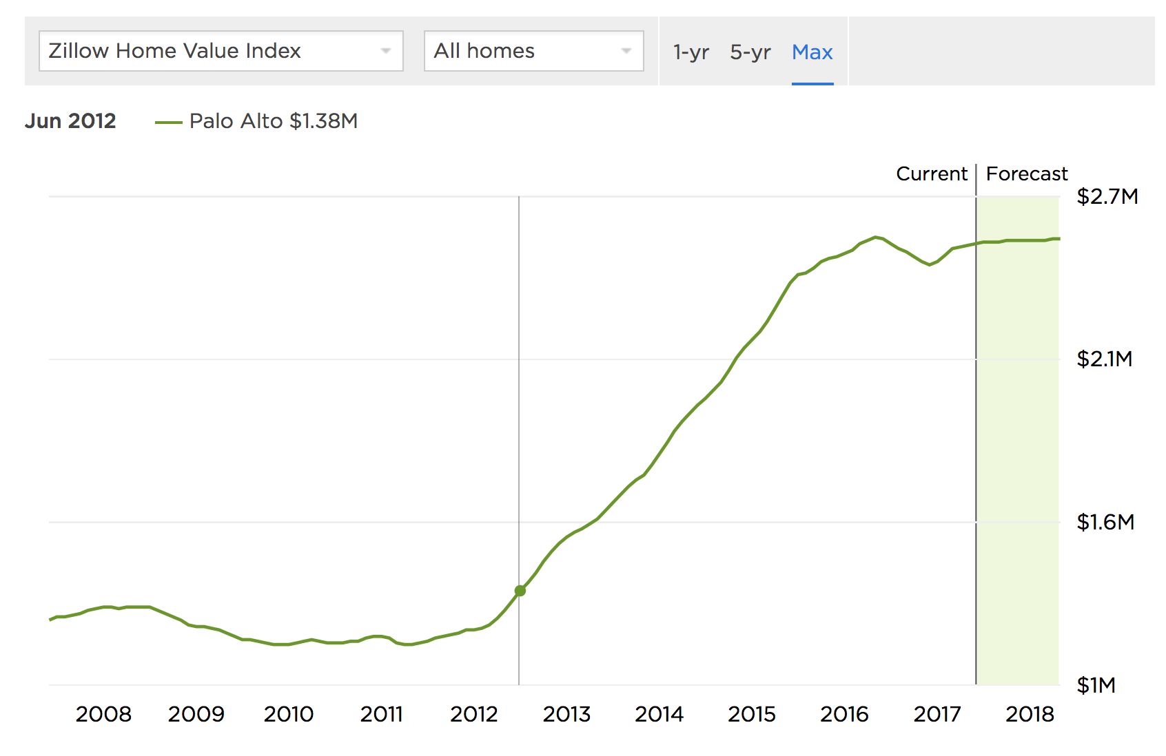
This is what Zillow looks like today for Palo Alto:

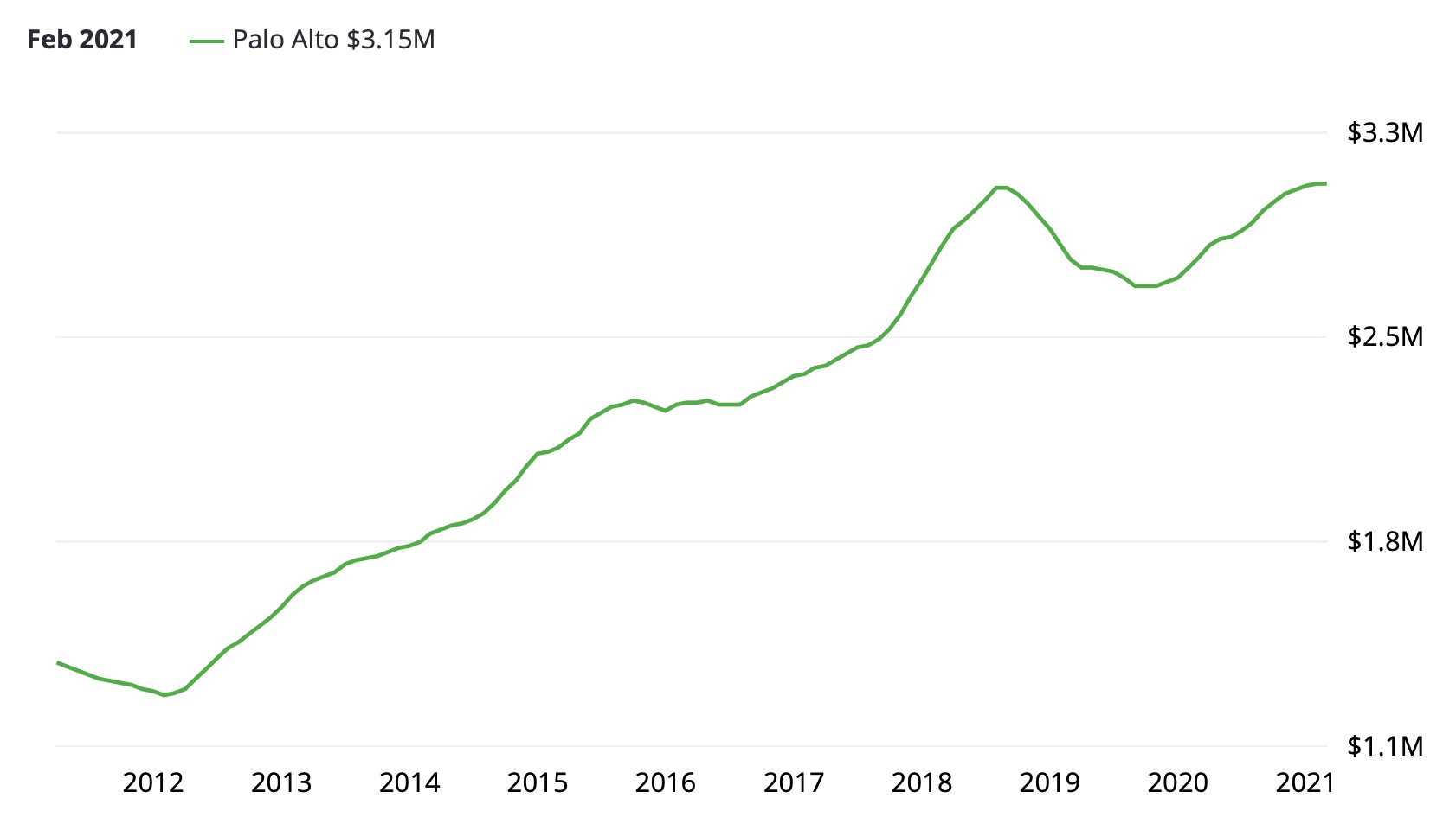
As you can see, in June 2012, the average Palo Alto home cost $1.44M. Roughly five years later, in June 2017, that average price was up 84.6% to $2.55M. Now, in March 2021, that price has risen a total of 117.9% to $3.15M.

That’s certainly a much faster increase than any normal measure of inflation, whether looking at changes in prices or wages. But what happens if we look at those increases in comparison to the stocks of some of the largest technology employers in Silicon Valley?

Apple ($AAPL)

Apple is the most valuable public company in the world right now, measured by market capitalization ($2.023 Trillion as of March 18, 2021), and second most profitable ($55.256B in 2020). Thanks to their exceptional financial performance, Apple stock ($AAPL) has increased significantly since June 2012, rising (split-adjusted) from $18.79 per share to $124.76 in March 2021. That’s a gain of over 565.8%.

Wow. 😳

Let’s look at Palo Alto home prices as measured in dollars, and then let’s look at them in comparison priced in shares of $AAPL.

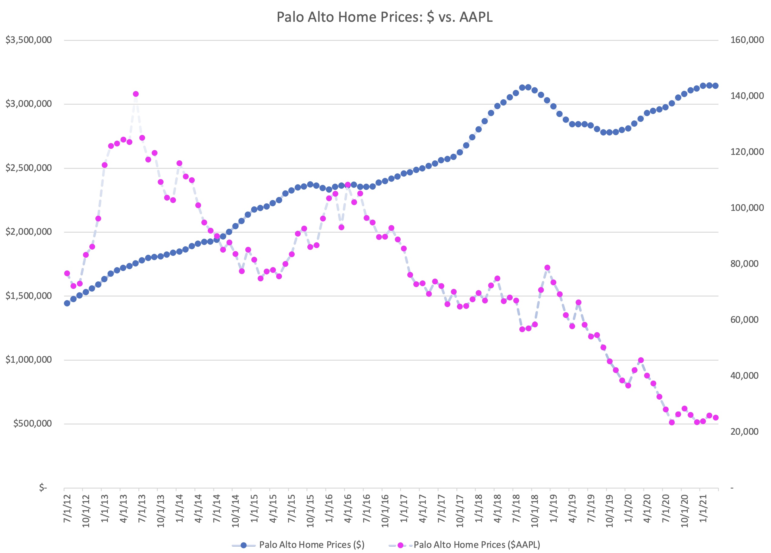
This chart tells a very different story than the one from 2017.

In the five years from June 2012 to June 2017, Apple stock was volatile, but over the entire time period almost exactly matched the growth in Palo Alto home prices. However, the run up since 2017 has been incredible.

Split-adjusted, it took 76,839 shares of $AAPL to purchase the average home in Palo Alto. By March of 2021, that number had dropped to only 25,216 shares.

This isn’t surprising, since Palo Alto home prices are only up 117.9% over that time period, and Apple shares are up 564%. But what this means from a practical viewpoint is that for people converting one asset (Apple stock) into another (Palo Alto housing), it has become easier, not harder, to purchase the average home.
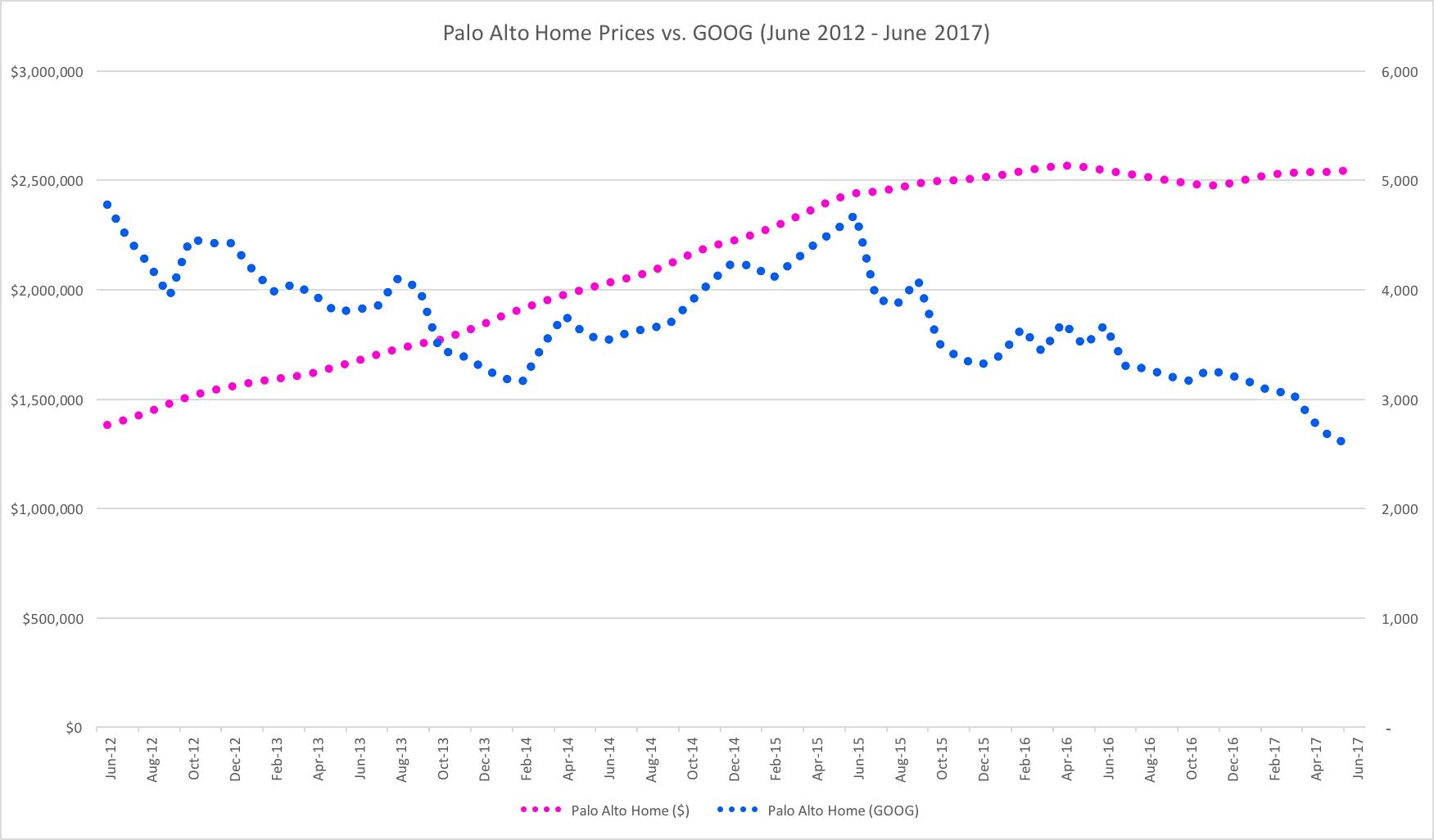
Google ($GOOGL)

Google tells a similar story to Apple in 2021, even though that wasn’t the case in the original post. Since 2017, Apple stock has clearly outperformed Google, leaving them with almost identical price increases from June 2012. (By itself, that’s somewhat of an amazing fact given the relative ages of the two companies).

As of March 2021, Google has a market capitalization of $1.37 Trillion, significant less than Apple’s. However, they have seen price appreciation of 557.3% since June 2012, rising from a split-adjusted $316.80 per share to an amazing $2,082.22 per share in March 2021.

Let’s look at Palo Alto home prices as measured in dollars, and then let’s look at them in comparison priced in shares of $GOOGL.

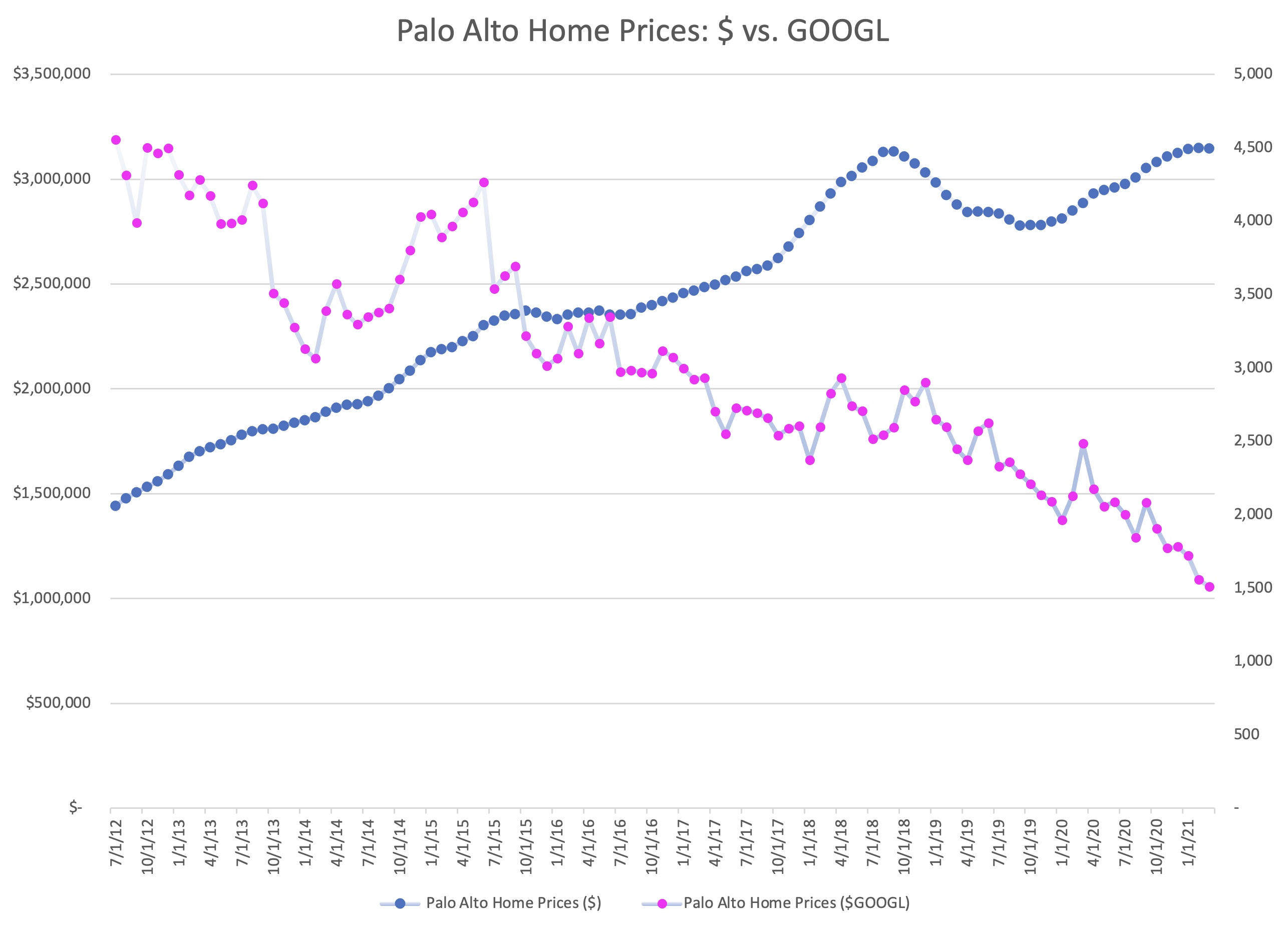
If you compare this chart to the one for Apple, it tells a different story but has a similar ending. Google shares are clearly more volatile than Palo Alto housing, but they have fairly consistently appreciated over the past decade.

In June of 2012, it would have taken 4,557 shares of Google stock to purchase the average home in Palo Alto. By March 2021, that number had dropped to only 1,511 shares.

So while Palo Alto home price appreciation has been tremendous by any historical measure, Palo Alto housing has become cheaper in the past decade for people holding Google stock, and more expensive for people holding dollars.
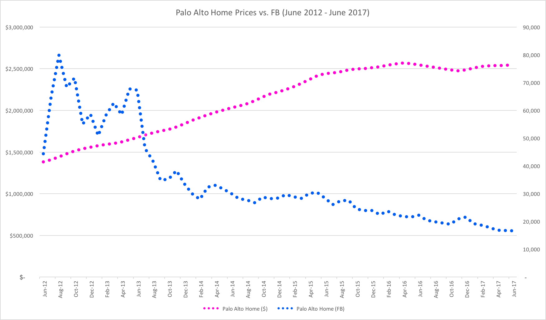
Facebook ($FB)

Facebook, the youngest of the massive tech giants, already has one of the largest market capitalizations in the world. As of today, Facebook is valued at $793.4 Billion. Facebook stock has risen an incredible 1208.2% since June of 2012, from a price of $21.71 per share to a price of $284.01 in March 2021.

At this point, you know how this story goes. With growth of over 1200%, Facebook stock goes a lot further in 2021 than it did in 2012, even against daunting Palo Alto housing prices.

In June of 2012, it would have taken 66,500 share of Facebook to purchase the average home in Palo Alto. By March of 2021, that number was down to just 11,077 shares. Quite incredible.
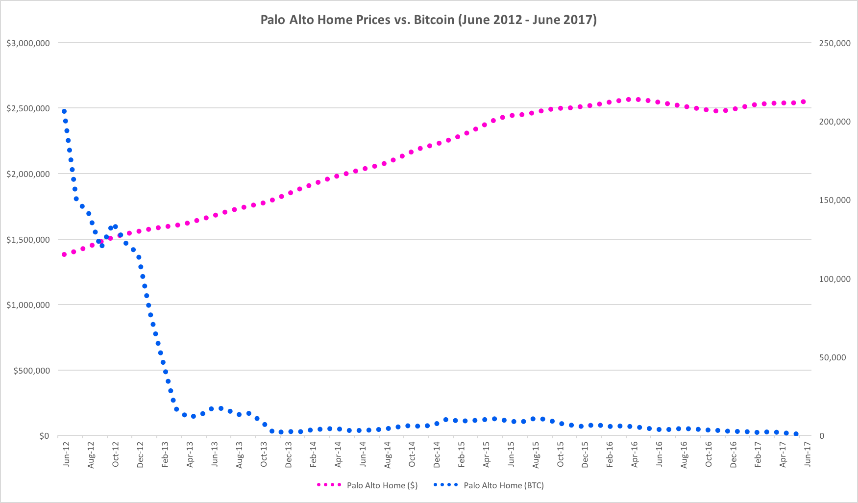
Bitcoin ($BTC)

While I realize that Bitcoin isn’t a large employer in Silicon Valley, nor is it a stock, the original idea for this post came from a joke I made on Twitter back in 2017.

Most of you likely already know the story here. Bitcoin price appreciation in the past 12 months has been unbelievably high, so looking back to June 2012 is going to be somewhat jarring.

In June of 2012, the price of Bitcoin was about $9.40. By March of 2021, it had risen to $57,326.20. That’s a gain of over 609,753%.

The growth rate in Bitcoin prices, as measured in US dollars, has been so incredible, this chart is almost impossible to read in recent years.

For context, in June of 2012, it took about 153,586.2 Bitcoin to purchase the average home in Palo Alto. By March of 2021, that number had dropped to just 54.9 Bitcoin.

This, of course, has a number of dramatic implications. As measured in US dollars, or in real assets like Palo Alto real estate, the wealth of Bitcoin holders has increased dramatically. As measured in US dollars, the average price of a house in Palo Alto has increased by 117.9% in less than 10 years. However, as measured in Bitcoin, the average price of a house in Palo Alto has decreased by 99.96%.

There aren’t many people who invested in Bitcoin back in 2012, but a disproportionate number of them were in Silicon Valley. However, even based on recent numbers, the story is similar.

In March of 2019, you could have purchased the average house in Palo Alto for 702.0 Bitcoin. Just two years later, in March 2021, the average house in Palo sold for 54.9 Bitcoin. That means the average home in Palo Alto, as measured in Bitcoin, has decrease by 92.2% in just the past two years alone.

Silicon Valley Is Seeing Significant Asset Inflation

These charts are not meant to imply direct causality, but in many ways they confirm several economic facts about Silicon Valley that may not be obvious when looking at nationwide statistics.

Because technology employers in Silicon Valley compensate most employees with equity, it is very likely that asset inflation in stock (and crypto) markets has some impact on the housing market. This is likely exacerbated by the lack of new housing construction in Silicon Valley.

The fact is, if you are fortunate enough to have equity in one of the tech giants, or if you have been an investor in Bitcoin, houses might actually look cheaper in 2021 than they did in 2012, or even in 2020.

What is most surprising about the data refresh is the apparent detachment of equity and crypto prices from the prices of Palo Alto real estate. There are a number of potential reasons why this might have happened. One theory is that real estate markets move relatively slowly compared to equities and crypto, and so the rapid price increases of 2020 have not yet worked their way into the market. A second theory is that large technology company compensation has been shifting away from stock options to RSUs, leading employees to hold less stock as they convert their shares to cash on vesting. A third theory is that we’re seeing complicated effects from COVID, as windfall money from equity and crypto markets may be flowing into other places rather than local real estate.

(Before the San Francisco crowd gets too rowdy, there is absolutely no evidence yet that more money is flowing into San Francisco real estate instead of Palo Alto this cycle.)

In any case, whatever the reasons may be, it is always worth checking the actual data to see whether it confirms or contradicts our intuition.

Let’s check back in another four years.


Index Funds: Good for Corporate Governance & Good for Crypto

On March 8th, Dick Weil, co-CEO of London-based Janus Henderson Investors,wrote an op-ed in the Wall Street Journal arguing that the SEC should prevent index-funds from voting on shareholder proxies. In it, he argues that index funds “have no interest in the performance of particular companies” and that index funds “lack a strong incentive to cast informed votes.”

Unfortunately, Mr. Weil misses some of the most important incentives that drive long-term equity holders, including index funds. In fact, index funds are likely to be superior to active funds for effecting good long-term corporate governance.

Index Funds Are Long-Term Owners

In October 2017, Jack Bogle gave an interview with Morningstar that addressed this exact issue. His argument, as usual, was clear and compelling:

Benz: How about on the governance front. I know you and I have talked about this over the years, about whether passive products are more limited than active managers from the standpoint of influencing corporate governance of the companies they own. What do you say to that assertion that passive products because they can’t walk away from some of these companies altogether don’t have that ultimate weapon that active managers do have?

Bogle: I’d say traditional index funds are the last, best hope for corporate governance.

Benz: And why is that?

Bogle: That’s because they’re the only true, long-term investors. Corporate governance should be based on long-term factors affecting the corporation, not a bunch of traders who want you to report higher earnings, gonna try and get on your board for a minute, and in a moment … I don’t know how they’re this smart to do it, but realign the entire company and then all will be well. It just doesn’t happen. In fact, the reverse is more likely to happen.

So, I don’t see … The old Wall Street rule was if you don’t like the management, sell the stock. The new index fund rule is if you don’t like the management, fix the management because you can’t sell the stock.

The critique of index funds and corporate governance comes from the mistaken idea that it is only by buying and/or selling a security that you can influence management and the allocation of capital. While there is no doubt that individual actions in the secondary market affect the price of a security, and the price of a security can affect capital allocation decisions, it is a relatively indirect link. Activist shareholders typically use these actions, but as a means to more direct control, either influence or direct membership on the board of directors.

Unfortunately, because discretionary investors have the power to walk away and sell a security, there is a weakness in their commitment to fixing a company. While some of the best activist private equity funds might spend years working to improve the returns of a company, most active investors show no such patience.

Index funds effectively operate as permanent owners of the business, so their incentive is to work to improve the performance of each and every company in proportion to their market capitalization.

Patient Capital Has Value

Perhaps one of the most compelling aspects of index funds as investors is their reliability as a patient source of capital. There is no doubt that the short-term focus of current capital markets is a problem for public companies looking to optimize their performance for the long term. Very often, significant changes in corporate strategy take years to implement, and can often result in negative short-term performance in exchange for the potential for significant long-term upside. Unfortunately, if most investors hold securities for short periods of time, management can be pushed for making decisions that are optimized for long-term value creation.

In fact, this problem is the focus of Eric Ries’ new startup, the Long-Term Stock Exchange.

For example, as of 2013, the average active mutual fund had a turnover of over 85% (according to Morningstar). This means their average holding period for a stock was barely over one year! They are not long-term investors, and their financial interest is incredibly biased towards short-term performance. They are not going to support any solution to a corporate problem that might hurt short-term performance.

This is not just a problem for active mutual funds. Private equity buyout funds, based on their structure, predominantly look for returns often within a relatively short number of years. Because they often use debt to leverage their buying power and maximize return on capital, their playbook also includes damaging short-term actions like the payoff of significant one-time dividends that can starve a business of long-term capital.

Index funds provide long-term, patient capital that is well aligned with the desire to see companies optimize their corporate governance for maximum shareholder value. The time frames of active investors are just too short to align with management changes and strategic choices that may not pay off for years, if not decades.

This Applies to Crypto, Too

One of the most exciting developments in cryptocurrencies has been credible initiatives around index investing. Bitwise Investments (currently available) and Coinbase (available soon) have both announced crypto index products and platforms. (disclosure: I am a private investor in both.)

Over the past few years, more and more investors are convinced there is an incredible opportunity for blockchain-based products and platforms. Though cryptocurrencies have the same liquidity as public companies, they are based on far younger organizations and will take time to develop. Index funds can act as a stabilizing force amidst the volatility, especially if index funds see continued net-positive inflows like their brethren in equity and debt assets.

Amidst all of the volatility, index funds will likely also have a role to play as aggregators of long-term holders of cryptocurrency. Index funds, given their incredibly long time implicit frames, are aligned to advocate for governance and development that will maximize the long-term value of the ecosystem.

Index funds may not control the marginal price of these assets, but they can provide a structure for a large pool of investors to have a long-term influence on the direction of these platforms. Whether the future belongs to proof-of-work systems, proof-of-stake, or other alternatives, my guess is that we’ll find that, over time, that access to long-term, patient capital is a huge benefit to products and platforms in crypto.

Long-Term Ownership Will Improve Governance

While there is no question that active investors can have a positive impact on the governance of corporations, it would be foolish not to see the additional advantages that index funds bring to the financial ecosystem.

Index funds may actually be the missing form of long-term, patient capital that we’ve needed in corporate governance to better align companies with the creation of long-term value for all of their stakeholders.

Silicon Valley Home Prices, Stock Prices & Bitcoin

I’m writing this post with a bit of trepidation, because talking about Silicon Valley home prices these days is a bit dicey. The surge of the last five years has been shocking, and almost no one I know feels good about how difficult it is for people to buy a new home in Silicon Valley in 2017. Some houses are pretty bad but others arae actually at a reasonable price, because they come with furniture and some even come with shutters from plantation shutters installation Sydney. They are actually really good quality.

So if you need a trigger warning, this is it. Stop reading now.

The truth is, as shocking as the rise in Silicon Valley home prices has been, there has also been an asset boom in other dimensions as well. Total compensation for engineers is up considerably and stock prices at the big tech companies continue to rise.

To visualize this, I thought I’d put together a few charts based on real market data. As a proxy for Silicon Valley, I pulled the last 5 years of home prices from Zillow, and monthly stock price data from Yahoo.

Palo Alto Home Prices

Two days ago, the Mercury News reported that a home in Palo Alto sold for $30 million.  A quick check on Zillow seems to confirm this.

I chose Palo Alto as a proxy for Silicon Valley home prices because it is historically “ground zero” for Silicon Valley tech companies, and it has relatively close proximity to all of the massive tech giants (Apple, Google, Facebook).

I picked June 2012 – June 2017, not only because it is roughly five years, but also it also happens to mirror the time that Facebook has spent as a public company. For many in the local real estate market or online sites as SafeguardProperty.com, correctly or incorrectly, the Facebook IPO still looms as a transformational event.

As you can see, in June 2012 the average Palo Alto home cost $1.38 million. Five years later, the estimate for June 2017 is up 84.6% to $2.55 million.

Apple (AAPL)

Apple is the most valuable company in the world, as measured either by market capitalization ($810B as of 6/7/2017) or by profitability ($45.7B in 2016).  Thanks in part to this exception financial performance, Apple stock (AAPL) has risen 84.5% in the last five years, from $83.43 per share to $153.93 per share.

84.5%? Where have I heard that number before?

That’s right, the increase in Apple stock over the last five years is almost exactly the same increase as the average home price in Palo Alto over the same time period.

In June 2012, it took 16,555 shares of Apple stock to purchase the average Palo Alto home. In June 2017, it took 16,566 shares. (Of course, with dividends, you’re actually doing a little better if you are a shareholder.)

If you look at the chart, the pink line shows clearly the large rise in price for the average Palo Alto home. The blue line is the number of AAPL shares it would take to by the average Palo Alto home in that month. As you can see, AAPL stock is volatile, but five years later, that ratio has ended up in almost the exact same place.

Alphabet / Google (GOOG)

Alphabet, the company formerly known as Google, may not be as large as Apple in market capitalization ($686B), but it has seen far more share appreciation in the past five years. Since June 2012, Alphabet has seen its stock price rise 240.4%, from $288.95 in June 2012 to $983.66 per share.

What does this mean? Well, it means that if you have been fortunate enough to hold Google equity, the rise in Palo Alto home prices doesn’t look as ominous. It took 4,780 shares of Google to purchase the average Palo Alto home in June 2012, but it only took 2,592 to purchase the average Palo Alto home in June 2017.

Facebook (FB)

Facebook, the youngest of the massive tech giants, already has one of the largest market capitalizations in the world. As of today, Facebook is valued at $443B. Facebook stock has risen 394% in the past five years, from $31.10 in June 2012 to $153.63 in June 2017.

To state the obvious, it has been a good five years for owners of Facebook stock. Not many assets could make owning Palo Alto real estate look slow, but 394% growth in five years is unbelievable. In June 2012, you would have needed 44,412 shares to buy the average Palo Alto home. In June 2017, that number had dropped significantly to just 16,598 shares.

Bitcoin (BTC)

While I realize that Bitcoin is not a stock, the original idea for this post came from a joke I made on Twitter recently given all of the buzz about Bitcoin, Ethereum and ICOs over the past few weeks.

I couldn’t resist running the numbers.

For the small number of readers of this blog that haven’t been following the price of Bitcoin, the increase in value over the past five years has been unbelievable.The total value of all Bitcoin outstanding is currently about $44.5B. Since June 2012, Bitcoin has risen approximately 4,257%, from $6.70 per Bitcoin to a current value of $2,858.90.

You can see why there has been so much buzz.

In June of 2012, it would have taken 260,149 Bitcoin to buy the average home in Palo Alto. In June of 2017, that number is now down to 892.

Needless to say, anyone who sold Bitcoin to buy a house in 2012 is likely not loving these numbers. But to people who have held Bitcoin for the past five years, Palo Alto is looking cheaper by the day.

Silicon Valley Is Seeing Significant Asset Inflation

To be clear, I’m not attempting to attribute causality to these charts. I believe the real driver of home prices in Silicon Valley is the lack of sufficient building of new supply at pace with the economy, combined with a significant increase in compensation for technology employees and historically low interest rates.

But the fact is, if you are fortunate enough to have equity in one of the tech giants (or in Bitcoin), houses might actually be looking cheaper now relatively than they did five years ago.

I always find it enlightening to look at real data and compare it to intuition. Hope you find this data and these charts as interesting as I did.

Apple & Dow 15000: Update

In February 2012, I wrote a blog post that indicted the Dow Jones Industrial Average for including Cisco in 2009 instead of Apple.  At the time, Apple had just crossed $500 per share, and that simple decision had cost the US the psychology of an index hitting new highs.

I was driving home on Sunday, listening to the radio, and it occurred to me how different the financial news would be if Apple ($AAPL) was in the Dow Jones Industrial Average (^DJI).

Of course, being who I am, I went home and built a spreadsheet to recalculate what would have happened if Dow Jones had decided to add Apple to the index instead of Cisco back in 2009.  Imagine my surprise to see that the Dow be over 2000 points higher.

Update: AAPL at $700

With the launch of the iPhone 5, we find ourselves roughly 7 months later.  For fun, I re-ran the spreadsheet that calculated what the DJIA would be at if they had added AAPL to the index in 2009 instead of CSCO. (To date, I’ve never seen an explanation on why Cisco was selected to represent computer hardware instead of Apple.)

Result: Dow 16,600

As of September 17, 2012, AAPL closed at 699.781/share.  As it turns out, if Dow Jones had added Apple instead of Cisco in 2009, the index would now be at 16,617.82.  Hard to think that hitting all new highs wouldn’t be material for market psychology and the election.

Anyone up for Dow 20,000?

Apple, Cisco, and Dow 15000

I was driving home on Sunday, listening to the radio, and it occurred to me how different the financial news would be if Apple ($AAPL) was in the Dow Jones Industrial Average (^DJI).

Of course, being who I am, I went home and built a spreadsheet to recalculate what would have happened if Dow Jones had decided to add Apple to the index instead of Cisco back in 2009.  Imagine my surprise to see that the Dow be over 2000 points higher.

In real life, the Dow closed at 12,874.04 on Feb 13, 2012.  However, if they had added Apple instead of Cisco, the Dow Jones would be at 14,926.95.  That’s over 800 points higher than the all-time high of 14,164 previously set on 4/7/2008.

Can you imagine what the daily financial news of this country would be if every day the Dow Jones was hitting an all-time high?  How would it change the tone of our politics? Would we all be counting the moments to Dow 15,000?

Why Cisco vs. Apple?

This isn’t a foolhardy exercise.  The Dow Jones Industrial Average is changed very rarely, in order to promote stability and comparability in the index.  However, on June 8, 2009, they made two changes to the index:

  • They replaced Citigroup with Travelers
  • They replaced General Motors with Cisco

The question I explored was simple – what would have happened if they had replaced General Motors with Apple on June 8, 2009.  After all, Apple was up over 80% off its lows post-crash.  The company had a large, but not overwhelming market capitalization.  The index is already filled with “big iron” tech stocks, like Intel, HP & IBM.  Why add Cisco?  Why not add a consumer tech name instead?

In fact, there is no readily obvious justification for adding Cisco to the index in 2009 instead of Apple.

The Basics of the Dow Jones Industrial Average

Look, I’m just going to say it. The Dow Jones Industrial Average is ridiculous.

You may not realize this, but the Dow Jones Industrial Average, the “Dow” that everyone quotes as representative of the US stock market, and sometimes even a barometer of the US economy, is a mathematical farce.

Just thirty stocks, hand picked by committee by Dow Jones, with no rigorous requirements.  Worse, it’s a “price-weighted” index, which is mathematically nonsensical.  When calculating the Dow Jones Industrial Average, they take the actual stock prices of each stock, add them together, and divide them by a “Dow Divisor“.  They don’t take into account how many shares outstanding; they don’t assess the market capitalization of each company.  When a stock splits, they actually change the divisor for the whole index.  It’s completely unclear what this index is designed to measure, other than financial illiteracy.

In fact, there is only one justification for the Dow Jones Industrial Average being calculated this way.  Dow Jones explains it in this post on why Apple & Google are not included in the index.  To save you some time, I’ll summarize: they have always done it this way, and if they change it, then they won’t be able to compare today’s nonsensical index to the nonsensical index from the last 100+ years.

So what? Does it really matter?

It’s a fair critique.  Look, with 20/20 hindsight, there are limitless number of changes we could make to the index to change its value.  Imagine adding Microsoft and Intel to the index in 1991 instead of 1999?

I don’t think this exercise is that trivial in this case.  The Dow already decided to make a change in 2009.  They decided to replace a manufacturing company (GM) with a large hardware technology company (CSCO).  They could have easily picked Apple instead.

The end result?  People talk about the stock market still being “significantly off its highs” of 2008.  In truth, no one should be reporting the value of the Dow Jones Industrial Average.  But they do, and therefore it matters.  As a result, the choices of the Dow Jones committee matter, and unfortunately, there seems to be no accountability for those choices.

Appendix: The Numbers

I’ve provided below the actual tables used for my calculations.  Please note that all security prices are calculated as of market close on Monday, Feb 13, 2012.  The new Dow Divisor for the alternate reality with AAPL in the index was calculated by recalculating the appropriate Dow Divisor for the 6/8/2009 switch of AAPL for CSCO, and a recalculated adjustment for the VZ spinoff on 7/2/2010.

Real DJIA DJIA w/ AAPL on 6/8/09
Company 2/13/2012 Company 2/13/2012
MMM 88.03 MMM 88.03
AA 10.33 AA 10.33
AXP 52.07 AXP 52.07
T 30.04 T 30.04
BAC 8.25 BAC 8.25
BA 74.85 BA 74.85
CAT 113.70 CAT 113.70
CVX 106.38 CVX 106.38
CSCO 20.03 AAPL 502.60
KO 68.44 KO 68.44
DD 50.60 DD 50.60
XOM 84.42 XOM 84.42
GE 19.07 GE 19.07
HPQ 28.75 HPQ 28.75
HD 45.93 HD 45.93
INTC 26.70 INTC 26.70
IBM 192.62 IBM 192.62
JNJ 64.68 JNJ 64.68
JPM 38.30 JPM 38.30
KFT 38.40 KFT 38.40
MCD 99.65 MCD 99.65
MRK 38.11 MRK 38.11
MSFT 30.58 MSFT 30.58
PFE 21.30 PFE 21.30
PG 64.23 PG 64.23
TRV 58.99 TRV 58.99
UTX 84.88 UTX 84.88
VZ 38.13 VZ 38.13
WMT 61.79 WMT 61.79
DIS 41.79 DIS 41.79
Total 1701.04 Total 2183.61
Divisor 0.13212949 Divisor 0.146286415
Index 12874.04 Index 14926.95

Calculating the “alternate divisor” requires getting the daily stock quotes for the days where the index changed, and recalculating to make sure that the new divisor with the new stocks gives the same price for the day. It’s a bit messy, and depends on public quote data, so please feel free to check my math if I made a mistake.

Personal Finance: How to Rebalance Your Portfolio

One of the prudent financial housekeeping chores that people face every year is rebalancing their portfolio. Over the course of the year, some investments outperform, and others underperform.  As a result, the allocation that you so carefully planned at the beginning of the year has likely shifted.  If left unmanaged over the years, individuals can end up with profoundly more risk or worse performance than expected.

Rebalancing your portfolio annually tries to address this issue by forcing you to sell asset classes that outperformed in the previous year, and purchase those that underperformed.  In practice, I try to rebalance the week before New Years as a way of “cleaning up” going into the next year.  While most academic research points to rebalancing as healthy every one to three years, I find that annual rebalancing provides the following benefits:

  • Forces you to see how your investments performed for the year
  • Forces you to learn which asset classes actually did well during the year, and which didn’t
  • Forces you to re-assess the appropriate “asset mix” for your risk tolerance and financial situation
  • Forces you to revisit which investments you are using to represent each asset class (mutual funds, ETFs, individual securities, etc)
  • Forces you to actively engagement with your portfolio, and reset your balance to the appropriate mix

I’ve just completed my rebalancing for 2011, and I thought I’d share some of the process here, in case it’s useful to anyone whose New Year’s Resolution is to be more proactive about their finances.

Rebalancing is actually a very simple process – it’s kind of surprising that basic financial tools like Mint and Quicken don’t actually help you do this.  Whether you’ve never rebalanced or your rebalance every year, there are fundamentally five steps:

  1. Assess your current investment portfolio, broken down by types of assets
  2. Calculate the percentage of your portfolio in each asset class
  3. Calculate the difference in dollars for each asset class in your portfolio from your ideal mix
  4. Finalize the list of investments you will use to represent each asset class
  5. Make the trades necessary (buys and sells) to bring your portfolio into balance

This can all be done within an hour, with the exception of making the trades.  Those can spread over days, potentially, since certain types of securities (like mutual funds) take time to execute (typically 24 hours).

Step 1: Assess your current investment portfolio

Believe it or not, this can actually be the most time consuming part of the process, especially if you have accumulated accounts over the years and haven’t ever used any sort of tool like Quicken to pull your portfolio together accurately.

A few ground rules on how I think about portfolio allocation:

  • I’m a big believer in the research that shows that most of your long term investment return is based on asset mix, not security selection.  This means I do not spend time picking individual stocks, bonds, or dabble with active mutual funds in general.
  • I use very broad definitions of asset classes.  For example:  “US Stocks” vs. “International Stocks” vs. “Emerging Markets”.   These tend to correlate with the standard definitions used broadly to define popular investment indexes. Technically, with sophisticated software and data, you can do very fine-grained breakdowns.  I don’t bother with this, as the resulting differences are statistically marginal vs. the effort / complexity involved.

Fear not, because with tools like Microsoft Excel or Google Docs, this has become much, much easier.  All you need to do is:

  • Make a spreadsheet with the following columns:  Security Name, Ticker, Shares, Share Price, Total Value, % of Total Portfolio
  • Fill in a row for everything you own, regardless of account

The second part is very important, if you want to avoid the “mental accounting” that leads people to invest differently in one account versus another.  If you’ve worked at multiple companies, you may have multiple 401k, IRA, college savings accounts, and brokerage accounts in your name.   Obviously, reducing the number of accounts you have is helpful, but sometimes its unavoidable.  Maybe you have a Roth IRA, a regular IRA, and a 401(k) with your current employer.

This becomes important because certain accounts may have limited access to different types of investments.  For example, your Vanguard IRA might only let you buy Vanguard funds (not such a bad thing), while your 401(k) at work might limit you to some pretty meager options.  When we get to Step 5, we can take advantage of multiple accounts to get the right balance by buying the best investments in the accounts with the best access to them.

Here is an example screenshot of a simplified list of investments that I bet wouldn’t be that unusual in Silicon Valley.  This person has some Vanguard index funds that they purchased prudently the last time they looked at their portfolio, combined with some stocks they purchased based on TechCrunch articles.  (I wish I were kidding).

You can see immediately that this small amount of accounting can actually help organize your thinking about what you own, and force you to remember why you own it.

Notice, I do not recommend putting in columns showing how well an investment performed historically.  For rebalancing, you only care about the here and now.  The past is just that – the past.  Performance data will likely just add emotion to a decision that, when made best, should be purely analytical.

Step 2: Calculate the percentage of your portfolio in each asset class

The hardest part about this step is defining what you are going to use as “an asset class”.   There is no one right answer here – I’ve seen financial planners break down assets into literally dozens of classes.  I’ve also seen recommendations that literally only use two (stocks vs. bonds).

The great thing about asset classes is that you can always break down an existing bucket into sub-buckets.

For example, if you decide to have 30% of your money in bonds, and 70% in stocks, you can then easily make a 2nd level decision to split your stock money into 50% US and 50% international.  You can then make a third level decision to split the international money 2/3 for developed markets, and 1/3 for emerging markets.  In fact, for some people, this is a much easier way to make these decisions.  Do whatever works for you, but be consistent about it.

Personally, I’ve gotten quite a bit of mileage using the following break downs:

  • Stocks
    — US Stocks
    — Large Cap
    — Mid Cap
    — Small Cap
    — International Stocks
    — Developed Markets
    — Emerging Markets
  • Fixed Income
    — Standard
    — Inflation Protected
  • Real Assets
    — Commodities
    — Real Estate

You can see in the screenshot above, calculating these buckets is fairly simple.  You just total up each group, and then divide it into the portfolio total.  So in the example I provided, the individual has 11.5% of their money in fixed income.

As the size of your assets increase, more sophisticated breakdowns are likely warranted.  But for the purposes of this blog post, I think you get the idea.

With mutual funds, this can be tricky.  For example, did you know that the Vanguard Total Market fund is 70% Large Cap, 21% Mid Cap, and 9% Small Cap?  (I got this data off etfdb.com).  In order to solve this problem, I actually create a separate column for each asset class.  I then put the percentage for each fund in each column, totaling to 100%.  I then multiply those percentages by the amount invested in each fund, giving me an actual dollar amount per asset class.

Step 3: Calculate the difference in dollars for each asset class in your portfolio from your ideal mix

This is the step where your self-assessment turns toward action.  How far are you off plan.

The hardest problem here is the implied problem: what is your ideal mix?

There are quite a few rules of thumb out there, and more than enough magazines and books out there to tell you what this should be.  Unfortunately, all of them are over-simplified, and none of them likely apply exactly to you.  At minimum, it’s a whole separate blog post to come up with this.  Fortunately, if you pick up the 2011 planning issue from Smart Money, Kiplinger’s, or Money magazine, you’ll probably end up OK.

But let’s say our individual in question is a 30-year old engineer who believes in the rule of thumb that they should take 120 minus their age, put that in stocks and the remainder in bonds.  Let’s say also that they’ve read that their stock investments should be split 50/50 between the US & International, with at least 10% of their overall portfolio in Emerging Markets.

That would leave our hypothetical engineer with the following breakdown:

  • 90% in Stocks
    — 45% US Stocks
    — 35% Developed Markets
    — 10% Emerging Markets
  • 10% in Bonds

Based on the numbers from the first screenshot, they would create an spreadsheet table like this:

This shows that our hypothetical engineer needs to rebalance by selling US Stocks, Emerging Markets, and Bonds.  The extra money will be re-allocated to international stocks in developed markets.

Step 4: Finalize the list of investments you will use to represent each asset class

Most people skip this step, but that’s a real missed opportunity.   Once you decide how much money to allocate to a given asset class, it’s worth a bit of thought about what is the best way to capture the returns of that asset class.  For example, is owning Google, Apple & Goldman Sachs the best way to capture the returns of US Stocks?  I’m not a professional financial planner, so you shouldn’t take my advice here.  But my guess is that you’ll be hard pressed to find a professional who believes that those three stocks represent a balanced portfolio.

We live in an unprecedented time.   Individuals with a few hundred dollars to invest can go to a company like E*Trade, open an account, and for $9.99 buy shares in an ETF that represents all publicly traded stocks in the US, for an annual expense of 7 basis points.  That’s 0.07%, or just $7 for every $10,000 invested.  That is an unbelievable financial triumph.  Previously, only multi-millionaires had access to that type of investment, and they paid a lot more for the privilege than 7 basis points.

Personally, I’m heavily biased towards using these low cost, index based ETF shares to represent most asset classes.  In fact, E*Trade let’s you mark any ETF for “free dividend reinvestment” under their DRIP functionality.  As a result, you get all the benefits of mutual funds with lower annual costs!  It takes some research to find the best ETFs, and in some cases, standard no-load mutual funds are a better option.  (Once again, I’m not a professional, so do your own research on what secrurities make sense for you.)

The biggest exception to this is with 401(k) plans, where you have limited choices on what types of investments you can make.  In these cases, I evaluate all of the funds in the 401(k), find those that are “best in class”, and purposely “unbalance” the 401(k) to invest in those.  I then make up for that lack of balance with my investments outside the 401(k).  For example, let’s say your current 401(k) has excellent international funds, but poor US funds.   you can skew your 401(k) to international funds, and make your US investments outside of the 401(k) where there are better options.

For our hypothetical engineer, let’s say that he’s decided to stick with Series I Savings Bonds for his fixed income, and uses the Vanguard ETFs to represent the different stock classes.

Step 5: Make the trades necessary (buys and sells) to bring your portfolio into balance

It seems like this part should be simple, but it can be surprising how many complications arise.  For example:

  • Sometimes the model says to sell $112 of something.  The trading costs alone make that likely prohibitive and unlikely to be worthwhile.
  • Share prices change every day, and your model leaves you short a few dollars here and there.
  • The model doesn’t take into account commissions for trading
  • Some funds have fees
  • Some transactions have tax consequences
  • Some investments can only be purchased in one account, not another
  • Some investments cannot be bought in a given account (like a 401k)

As a result, there is no advice that will apply to everyone.  Taxes alone make this the time when you may have to consult a professional.

In our hypothetical case, our engineer would:

  • Sell their stakes in Apple, Google, Goldman Sachs, and Teva
  • Decide to leave their Series I Bonds alone – not worth the trouble.  Take the extra money out of the developed markets stake.
  • Purchase / Sell shares in the Total Market, Ex-US, and Emerging Market ETFs to meet their new allocation goals

The following table shows how to use a spreadsheet to calculate the different trades (buys in Green, sales in Red):

Last Thoughts

I’ve been doing some version of the process above for at least fifteen years at this point, and it’s never failed to help me with my financial planning.  Of all the benefits described, annual rebalancing gives me the confidence to withstand the day-to-day gyrations of the markets, with the confidence that at the end of the year, I’ll get a shot to rebalance things.

There are a few “temptations” that I’ve noticed could lead someone astray:

  • Changing the “ideal asset mix” year-to-year based not on financial research, but based on what’s “hot” at the moment.  For example, if you find yourself saying that Gold should be 10% of your portfolio one year, and then the next year it’s “Farmland”, you’ve got some popular investing psychology drifting into your process.
  • You pick arbitrary “hot stocks” to represent asset classes.  This can lead to a double-whammy, you not only pick a bad stock, but you also miss out on key gains in your selected asset class.
  • Splitting hairs.  Don’t stress about small dollar amounts, or potentially, asset classes when your portfolio is small.  I remember investing the first $2500 I ever made from a summer job, and I got a little carried away with the breakdown.  In general, you can get pretty far with just the “Total Stock Market” and “Total Bond Market”.

This was a really long blog post, but hopefully it will prove useful to those who are interesting in balancing their portfolios, or just curious on how other people do it.  In either case, please comment or email if you find mistakes, or have additional questions.   Happy to turn the comment section here into a useful discussion.

Don’t Panic About E*Trade

Wow, people are really panicked.

Here’s what happened. Yesterday, Citigroup analyst Prashant Bhatia wrote an extremely negative report on E*Trade based on their announcement of exposure to mortgage securities where he put the likelihood of bankruptcy at 15%. How he calculated this, I don’t know. Maybe he estimated their exposure and risk curve for their portfolio, and then he ran monte carlo simulations of possible futures. More likely, he squinted his eyes, held up his thumb, and said “1 in 7”.

More coverage here in Business Week.

In any case, I’ve had a few people email me today about whether or not their money is safe at E*Trade.

Here is what I know:

1) If you have bank accounts, they are FDIC insured up to $100,000. So if E*Trade folded tomorrow, you’d be able to open up a new account elsewhere, and the FDIC would wire money in (up to $100,000) within a matter of days.

2) The brokerage accounts are protected by SIPC up to $500,000. Not sure how the re-imbursement works, but I’m guessing it’s something like an insurance claim.

3) The brokerage accounts are protected by a separate insurance policy for up to $150M per brokerage account.

None of these scenarios are likely – other brokerages & banks would be completely moronic to not buy E*Trade or it’s accounts for customer acquisition. E*Trade’s brokerage and bank business is doing quite well at this point.

In fact, here is an article suggesting that this might be a great buying opportunity for the stock.

So, unless you have more than $500K in securities at E*Trade and $100K in bank deposits at E*Trade, you are fine.

Update (11/13/2007): Wow. While E*Trade stock is now up almost $1.00 per share right now on Wall Street, I must not be the only one getting email on this issue. Look at what greeted me when I logged into E*Trade today:

Update (11/14/2007):  The following letter was updated on E*Trade today, which details the complete protection of brokerage accounts up to $150M.

To All E*TRADE Customers:

The old adage “there is no such thing as bad publicity” does not apply to E*TRADE FINANCIAL this week. Seemingly by the stroke of a pen… or a few clicks from a keyboard… a Company with a core business that has generated impressive growth quarter after quarter has been bombarded by rumored reports of its imminent demise.

Well, we want customers to know that the entire E*TRADE team has come together with resolve and commitment, taking appropriate and decisive action to manage through this issue and to ensure that E*TRADE FINANCIAL continues to deliver the best value in the marketplace for our customers.

I have spoken with scores of customers over the past week. Many of you have openly expressed your confidence in E*TRADE. It is genuinely gratifying to know that our retail customers—the heart of our business—understand the value in our model and the strength of the franchise.

Many of you have also asked me about asset protection, so to be clear—your money is safe at E*TRADE FINANCIAL. Here are the facts:

  • FDIC insures all E*TRADE Bank accounts to at least $100,000 and Extended Insurance Sweep Deposit Accounts to $500,000.
  • SIPC protects E*TRADE Securities customers up to $500,000 (including $100,000 for claims for cash).
  • Additional E*TRADE Securities protection provides up to $150 million per brokerage account, underwritten by London insurers (aggregate $600 million).
  • E*TRADE is well-capitalized by regulatory standards.

E*TRADE was founded on the concept of empowering the individual investor. This value is still at the heart of our business. We look forward to continuing to provide you with the products, pricing, service and functionality you have come to expect in order to help you manage your financial world.

We haven’t lost focus on our customers, our business or our future. The credit crunch has had a tremendous impact, but we are taking appropriate and decisive action to manage through it.

Thank you for your continued business,
Jarrett Lilien
—Jarrett Lilien
President, COO and Director, E*TRADE FINANCIAL

Thoughts on VMWare (VMW) and EMC Valuation

I’ve been resisting any comment on this topic, but I just had to note something.

VMWare, after its IPO at $29 per share, crossed over $100 today to close at $101.61. Since they have 383 Million shares outstanding, that’s a market cap of $38.91 Billion. EMC closed at $21.81, and with 2.1 Billion shares outstanding, their market capitalization is now $45.75 Billion.

On the surface, that looks like a generous valuation for EMC. P/E of 26 on 2008 earnings projection, which is more than double their 5-year expected growth rate of 12%.

But, let’s factor out a few assets here.

They have over $4.5B in cash. They also hold a 87% stake in VMWare, which at today’s close, is worth $33.85 Billion.

So that means, you are basically buying all of EMC right now for $7.4 Billion, which gets you a $12B+ revenue business with a net margin of 10.8%.

That just doesn’t make any sense, on its surface. My guess is you are seeing two factors at play here:

  1. There are liquidity issues with VMW, which are pushing up the valuation artificially. No options, no real shares to short. As a result, the EMC valuation is discounting the VMW stake to a more realistic value.
  2. VMW valuation is being driven largely by large consumer interest, and that interest just isn’t doing the math on EMC which is broadly held by professional investors and indexes.

Personally, my trade in this area has been a winner, but still disappointing. Since I couldn’t get VMW IPO shares, I used a put spread (Jan 2009) on EMC, 17.5 and 25, to capture value as EMC appreciated, and to generate the cash to buy EMC 17.5 calls at a 10:1 ratio of my desired VMW position. I closed out the put spread last week, and now just have the calls which are deep in the money. Overall, the position has returned 80+%, which is great, but doesn’t quite capture the 300% return of VMW post-IPO. Of course, this is because it’s clear that EMC was pricing in the IPO in the run-up from 12 to 19 ($14B worth) from the Feb IPO announcement.
So the only question remaining is, when will VMWare be worth more than EMC? 🙂

VMware (VMW) IPO Countdown Begins

The hottest software IPO of 2007 is likely just two weeks away.

VMware (VMW) has begun its official IPO roadshow, and has set tentative pricing of it’s IPO at $23 to $25 per share.  EMC will be retaining an 87% stake in the company.  The shares released to the public will be Class A shares, while EMC will retain Class B shares that have a 10:1 voting ratio to Class A shares.

That structure tells me that EMC wants to maintain control of VMware, while reserving the ability to liquidate a majority of the shares.  With that voting ratio, EMC could liquidate its stake down to just 9.1% of the company, while still maintaining control.  More details are available from 24/7 Wall Street:

The final pre-IPO range is for 33 million shares of class A common stock at an expected price range of $23.00 to $25.00.   That price can change ahead of the IPO and is not set in stone.  Book runners are Citigroup, J.P.Morgan, and Lehman; co-managers are listed as Credit Suisse, Merrill Lynch, and Deutsche Bank.  After the offering EMC will own 26.5 million shares of Class A common stock but will own all 300 million shares of the Class B common stock, representing approximately 87% of the outstanding shares.  The rights of A & B shares are identical, except when it comes to who gets the final say: Class B shares have 10 votes, or then-times the 1 vote per share of class A common stock.

As a sign of the times, you can actually watch the entire IPO roadshow here, on the web.  The stock will begin trading as VMW, and will likely issue the week of August 13th.

There has been plenty of blog coverage of the IPO.  Here is a Google Blog Search link to the most recent articles.

EMC has already run up by over $10 Billion in market capitalization since the IPO was announced.  Not surprisingly, that is roughly in the range of the expected value of VMware.  With $289 Million in revenue in Q2 2007, VMware is on fire, growing at near triple-digit rates year-over-year.

Even if you have no interest in investing, it’s likely worth watching the roadshow if you are interested in the virtualization space.  VMware is a smart aggressive company, and they keep moving the bar higher.

Hard to believe that EMC acquired them for just $623 Million in 2004.  Now that was a good buy.

Tough Choice: Picking an International REIT ETF

Tough choices tonight on the personal finance front.

I recently rolled over my 401k from eBay into an IRA. As a result, I now have the ability to better balance out my retirement portfolio across different asset classes.

In a previous post here, I discussed the launch of the first international REIT index ETF, the SPDR DJ Wilshire International Real Estate ETF (RWX).

Of course, in the months since then, a new fund has launched, provided by WisdomTree, the WisdomTree International Real Estate Fund (DRW).

The question is, which to choose?

Let’s assume first, for the purpose of this article, that we’re not going to debate whether or not now is the time to invest in real estate, international real estate, or whether ETFs are the right vehicle. Another time, another post. For tonight, the question is between these two funds.

Normally, picking ETF funds that track the same index is trivial – go with the one with lower expenses, unless the fund has a history of failing to track the index accurately.

However, when ETFs follow different indeces to track the same asset class, it gets a bit more complicated. In this case, there is a fairly radical difference in the two indeces that form the basis of these two funds.

I found this excellent table outlining the historical performance of the two on this Seeking Alpha post:

The first place anyone starts when comparing ETFs is performance, and here, it’s a mixed bag. For the 10 years ending March 31, 2007, the performance differential for the underlying indexes looks like this.

DRW 1

It’s worth noting that these returns are backtested, and do not reflect fees for the ETFs. But because the two ETFs have similar fees – 0.60% for RWX and 0.58% for DRW – the real-time returns should have been similar.

Mixed… DRW has lagged in the past 5 years, but is significantly higher over 10 years. Of course, this is backtested theory – neither fund existed that long.

In terms of the philosophy of the two funds, the question really outlines how truly you hold to indexing ideals versus value-philosophy in your investing. The SPDR is market-cap weighted, like the S&P 500 or the Wilshire 5000. The biggest percentage of the fund goes to the stock with the highest market cap. The WisdomTree fund is dividend-weighted. The biggest percentage of the fund goes to the stock with the highest dividend.

Personally, I’m normally biased towards simple, market-weighted indeces for the US market. However, deep down, I’m a value investor at heart, and the concept of dividend weighting, particularly in foreign markets where security enforcement may vary, is fairly appealing to me, especially in a dividend-focused asset class like real estate.

As another nod to DRW, the WisdomTree fund has both REITs (Real Estate Investment Trust) and REOCs (Real Estate Operating Companies) in it. Not all countries have the REIT structure, which originated in the US. As a result, DRW also has far more stocks (224) in it than RWX (154).

I found a lot of good articles comparing these two:

In the end, I was very close to just splitting my cash between the two funds. That might actually be the right answer if you have sufficient assets. However, I decided that since the real estate market has been anything but value oriented for the past five years, my bias is towards the WisdomTree approach for this asset class.

If you are interested in these funds, I suggest you read all the above material yourself. Post here if you reach a different conclusion – I’m interested to know why.

P.S. In case you are curious, I went with a straight, market-weighted index (Vanguard REIT Index ETF, VNQ) for the US REIT portion of the portfolio.

Thoughts on My First 24 Hours with a Nintendo Wii

So, I actually did get a Nintendo Wii for my birthday. And yesterday, for the first time, I actually had a free moment or two to hook it up and play with it. Since then, I’ve probably played a total of 60 minutes of Wii Sports, and I thought I’d capture some of my first thoughts.

First, I wrote in a post about the Nintendo Wii a while back that I thought the new Wii Remote was a gimmick. Well, while I still think it’s a bit of a gimmick, it’s a well executed one. The thing works. It’s very easy to pick up and play, and there is something very engaging about interacting with video games this way.

In fact, my two year old son, Jacob, thinks it is absolutely hysterical to watch people play with the Wii. I think he loves seeing people jump around, and then have it be mirrored on screen. I don’t know, but when my brother Daniel was playing Wii Tennis, we could not get him to stop laughing.

It’s great. More importantly, it is well designed. The wireless detection and motion measurement is good enough to work and not be frustrating.  My faded, scarred memories of the Nintendo Power Glove have now been put to rest.  This is what motion detection should be in a gaming environment, with very little setup.  I’ve have found some sports more “realistic” than others. Tennis and Baseball seem to map well (there is something very rewarding about hitting a home run with the Wii Remote). Bowling is OK, but has some kinks. Golf and Boxing are really not designed to reward people with realistic motion.

From a product design standpoint, the way the remote fits in the hand, the placement of the buttons seems excellent. The affordances of the Wii remote seem to match the intended motions well.

Now, since I’m a nitpicker, here are my design suggestions for Nintendo:

  • Learn by example. It’s clear that the Wii remote is measuring some types of movements and not others when you play certain games. It would be nice to have a standardized “visual feedback screen”, where you could make sample motions, and the Wii would “diagnose” what it actually detected.  When is it looking for lateral motion, up/down, twisting.  It would be a big help to avoid frustration if you actually knew what the game was looking for. It took me 5 frustrating minutes to figure out the motions that the boxing game really cared about. Another idea here would be a “demo” mode where the Wii showed you how it expected you to work the remote for that game.
  • Ship with Two Controllers. It’s a bit lame to get the machine, and then realize that most of the games are more fun with two people. You can’t find extra controllers anywhere – Nintendo should have launched the 1.0 package with two controllers. It would have highlighted the social aspect of the Wii.
  • Expand to the Feet. It seems like there should be something, like the Nike+iPod insert, that you could add to your feet for these games. Since it’s only looking at the motion of the hand controllers, games that need foot motion are left out, or end up somewhat awkwardly implemented (like Boxing). This interface could really scale to having multiple on-body measures – maybe eventually motion points in multiple places (like arms, legs, torso).
  • Wii Elbow? Wii Shoulder? After playing for an hour, I hate to say it, but you can really feel it. It’s not tiring, per se, but I could feel a little bit of tennis elbow coming on, and my rotator cuff was feeling a little strained. Maybe there needs to be a stretching routine for the Wii? I know this sounds goofy, but I’m expecting to see more engineers walking around rubbing their elbows & shoulders as 2007 goes on.

It’s not surprising to me that the Wii is selling as well as it is. What is suprising is that the Wii is almost outselling the Xb0x 360, even though the Xbox is a high definition box with more games and with ample supply. I agree with this article – I’m going to be checking out Nintendo stock a little more closely.

I’m going to play a bit more now. My “Wii Age”, according to Wii Sports, started at 50 when I first played, and is now down to 33. I’m going to have to work hard to get down into the 20s.

In the meantime, watch out for Wii damage (my most popular post on the topic), and tighten your straps.

Your Employee Stock Purchase Plan (ESPP) is Worth a Lot More Than 15%

First, credit for this article goes largely to “The Finance Buff“, a great blog I just discovered today. He wrote a post about Employee Stock Purchase Plans (ESPP) that really struck a chord with me, and I thought I’d share it with my readers.

Employee Stock Purchase Plan (ESPP) Is A Fantastic Deal

Most people think of their ESPP plan as a nice little perk. But after running the numbers, it seems like it’s a much better return that people give it credit for. It’s definitely a much higher return, on average, than the 15% number that people tend to gravitate to.

Let’s walk through the highlights of why by walking through the original post. First, he defines the basics of what an ESPP plan is:

An ESPP typically works this way:

1. You contribute to the ESPP from 1% to 10% of your salary. The contribution is taken out from your paycheck. This is calculated on pre-tax salary but taken after tax (unlike 401k, no tax deduction on ESPP contributions).

2. At the end of a “purchase period,” usually every 6 months, the employer will purchase company stock for you using your contributions during the purchase period. You get a 15% discount on the purchase price. The employer takes the price of the company stock at the beginning of the purchase period and the price at the end of the purchase period, whichever is lower, and THEN gives you a 15% discount from that price.

3. You can sell the purchased stock right away or hold on to them longer for preferential tax treatment.

Your plan may work a little differently. Check with your employer for details.

OK, so that covers the basics. I have seen minor variations on the above, but nothing that eliminates the math that he is about to walk through:

The 15% discount is a big deal. It turns out to be a 90% annualized return or higher.

How so? Suppose the stock was $22 at the beginning of the purchase period and it went down to $20 at the end of the period 6 months later. Here’s what happens:

1. Because the stock went down, your purchase price will be 15% discount to the price at the end of the purchase period, which is $20 * 85% = $17/share.

2. Suppose you contributed $255 per paycheck twice a month. Over a 6-month period you contributed $255 * 12 = $3,060.

3. You will receive $3,060 / $17 = 180 shares. You sell 180 shares at $20/share and receive $20 * 180 = $3,600, earning a profit of $3,600 – $3,060 = $540.

Percentage-wise your return is $540 / $3,060 = 17.65%. But, because your $3,060 was contributed over a 6-month period, the first contribution was tied up for 6 months, and the last contribution was tied up for only a few days. On average your money is only tied up for 3 months. So, earning 17.65% risk free for tying up your money for 3 months is equivalent to earning (1 + 17.65%) ^ 4 – 1 = 91.6% a year.

90%+ a year return is fantastic, isn’t it? That’s when the employer’s stock went down. Had the stock gone up from $20 at the beginning of the purchase period to $22 at the end, your return will be even higher at 180%!

I think the reason people focus on the 15% is a classic example of why people, even very educated people, are not very good intuitively at dealing with money. 15% feels like the value of the ESPP program, because that is the “cash on cash return”, as we used to describe it in venture capital.

Let’s take the example of a hypothetical engineer, Joe, who makes $85,000 a year working for Big Tech, Inc. Joe is a saver, and as a result he puts 10% of his salary into his ESPP plan. Over the course of the period, the stock goes nowhere. Big Tech shares are always worth $50.

At the end of six months, Joe has contributed $4250 to his ESPP plan. They take the lower of the two stock prices, which are both $50, and set the price at 15% lower, $42.50 per share. (You can tell that I used to be a teacher… my numbers are suspiciously turning out to divide out evenly…)

$4250 buys 100 shares at $42.50 each. Since you got a 15% discount, people think that you got a 15% return.

Wrong. A 15% discount actually means you got a 17.65% return. (Read that line again). You have stock worth $5000. But you only paid $4250 for it, for a gain of $750. $750/$4250 = 17.65%.

This isn’t some sort of numbers trick – it’s actually just the difference between looking at what discount you got off full price (15%) versus the return on your money that you received (17.65%). Percentages going down are always more than percentages going back up. For example, if you got a 50% discount on a $1000 TV means you only have to pay $500. But if they raise the price from $500 to $1000, that’s a 100% increase.

So that’s the first gotcha. And 17.65% is nothing to sneeze at. That’s better than the historical average return of every easily accessible asset class I know of (I am excluding Private Equity & Venture Capital, since most people do not have access to them.)

The second gotcha is the fact that Joe didn’t just give them $4250 one day, wait six months, and then got $5000 back. He actually paid it in gradually, paycheck by paycheck. So, he didn’t get a 17.65% annual return.

Now, this is the place where I’ll get technical and explain that Joe didn’t get 17.65% return over 3 months either… that math is faulty. To calculate this correctly, you need to do a cash flow analysis where you evaluate the internal rate of return taking into account each paycheck that Joe made.

In fact, using the numbers provided in my example, I get an annualized return of 98.4% for Joe – and that’s for a stock that didn’t go up!

Salary: $85,000.00
ESPP: 10%
Paychecks/Year: 26

1/14/06 $(326.92)
1/28/06 $(326.92)
2/11/06 $(326.92)
2/25/06 $(326.92)
3/11/06 $(326.92)
3/25/06 $(326.92)
4/8/06 $(326.92)
4/22/06 $(326.92)
5/6/06 $(326.92)
5/20/06 $(326.92)
6/3/06 $(326.92)
6/17/06 $(326.92)
7/1/06 $(326.92)
7/1/06 $5,000.00

IRR 98.4%

So, I think the lesson here is pretty clear. The biggest problem with ESPP programs is that you can only contribute up to 10% of your salary to them, typically. Otherwise, it would make sense to take out almost any type of loan in order to participate. You’d easily be able to pay it back with interest.

However, be forewarned. All of this analysis assumes that you will sell your stock the day you get it. It also is a “pre-tax” return, since you own income taxes on the $750 gain the day your ESPP shares are purchased.

Disclaimer: I am not a financial professional, and every personal situation is different. This blog is personal opinion, not financial advice. You should thoroughly investigate and analyze any financial decision yourself before investing any money in any investment program.

Update (11/10/2007):  There has been some commentary that questions the IRR calculation for this example.  I’ve uploaded an Excel Spreadsheet for this example.  It shows that for this series of cash flows every 2 weeks (13 negative, 1 positive) that the IRR is 98.4%.  For this spreadsheet, I use the XIRR function, which is part of the Excel Analysis Toolpack Add-on, which handles IRR calculations for non-periodic cash flows.

From Excel Help:

XIRR returns the internal rate of return for a schedule of cash flows that is not necessarily periodic. To calculate the internal rate of return for a series of periodic cash flows, use the IRR function.

Blogs I Read: Herb Greenberg

I have been reading Herb Greenberg since he was a financial columnist for the San Francisco Chronicle (yes, there was a time when I had a subscription to that paper).

I followed him to TheStreet.com, and even ponied up $99 a year for a while for the privilege of reading his articles.

Now, he is at CBS Marketwatch, and even better, he has a blog!

You want to read Herb regularly if you are a fundamentals-based investor, and you like to read pieces about hot companies where some of the numbers may be in question.  Herb is very good about admitting mistakes, but I have to say, he’s normally very ahead of the curve with company problems.  As a result, there are quite a few CEOs out there who hate him.

Here are a couple of posts from his blog today that explain why Patrick Byrne, CEO of Overstock.com, hates Herb:

Overstock: It’s a conspiracy, I tell ya – a conspiracy!

More Overstock: Why Investors got Byrned. 

You might not realize it from these pieces, but Herb was writing about rising inventory levels and low turnover long before the public-facing numbers turned.

He’s fairly high on my RSS feed list.  I think if you invest in individual stocks, he should be on yours as well.