Figma: A Random Walk in Palo Alto

Figma’s first conference, Config 2020.

On June 25, 2013, Dylan Field, one of my favorite interns from LinkedIn dropped by Wealthfront headquarters in Palo Alto to catch up and get some advice about his new startup, Figma.

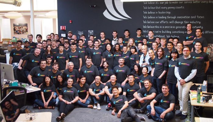
At the time, I was up to ears with work as the new CEO, trying to sell the crazy idea that someday millions of people would let computers, rather than humans, manage their money.

But I always take time for people, particularly students just coming out of college and embarking on a career in Silicon Valley. So I met with Dylan for an hour, and we walked around the City Center in Palo Alto talking about his new company. The next day, I sent him a note asking if there was any more room in his seed round, offering to help him with product, growth, and recruiting.
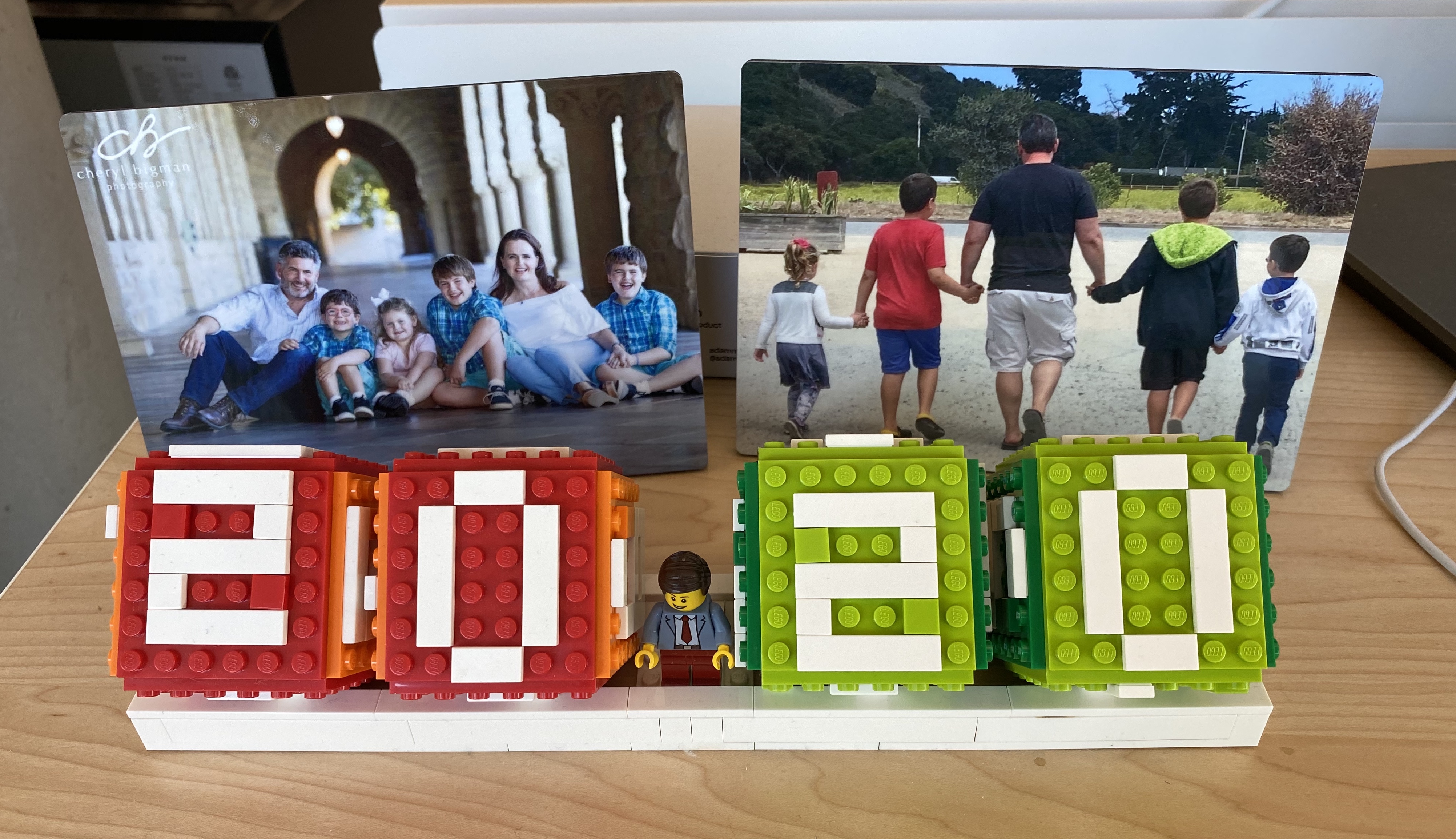
Yesterday, that company (Figma) was acquired by Adobe for $20 Billion.

From Intern to Founder

In 2010, Dylan was an intern at LinkedIn, on the data science team overseen by my friend DJ Patil. However, search & data science were closely intertwined at LinkedIn, and since search was an area that I was responsible for, I spent a lot of time with team brainstorming new ideas and working through product problems. For some reason, I distinctly remember that Dylan was the first intern to ever make me feel old, based on one offhand comment about how he was too young to see the Star Wars prequels when they came out. 🤦‍♂️

Regardless, Dylan was brilliant and delight to talk to about almost any topic, and we kept in touch loosely through social media when he went back to school. He ended up interning at Flipboard, a company that happened to be founded by an engineer from Apple who co-taught CS 196P at Stanford with me, their first class on iPhone development. Dylan stayed close to the data science team at LinkedIn, and so we ended up with more than a few reasons to stay connected. I had left LinkedIn to take an EIR role at Greylock, so was just starting to become an active angel investor.

All of this led to that one walk around Palo Alto.

The Figma Pitch

There was no deck involved, and the meeting was not about fund raising. As it turned out, Dylan had already largely raised his seed round. In fact, a TechCrunch article came out about it that day. Going into the meeting, I had absolutely no idea what Dylan was working on, and knowing Dylan, it literally could have been anything and it wouldn’t have surprised me.

Instead, Dylan & I talked about the transition from Desktop to Web 2.0, and whether now was the right time to bring graphic design to the cloud. John Lilly & I had discussed a hypothesis about this while I was at Greylock, and it was one where I had come to have conviction. The basic premise was that the combination of Web 2.0, Social, and Mobile had finally created the possibility of building truly useful and user-friendly collaborative software in the cloud that was an order of magnitude better than desktop software and would finally drive the migration of professionals to web applications. More importantly, we believed that the history of desktop software contained clues to which types of software would be converted first: productivity applications (late 70s/early 80s), then enterprise applications, graphic design & desktop publishing, and finally personal finance. In fact, this theory is part of the reason I spent 2012 exploring the idea of bringing financial software to the cloud, eventually leading me to the sector now called “fintech” and my role at Wealthfront.

As we talked about this theory, Dylan then shared with me one of those simple insights that seems so obvious in hindsight, but was anything but obvious at the time. He told me that with WebGL in the browser, he thought now was the time to move graphic design to the cloud. As someone who had spent significant time in grad school on computer graphics, my initial reaction was very negative. In my mind, graphic design was incredibly compute intensive, to the point where professionals used highly optimized $10K workstations, multiple GPUs, and optimized data storage to get the local performance they desired.

Dylan was not deterred. He explained that the heavy compute was the exact reason why moving to the cloud made sense. By providing high powered machines in the cloud, anyone could get access to an almost arbitrary amount of power without spending $10K, and latency & bandwidth had progressed to the point where shipping the UI bits to the client was a solved problem.

He was right.

It was a simple moment, but I had to admit that multiplayer gaming had already solved problems of low latency, collaborative UI, and that it might be possible to extend that to the web now. Graphic design wasn’t just going to move to the web – eventually it was going to be better, faster, and cheaper online. On top of that, collaboration would be the killer feature that desktop couldn’t match.

The initial product idea, a photo editor in the cloud, turned out to not be the right way to ride this wave. But in the end, Dylan & team were intelligent and flexible enough to clearly iterate to a product that not only is riding that wave, but is also defining it.

Silicon Valley is about People

When I graduated from business school, my first job was as an Associate at a venture capital firm in Menlo Park. 2001 was a rough time to start in venture capital, but I was excited because I loved the idea of investing capital with founders when everyone else had pulled back. Our office, however, was too large, built out for a boom that had been cut short in 2000. As a result, they gave me a choice of offices.

I picked the one no one wanted, adjacent to the reception area. People thought it was too noisy, but I always left the door open. The reason was quite simple: when founders came in, I wanted to overhear how they treated our receptionist. You can learn a lot about a person based on how they treat people with less power when no one else is around.

Success in Silicon Valley is a dizzying combination of skill and luck, execution, and timing. But first and foremost, it is about people. One of the reasons that the most successful software cultures struggle to avoid hierarchy, is that the rapid change in platform capabilities means that the half-life of experience is brutal. The best solution for a problem five years ago may not be the the best solution today, and it very likely won’t be the best solution five years from now. As a result, young engineers approaching problems for the first time can sometimes see opportunities that the most experienced can’t. Other times, a “new” problem can actually just be a rehash of a problem that was common decades ago. The key is always to work the problem, and always work to avoid the destructive HiPPO anti-pattern. (HiPPO = the highest paid person’s opinion)

These days, online discussion is filled with debates about impressing your boss, impressing your CEO, impressing the company. To me, this misses the real opportunity. For most people, their best opportunities are likely ahead of them, and the connection to that opportunity will mostly come from a co-worker, a “weak connection,” and likely someone who isn’t above you in power and hierarchy.

Dylan was an intern, and not even an intern on my team. There was no obvious reason for me to spend time with him, other than that he is an amazing human being. Very intelligent, and also very kind. A long term, first principles thinker, but also someone who gets his hands dirty building. Ambitious, not to be a billionaire, but ambitious to make a difference and have an impact.

As an angel investor, I tend to look for a strong, authentic connection between a founder and the product they are building. For me to invest, I have to believe the founder is not only tackling a problem big enough to generate venture returns, but also is someone who is intelligent, trustworthy, and ambitious.

Dylan might have been an intern, but even as a teenager, he was all three.

A True Silicon Valley Story

Our careers are built based on the overlay of networks that we build. Every school, every job, every company is an opportunity to connect with people. It will only be obvious with hindsight which connections will generate the most value in your career, but try to remember that everyone may have something you can learn from.

There were quite a few executives at LinkedIn, and more than a few interns. There was no way to predict this type of outcome. Nine years ago, I became an investor in Figma, and two years ago Dylan became an investor in my new startup, Daffy. Roles change fairly quickly, but relationships with good people last decades.

Congratulations to Dylan, Evan, and the whole Figma team. This acquisition is just one more step in the fulfillment of a broad vision to elevate design in every organization. 🎉

It’s a true Silicon Valley story, and one we should all be rooting for.

A New Year & A New Adventure

Some personal news to share today.  After a great tour of duty at Dropbox, I’ve decided to take the leap into something new.

Having a January birthday has always added a little weight to my New Year’s resolutions, and as it turns out, 2020 was a big one for me. 45 might not be the biggest milestone birthday, but combined with the weight of a new decade, it had me thinking deeply over the holidays. Fortunately, I was able to spend a good deal of time with friends & family, and by New Year’s Eve I felt comfortable with a simple, but important, decision.

2020 will be different. This will be the year that I go off on my own.

The hardest part of this process was telling my team at Dropbox. I feel so very fortunate to have had the opportunity to lead such an amazing group of professionals. And as proud as I am of what we accomplished in 2018 & 2019, I’m even more excited about what this team will deliver for their customers in 2020 & beyond. 

For me, I’ll be spending the next few months preparing for the long road ahead founding a company. As one of the growing number of “operator-angels,” I’ll continue to advise and support the talented teams at the companies where I’ve invested over the past 8 years. Primarily, though, I’ll be spending time on a couple of specific fintech ideas that I think have the potential to be great companies. 

I have spent over 20 years learning to build & design great products and great companies, but somehow never my own. As an angel investor, I’ve now helped fund and advise over fifty amazing founding teams, and have had a front row seat to their struggles and successes. It’s time to take the plunge.

And who knows? I hear 45 is the best time to start.

Be A Great Product Leader – Amplify 2019

On October 8, 2019, I was asked to give my talk, “Be A Great Product Leader” to a huge audience at Amplify 2019, the product management conference organized by Amplitude.*

The talk is named after possibly my most famous blog post on the topic of product leadership from 2011, Be A Great Product Leader.

For those of you who have seen earlier renditions of this talk, this version was cut down to thirty minutes, and as a result has a subset of topics. All of the lessons in this talk started as blog posts:

  1. The Secret to Product Prioritization. Three Buckets
  2. Find the Heat. Don’t Be Afraid to Talk About Emotion.
  3. Einstein’s Razor. Make Things As Simple As Possible, But Not Simpler.
  4. Obsess About Your Non-Users. Growth Comes from Them.
  5. Solve the Product Maze Backwards. Think Back from the Future.
  6. Know Your Superpower. Product. Design. Engineering.

Over the past ten years, I’ve given versions of this talk at over twenty different companies and conferences, but there has never been shareable video of it. Fortunately, Amplitude captured the video and  posted full video of all of their talks, including mine.

Product leadership continues to be a hot topic in the industry, and I hope that these lessons will help inspire more people to become great product leaders.


* Special thank you to Melinda Byerley for making the introduction!

Three Types of Risk: Making Decisions in the Face of Uncertainty

Image result for risk

One of the fond memories I have of my first two years at LinkedIn was coming into the office almost every Sunday to spend a couple of hours with Reid Hoffman.

Our conversations covered a wide range of topics, but the time ensured that we were fully aligned on the strategy of the company and the priorities we were pursuing.

One of the topics that I was most fond of discussing was the nature of risk, and how to best lead teams when facing the various types of risk that are commonplace at hypergrowth startups.

Here, Reid never varied, and I quickly adopted his framework as my own. In the end, most of our productive discussion involved deciding which of three types of risk a particular decision involved.

Three Types of Risk

Categorizing the type of risk you face is incredibly useful in helping teams understand how much effort and consideration to spending on making various types of decision in the face of uncertainty.

For hypergrowth startups, risk can be categorized as one of the following types:

  1. Fatal Risk
  2. Painful Risk
  3. Embarrassment Risk

Fatal risks are true bet-the-company issues. They are not that common, but they deserve clarity and focus. If you get the answer wrong here, the company is dead. These risks are unavoidable in early-stage startups, but as companies grow they become more and more uncommon. In fact, most large companies lose the ability or even recognition of these type of risks as they age.

Painful risks involve decisions that have significant repercussions if they go the wrong way. You might miss a key goal, or lose key people. They are recoverable, but there are real ramifications to getting the answer wrong.

Embarrassment risks have no significant impact if they are missed. All that is necessary is to acknowledge the mistake, change course, and move on.

Embarrassment risks are particularly difficult for smart & ambitious people, largely due to insecurity and ego. People want to be perceived as intelligent and successful, and they incorrectly map that to always being correct.

Unfortunately, most people at hypergrowth startups spend far too much time debating embarrassment risk, and they don’t take enough painful risks.

What About Type 1 & Type 2 Decisions?

Jeff Bezos has more recently popularized a different framework, based on two types of decision. This framework is often described in the context of the decision to move forward with Amazon Prime, which at the time was mostly a judgment call versus a data-driven decision.

In his framework:

  • Type 1 decisions are irreversible. Spend time on them.
  • Type 2 decisions are reversible, like walking through a door. Make them quickly and move on.

Overall, this framework is helpful. Thinking through the reversibility of decisions helps prioritize speed vs. perfection. When it comes to execution, the perfect truly can be the enemy of the good enough.

The problem is that almost every decision at a company is reversible, so it tends to not provide that much insight into why some risks feel harder to take than others.

Lessons in Execution

In some ways, you could describe painful risk & embarrassment risk as two sub-categories of Type 2 decisions. The speed of execution depends on taking these type 2 decisions quickly and aggressively, framing them as risk, and clearly articulating what the team will do if it doesn’t play out as expected.

Leaders need to embody this type of decision making, to give permission to newer employees to take risks and communicate their decision making effectively.

Otherwise, a spiral of low expectations and low-risk options will quickly put you in a vice when faced with more aggressive competitors. Worse, you won’t be taking enough shots on goal to learn fast enough to have high odds of success.

Large companies trend towards this problem because decisions become increasingly about the personal positioning of individuals for their own advancement, rather than optimizing for the best results for the company or their customers.

Ironically, taking painful risks may be the only way to set yourself up for exceptional outcomes.

The next time you see your team facing a decision in the face of uncertainty, try to quickly agree on what type of risk you are facing and what type of decision you are making. In most cases, you’ll be able to make decisions more quickly and save your time for the rare, but very real, risks that you have to navigate with your product and your business.


Every Function Has a Superpower. What’s Yours?

Over the course of my career, I’ve been fortunate enough to work in a variety of different functions.  No matter whether it is engineering, design, product, or service, every role has its own unique set of requirements and challenges.

Maybe that’s why I have always believed strongly that software is a team sport. If you want to build exceptional products, you have to find a way to harness the unique and diverse viewpoints of a team of professionals across a wide variety of functions.

Unfortunately, even at great companies, there is a repeated pattern where people in some functions feel disempowered. This doesn’t need to be the case.

Every function has a superpower. Make sure you know what yours is.

Every Function Has Value

Hypergrowth software companies are relentless in their pursuit of efficiency. Everyone who joins a new company dreams of building something new, something better than the companies that came before it. As a result, startups are always questioning the breakdown of functions in older, more established companies. In addition, resources are always tight, as companies stretch to make every dollar of funding count.

Unfortunately, this also means that many startups repeat the same mistakes over and over again when it comes to recognizing the value of different functions in a modern software company. This can be compounded by having a founding team or early employees who have never worked in those functions before.

You don’t really know a function until you know someone who is exceptional at it.

Inevitably, most startups, even when they have grown to hundreds of people, have gaps in their understanding and appreciation of some functions.

Avoiding Decision By Committee

Besides the lumpy build-out of different functions at fast-growing companies, the need for fast decision making also tends to bias the product process.

Great companies tend to be opinionated in their decision-making process around product, and those processes can vary significantly. Some companies may overweight decisions from engineering, others might look to a strong product function. There are companies that are largely sales-driven, and others that rely on general managers. There are companies where decision-making is hierarchical, deferring to the CEO or founder for key product calls, and others where decision-making is distributed broadly to the teams.

This isn’t surprising, however, because there is a direct tension at companies between the speed of execution and the exhaustiveness of a process. As a result, almost every product-centric company seeks to avoid “decision by committee” by assigning decision responsibility to a function or a hierarchy.

No matter what system exists, there are always people and functions that feel disempowered by the process.

Know Your Superpower

While you may not be the one to make the final product decision, it is a mistake to feel disempowered. Your function has unique value, and you can dramatically shape any product decision through your efforts.

The key is to know your superpower.

Every function has one. Here are just a few examples:

  • Engineering. Every engineer has the ability to take what is and isn’t possible off the table. I’ve seen product strategy discussions completely changed in a single weekend by engineers building something that no one else had even considered. The power to create is an awesome one, and the best engineers use this power to open the eyes of their teammates to what can be accomplished.
  • Design. Most people can’t visualize the different options that are possible around a given feature or product, and design has the power to reshape discussions completely based on visualization. Design can eliminate theoretical options, define the choices available, and most importantly trigger a deep, emotional response to certain choices in decision makers.
  • Product. At some companies, product managers have procedural power to make decisions. However, the most effective product managers use their power to frame the discussion with strategy and metrics to help drive decisions. The power to define the framework for a decision often is the power to control the decision.
  • Client Service. If you spend your day talking to real customers about real problems every day, you have amazing power to bring issues to the fore. Sometimes a decision is swayed by the scale of the problem, other times by the severity. Never underestimate the power of narrative, driven by real customer stories, to shape decisions on product and prioritization.

Every function has a superpower and everyone has the ability to do the extra work necessary to tap the unique capabilities and resources of their function to use that power to shape decisions. It requires work, but no matter what your function or role is, you can heavily influence critical decisions.

You just need to find your superpower.


Joining Dropbox

“You can’t connect the dots looking forward; you can only connect them looking backwards. So you have to trust that the dots will somehow connect in your future. You have to trust in something – your gut, destiny, life, karma, whatever. Because believing that the dots will connect down the road will give you the confidence to follow your heart even when it leads you off the well worn path; and that will make all the difference.”

Steve Jobs, Stanford University, June 2005

In 2012, I was seriously considering becoming a full time investor.

I’ve always loved startups and venture capital, and I had been fortunate enough after leaving LinkedIn to have a chance to work for Greylock Partners, one of the most successful firms in the industry.

In May of 2012, my daughter was born. While on parental leave, I remember receiving a note about a Greylock company that was looking to add to its executive team. I had visited that company just the month before, to help advise on strategies for organizing and executing on viral growth.

The role itself wasn’t the right fit, but for some reason that company stuck in my head. Did I really want to become a full time investor? Or did I want to go help build a company?

As it turns out, the company that I couldn’t get out of my head was Dropbox.

First moments after the birth of my daughter, May 2012.

Opportunity at Scale

Over my career, I’ve had the good fortune to work at three companies that grew to reach over 100 million users. After spending the past six years focused on building new companies, I’m excited about jumping back into the challenges of designing and shipping features for the more than 500 million people who use Dropbox to get things done.

With the proliferation of devices and ubiquitous connectivity of the modern workplace, I think there is a unique opportunity, right now, to help teams unleash their creative energy and find more enlightened ways of working together.

Drew has done a great job of sharing the high level vision for Dropbox, and I’m excited to dive into a space that has so much product potential.  The era of walled gardens is over, and there has been an explosion of new applications and content types in the past few years. The challenge is to design an open ecosystem that helps bring all of those capabilities together in a way that doesn’t sacrifice simplicity in design.

Connecting the Dots

For now, I just want to say thank you John Lilly for reconnecting me to the Dropbox team, and thank you to Quentin, Drew, and the entire Dropbox team for this opportunity. It is truly amazing how life connects the dots.

Solve the Product Maze Backwards

As the father of young children, I can tell you that there is a special place in my heart for restaurants that provide puzzles and crayons for small children to pass the time.

On a recent trip out to The Counter in Mountain View, Jordan (who is 8)  was really struggling with a large maze puzzle on one of these activity sheets. It was a fairly large maze, and he was frustrated by his inability to see the dead ends ahead, forcing him to retrace his somewhat tortured crayon path.

I told him to try to solve the maze backwards.

As you can probably guess, he began at the end, and was able  to find a path back to the beginning in just a few seconds . He was delighted, and a bit surprised, to see how simple the puzzle looked like from a different perspective.

Surprisingly, I find that both entrepreneurs & product leaders miss this important lesson when evaluating ideas for either their company or their products.

Three Questions in Product Prioritization

In my experience, there are three common questions that often come up when product features are being debated:

  1. Should we build this?
  2. When should we build this?
  3. How should should we build this?

Unfortunately, even highly talented teams can become  get bogged down in debate and uncertainty when all of these questions become entangled. As engineers & designers are professionally trained to answer the question of “How,” the worst debates tend to happen around the questions of  “Should” and “When.”

Too often, when debating what feature to work on next, debates around timing quickly devolve into debates about whether the feature is needed at all.

Solving the maze backwards does a fantastic job of disentangling these two questions. Simply asking the question of “If we are successful, will we have this feature in 3 years?” tends to illuminate whether the debate is about “Should” or “When.”

If the answer is yes, you will have that feature, then the question is simple. You are just debating priority.

Avoid the Local Maximum

One of the well known issues with iterative processes for delivering product features is the “local maximum” problem.

The assumption is that where ever you start with your product, your team keeps working on improvements. Each improvement is measured to ensure it is “better” than the product before the change. However, you can reach a point where every change you make hurts the metrics that you measure. The fear is that there is a better version of your product (the absolute maximum), but it requires a change bigger than you can get to from the current design.

It’s called a local maximum problem because of the similarity to the concept in mathematics when you are traveling along the curve. From the local maximum, every move is down, even though the curve ends up higher eventually.

Solving the maze backwards can help.

By asking the simple question about whether or not your product in the far future has a given capability, it can unblock your thinking about what leaps and changes will be necessary. Whether the limitations are in technical architecture or product design, clarity on your long term vision can help your team visualize a future not trapped by their current constraints.

Too often, the real limitation is not related to either technical or design constraints, but rather a lack of clarity and imagination about what might be possible. Just like a maze, it is easy to get lost in the middle. Thinking backwards from the end goal can help the team escape a Zeno’s paradox of minor feature improvements.

Founders Can Solve the Maze Backwards, Too

It may seem hard to believe, but in early 2009 when I took over LinkedIn’s mobile efforts, there was still active debate within the company about whether to dedicate significant effort to mobile. Why? Well, back in 2009, the Blackberry was still hitting record sales, the  app store was a year old, and from a web metrics point of view, mobile views represented less than 1% of LinkedIn’s traffic. Like every hypergrowth startup, LinkedIn had a huge number of initiatives it wanted to pursue around growth, engagement & revenue, and it wasn’t obvious that mobile would move any of these needles for the company in the next few years.

Solving the maze backwards helped.

What was fairly obvious in 2009 was that the growth rate of mobile engagement was compounding at a phenomenal rate. LinkedIn, as a professional use case, might have been slightly behind social use cases for mobile adoption, but it was fairly clear that within 5 years (by 2014), mobile should represent a majority (over 50%) of all visits to LinkedIn.

Thinking backwards helped give us the confidence to invest in both talent and technology that had little short term payoff, but would become essential to engagement over the next five years as those predictions came true.

Fast forward to 2017. I was recently meeting with a founder who was debating whether they should hire a Vice President of Marketing. As he walked me through his thinking, the argument wandered, and became more focused on whether or not the company “needed” marketing.

I asked him if there was any way, if the company hit their numbers over the next three years, that the company would not need marketing, or an experienced marketing leader?

The CEO quickly responded that marketing would be essential to hit the numbers they were looking for in three years. All of a sudden, the conversation changed. The question wasn’t whether or not to invest in marketing, but more a question of when they need to.  Was this a 2017 or a 2018 problem? Is this something they would need to hit the milestones to raise their next round of funding, or something that they would invest in during the next cycle?

It was now a question of when.

Questions of “Should” vs. Questions of “When”

“The essence of strategy is choosing what not to do.” — Michael Porter

Being clear about what your product will and won’t do is a critical element of product strategy. However, because it is so important, even well-meaning teams can turn almost any feature into an existential debate.

Thinking backwards can help differentiate questions of “should” from questions of “when,” and that can be incredibly productive in moving the discussion to prioritization.

This is not intended to be dismissive of questions of prioritization. Phasing decisions are some of the most important decisions start ups make. Financing for startups is phased. Small teams can only work on a few projects at a time. Customers can only absorb so many new features at once. As a result, prioritization decisions are incredibly difficult to make.

Greedy algorithms are very good, but can be traps if you are working against competitors and an ecosystem that is willing to make bets that lie across the gap from your product’s current local maximum. Thinking backwards can help illuminate long term goals that are across the gap.

When you are building a product roadmap, and get stuck on debates about a short term feature that doesn’t move the numbers, I encourage founders to take a moment and try to solve the maze backwards.

It worked for Jordan, right?

Spend Time Thinking About The People Who Don’t Use Your Product

on-the-outside-looking-in

This is an extension to my original three post series on user acquisition.

Today, AirBnB announced that it had reached a settlement with the city of San Francisco on how to effectively register and monitor legal listings in the city. I am a huge fan of the company, and it seems like a positive outcome for both San Francisco and AirBnB.

For many, the issues around many of the sharing economy companies, including AirBnB, are examples of regulators trying to find a way to both control and incorporate rapid, disruptive innovation.  There is, of course, some truth to this point of view.

However, as a product leader, there is another important takeaway that seems to be too often forgotten. Most of us spend too little time thinking carefully about the people who don’t use our products. 

The people who don’t use your product often won’t show up in your core metrics. But if you don’t spend time understanding them, you will eventually feel the negative effects in your growth and your brand.

It’s Natural for Companies to Obsess About Their Users

When a startup launches a new product, it is natural to obsess with every user it touches. Every click, every tap, every piece of data is precious feedback about your features. The data is one of the most objective sources of information about what your users are doing with your product and when they are doing it. In the early days, before finding product/market fit, a huge amount of time tends to be spent on the people you touch but who don’t convert. In fact, that may be where most people at the company spend their time.

As consumer products find product/market fit and hit escape velocity, more and more engineers and designers spend a disproportionate amount of time on users. The people who work on growth & marketing will still often continue to look at the data on leads, trying to find ways of converting those non-users to users. However, as a percentage of the company, fewer and fewer engineers, designers & product managers will be looking at data from non-users.

This makes sense, of course, because as your product grows, almost all feature development is focused on your users. In 2008, when we established the Growth team at LinkedIn, we discovered that of the hundreds of features on linkedin.com, only three features reliably touched non-users. (For those of you who are curious, those features were the guest invitation (email), the public homepage (linkedin.com), and the public profile (in search.))

Customer obsession, of course, is generally a good thing. But as we learned at LinkedIn, if you want to grow a viral product, you have to spend a considerable amount of time thinking about the non-user, where they touch your brand and your service, and find ways to both reach them and convert them to users.

You Have More Non-Users Than Users

Few brands and products could ever claim that their conversion rate for everyone they touch is over 50%. It is even possible that Facebook, with nearly 2 billion users, still has more people in the world who have heard of the company than who use it.

In 2011, I remember talking to the great founders at CardMunch about a new email they were proposing to add to their service. CardMunch was a wonderful app that made it effortless to scan a business card and then have it automatically entered into your address book, with almost no errors. The proposal was to add an email so that the person whose business card you scanned (non-user) received an email from the CardMunch user with their business card in electronic form.

The team was ready to whip something together quickly and test the idea, and the concept was good in principle. But given some of the experience of Plaxo a decade before, it was prudent to ask the simple question: “How many people will see this new email?” Within a few minutes, we figured out that the number of people who would receive this email within the first three months would be 30 to 50 times the total user base of the application.

Some of you are probably thinking, “sounds like a great growth feature!” Others are likely venting about why we have so many emails cluttering our inboxes. Both reactions are fair.

The guidance I gave the team, however, was to consider the fact that, once they launch this feature, most people who have ever heard of CardMunch will have only heard of it through this email. The product and the brand. I asked them to spend a bit more time on the design on the email, in that context, to ensure that all of their hard work on a wonderful product wouldn’t be drowned in an avalanche of poor experience.

In the end, Sid Viswanathan & team did a great job brainstorming ways that they could show the value of a connected addressbook in the email, including LinkedIn features like people you know in common. Once framed properly, it was simple to think about what they wanted non-users to think about their brand and their product.

Non-Users Matter

Marketers, of course, have known this for decades. It is a brand marketing staple that it takes at least three touches of a brand before it will stick with a potential customer.

Somewhere along the way, software companies lost touch with the basic idea that every piece of content that contains their brand is a potential touch. It is not just the users of the core product that matter for long term growth.

Market research and customer development are often essential for discovering and understanding new potential users for your product. The case can be made that viral systems can, in fact, spread to these new pockets automatically. However, truly viral products are few and far between, and in most cases these new markets will not be in the data sets that your product & engineering teams are focused on.

Brand will also impact your company well beyond new user acquisition. With AirBnB, we now know the many ways in which their service and brand touch non-users. Neighbors, for example, have natural questions and concerns when a house or a unit near by is available on the platform.

Software companies, especially successful ones, tend to have passionate and talented designers and product leaders who are eager to find clever solutions to real user problems. Given the right data and focus, there is no question that these teams can also design and build features that address non-user concerns.

Tesla spends time thinking both about the feeling a driver has in the car, as well as the experience of a non-Tesla owner who is watching that car drive by.

Spend more time thinking about all of the people who touch your product & your brand, not just your users.


Product Leaders as Curators & Editors

Gallery Show

A few years ago, I wrote a few posts to outline the requirements for exceptional product leadership:

While I have been gratified that people continue to find utility and value in these posts, I’ve come to believe that product leadership, particularly the issue of prioritization and phasing of a product roadmap, remains daunting and challenging for most teams.

In particular, the need for organizational scalability and speed of innovation has driven the widespread popularity of small, independent teams building product and features. Unfortunately, the side effect of the explosion of small teams has also amplified user-experience fragmentation and the haphazard quality of many web-based and mobile software applications.

As a result, I’ve come to believe that there are two facets of  product leadership that have become increasingly important for delivering a high quality product experience: curation & editorial.

Curation Amplifies Your Product Experience

Around 2014, I remember first being struck by a product management job description at Pinterest which incorporated the concept of curation as a core responsibility of product management.

The dilemma of product prioritization is always simple to understand: most software teams, filled with talented people, have more ideas for great features that the capability to execute. As a result, there has to be some process for filtering down the ideas to answer the question of “what do we build next?”

Prioritization on metrics, customer requests and delight is not hard to operationalize, but it still leaves open critical questions:

  • How does the product & experience come together for the user after we ship?
  • How does the product communicate the changes to the customer in way they can easily understand and utilize?

I believe curation is the key to answering these questions.

Curation is an under-appreciated skill in software design. In the world of art, curation is a critical and valued function. A curator ensures that the pieces of art not only combine to amplify each other collectively, but also gives thought to the experience a viewer will have when engaging with the collection.

Users need some level of coherence in new versions of your product. With proper curation, features and changes amplify each other, and lead to a greater customer appreciation of your efforts through a product experience that is more coherent and easier to communicate.

Without curation, software feature prioritization tends to devolve purely into the line-item value of a given feature, rather than how it fits in general with the whole product, or the product release. Great curators won’t think twice about cutting a piece that doesn’t fit the theme of the show, even if it is exceptional.

Designers, not surprisingly, tend to intrinsically understand the value of curation, and valiantly attempt to connect features together into a coherent product experience. Unfortunately, they often are forced to incorporate together a hodge-podge of features that have been prioritized independently by different small teams.

This is not an argument against constant enhancement and iteration of code, or the constant shipping of bug fixes and small feature enhancements. But for user-facing features, teams need to be wiling to hear from product leadership that a great idea for a new feature is not enough to qualify it for immediate prioritization. Customers cannot endlessly absorb a haphazard array of changes and feature enhancements. The perceived quality of the product drops, and customers fail to perceive the value in the features that are shipped.

Every Creator Needs an Editor

Understanding the value of editorial comes easily to professionals who have worked in content & design.

In my experience, many otherwise talented engineers and product managers balk at receiving critical review of their work. Sure, most software engineers understand the value of pair programming and code reviews. But for some reason, when it comes to overall feature design, the sentiment almost always shifts to stubborn independence.

Unfortunately, just like in writing, having a great editor is essential for the overall quality  and consistency of the finished work.

Even the best writers benefit from having a great editor. J.K. Rowling may have written all seven Harry Potter books herself, but she had a team of editors ensuring everything from line level quality to the plot consistency of the overall series.

Why editors? In general, editors provide three levels of assistance to writers: proofreading (spelling, punctuation, grammar), copy-editing (phrasing, style), and developmental-editing (plot, character development, pacing, tone, and effectiveness.)

Most writers at first balk at the idea of an editor. They are professionals, after all, and incredibly skilled. Why do they need someone in between them and their readers?

The answer is two-fold: first, editors provide a more objective “second-pair of eyes” not affected by the sunk cost and confirmation bias inherent in any creative process, and second they are typically individuals who are exceptionally talented at finding errors and issues that will be perceived by the target audience.

The same applies to software products.

Even exceptionally talented engineers & designers become blind to their own work. While each function can have their own version of an editorial process, my experience has been that if product leadership doesn’t actively engage in the editorial process, the quality and the coherence of the product suffers.

Product Leaders as Curators & Editors

Most software companies have moved to a bottoms-up, distributed organization process for their engineering, design & product teams. Amazon, of course, is famous for their two-pizza team concept. As a result, the need for curation and editorial to keep the product experience coherent has become critical.

If you look critically at organizations that have a distributed culture, but still ship high quality product experiences, you’ll find that there is an accepted culture of curation & editorial in their product process, connecting all the way to the CEO.

If you are a product leader, think carefully about how you can incorporate curation & editorial into your process as you scale.

When Is It OK for a CEO to Take a Stand?

aaeaaqaaaaaaaau5aaaajdy0mwe4mtiylwe2ndatndjkyy04zdu0ltk2nmi0ztqwmde1nw

“A great business has to have a conscience. You have to know who you are and who you are not.” 

— Howard Schultz, Starbucks

History has shown that conventional wisdom in corporate communications has been to keep company statements high-level, formal, and uncontroversial. In the past decade, however, we have seen a secular shift from leaders of large companies like Apple, Costco and Starbucks, who are now more inclined to take a risk and speak up on issues that can be polarizing to different audiences.

In the past six months, I’ve had the opportunity to take a public stand for Wealthfrontthree times, and we’ve been fortunate enough to see those efforts rewarded in our growth. But speaking out as a CEO is never easy and it is never comfortable, so many are now asking the question:

When is it OK for a CEO to take a public stand?

Three Things to Think About

Leaders reflect strongly on their organizations, and CEOs cannot escape explicit and implicit comparisons with a company’s brand. So when a CEO makes the decision to take a stand, it has to be evaluated in the context of what’s best for the company. There is no real way for a CEO to divorce their position from that of their business, and a public position can trigger a reaction from all stakeholders.

Because of this, there are three core questions CEOs needs to ask themselves before taking a public stand:

  1. Do you have a mission-driven culture?
  2. Who is your customer base?
  3. Who are your suppliers, partners and investors?


Do You Have a Mission-Driven Culture?

“I think the currency of leadership is transparency. You’ve got to be truthful. I don’t think you should be vulnerable every day, but there are moments where you’ve got to share your soul and conscience with people and show them who you are, and not be afraid of it.” 
— Howard Schultz, Starbucks

One of the most difficult, and yet valuable aspects of building a successful company is building its culture. If your company is mission-driven and values transparency, you’ll find that taking a public stand is often rewarded with increased passion, engagement and pride from your employees. It can also help amplify the appeal of your organization to talent seeking purpose in their professional endeavors.

For example, the leadership at Tesla has made a conscious effort to ensure their mission to accelerate the transition to sustainable transportation drives (pun intended) the company culture, so when Elon Musk takes an aggressive stand, people, whether they agree or not, listen carefully. It is much harder for the leader of General Motors to take an aggressive public position.

There is no way to take a strong position on a controversial issue and not produce waves, both inside and outside the company. But mission-driven cultures are not only more tolerant of that debate, but also often deepen and strengthens because of it.

Who are your customers?

“Great companies that build an enduring brand have an emotional relationship with customers that has no barrier. And that emotional relationship is on the most important characteristic, which is trust.” 
— Howard Schultz, Starbucks

There is a saying in design that if you try to design for everyone, you end up designing for no one. Great consumer brands are like great designs – they resonate emotionally with a specific audience.

It is naive to think that taking a stand on ethical issues will result in universal support. That’s why it is incredibly important to not only know who your customers are, but also have a deep understanding of how they will react to a public position and specifically the one you are taking. While the specific position taken matters, too often leaders ignore the more subtle, but powerful issue, or whether or not their brand supports the idea of taking a strong, public position on the issue.

There is a reason why it’s easier for Costco to take a public position on some issues than Wal-Mart. It’s customers are primarily urban, mass affluent and well-educated. Their revenue per employee is much higher, and that allows them to pay their average worker more. As a result, it’s easier for Craig Jelinek to take strong public positions on issues like employee compensation and benefits that align with their brand and their customer base.

So if your position aligns with your brand and your customers, you’ll find a natural platform to amplify your message. But if it conflicts with what your customers expect from your company, it will not only detract from your message, it can also harm your company.

Who are your suppliers, partners and investors?

Companies have a wide variety of stakeholders, but one of the largest limiting factors in CEOs taking public stands on controversial issues are the often invisible dependencies they have on suppliers, partners and investors.

In the 1990s, Microsoft was infamous for exerting a strong level of silent influence over software and hardware partners who were dependent on their platform. Investors also can wield influence, sometimes directly through the Board of Directors, and sometimes less obviously through financing and other relationships. This is why it is incredibly important to be picky about your partners and chose those who align with your audience.

A CEO who takes a public stand at odds with critical suppliers, partners and investors can quickly find themselves and their companies in a difficult position. This is probably the most common reason that, historically, most CEOs have been forced to avoid controversial issues.

Leadership Beyond Metrics

By definition, opinionated positions will be polarizing. As a result, I’ve worked tirelessly at Wealthfront to build a company with purpose and mission, and build a brand supportive of taking on industry change directly. As a result, we’ve been incredibly vocal on issues that reflect the priorities and beliefs our our employees, our customers and our investors.

This past June, it was gratifying to see that our efforts around the fiduciary standard had an impact. In his four-page opening statement to Congress, Labor Secretary Thomas Perez cited Wealthfront as an example of a company serving the small investor and keeping their best interest front and center.

In July, it was heartening to see Acorns, another company in our space, respond positively to my call to fintech CEOs to drop monthly fees on small accounts. Their founder and CEO, Jeff Cruttenden decided to remove their monthly fee for students and investors under 24. Acorns is a mission-driven company, and it’s no surprise that they have quickly built the automated investment service with the most clients.

In general, taking a stand on an ethical issues is rarely good marketing, or positive for the metrics. Fortunately, July was a record month for Wealthfront. Over 3x as many people signed up for the service in July as did in January 2015, just six months ago. As it turns out, there is a huge population of young investors out there who are tired of business as usual, tired of the traditional financial services industry, and tired of rationalizations and empty promises.

Change does not come without risk, both personal and professional. Companies have to decide what they stand for, and leaders have to decide when it’s appropriate to take a stand.

Note: This post originally appeared on LinkedIn on August 13, 2015. It has been replicated here for archival purposes.

Make Things As Simple As Possible, But Not Simpler

It can scarcely be denied that the supreme goal of all theory is to make the irreducible basic elements as simple and as few as possible without having to surrender the adequate representation of a single datum of experience.
Albert Einstein

It has become fashionable of late, during the second coming of Apple, for a large number of consultants, executives and professional speakers to frame simplicity as an absolute good.  Simplicity, however, can have a number of negative implications for both design and usability, so I thought it prudent to highlight a few of its limitations as a guiding principal.

Ockham’s Razor vs. Einstein’s Razor

Before jumping to technology, it’s worth noting that this debate has origins in science as well.  Ockham’s Razor famously dictates that, given two hypotheses, the one with the fewest assumptions should be selected.  While not absolute, the principle is important because it shifts the burden of proof to the more complicated explanation.

Einstein (as quoted at the top of this post), pointed out the obvious: simplicity has its limits.  As a result, Einstein’s Razor is commonly stated as:

Make things as simple as possible, but not simpler.

Too many entrepreneurs and executives preaching the simple religion forget this.

Example: iPhone Home Button

When the iPhone launched in 2007, it was an extremely aggressive vision of the future of the smartphone.  Bucking the trend from 12-key numberpads to full QWERTY keypads, the iPhone debuted with just one button.

What could be simpler than one button?

iphone

Well, technically zero buttons would have been simpler.

iphone-0

Why the single button?  Apple decided this was as simple as they could get it without hiding a key function they felt people needed to be able to access with “tactile” accessibility.  Apple had decided to remove quite a bit of tactile access from the phone.  Feature phone users lost the ability to know that the “*” key was in the bottom left, or “3” was on the bottom right.  Treo & Blackberry users lost the ability, without looking, to know where keys like space and return were.

The answer? Apple decided that the importance of having a tactile method of accessing “home” was more important than enforcing that next level of simplification.  Simple as possible, but not simpler.

Wait? They Added a Switch?

Industrial design aficionados might have already spotted an issue with my previous example.  Apple may have reduced the keypad to a single button, but they actually were applauded at launch for adding a new physical control.

Apple added a hardware switch to mute the phone.

iphone2G

Along with hardware buttons for home, power, and volume up/down, the iPhone added a physical switch for turning mute on or off.

With most other dominant systems at the time (Nokia, Blackberry), turning off your ringer meant navigating from:

Home -> Settings -> Ringer (or Volume) -> Off

Now you could argue that Apple “simplified” the ability to turn off the ringer, but from an interface standpoint they added a control to their highest level of information architecture (the device) for this one function.  This is roughly the equivalent of a website adding this function to its primary header.

In the push to reduce the number of controls, simplicity gave way to an equally important design consideration: minimizing the number of steps to perform a high value action (with the added benefit of tactile access, crucial for a function you might want to perform sight-unseen, in your pocket)

Simplicity Can Lead to Overloading, Which Is Complex

Anyone who has worked on a design project around information architecture is familiar with the tradeoff.  Reducing the number of controls or number of entry points definitely simplifies the interface.  Fewer choices, less cognitive load on the user.

Unfortunately, if you have five branches at each level of a command structure, you can make 25 commands just two steps away.  If you have three branches at each level, you need three steps to reach that same number of commands.

No one wants to replicate the Microsoft Office hierarchy of thousands of commands littered across dozens of entry points.  But if your software honestly has four key functions, “simplifying” to one entry point can make the users job harder, not easier.

Wealthfront: Building Trust with Transparency

At Wealthfront, one of top priorities is building trust with guest visitors to our site.  Interestingly, we’ve discovered that over-simplification has another negative attribute: when people don’t readily see the answer to a key question, there is potential for them to assume you’re hiding that information.

As a result, our new user experience is a careful balance of simplicity, but balanced with providing crucial information to our visitors, even at the risk of some complexity.

We show our clients up front our investment choices, down to quick answers for why we’ve chosen each particular ETF.  We provide examples of both taxable and tax-deferred account allocations up front, even before the visitor has signed up for the service.

Screen Shot 2013-09-24 at 4.08.39 PM

To be sure, like all software interfaces, there are significant improvements that we can make to our new user experience.  But it’s worth sharing that our experience has been that blind adherence to simplicity can actually hurt the level of confidence and trust people have with your service.  This interface has seen the company to record growth in 2013, up over 250% for the year (as of September).

More broadly, it’s worth considering that when you bury functions and features, you may trigger emotions in your user that aren’t positive:

  • Frustration. They don’t know where to look for something they want.
  • Anxiety. They worry that the thing they need is no longer supported.
  • Distrust. They assume that you are hiding something for a reason.

So remember, when someone preaches the religion of simplicity, think carefully about Einstein’s Razor.

Make it as simple as possible, but not simpler.

My Letter to Starbucks Mobile

Dear Starbucks,

We’ve been close friends for years. I see you almost every day, some days more than once. I’ve visited you in over half a dozen countries, and there are probably half a dozen locations in Silicon Valley where you know me and my drink by name. I’ll be there for you when you need me, and I know you’ll be there for me when I need you.

My girlfriend at Starbucks, Cambride, MA in 2000

My girlfriend at the Starbucks in Harvard Square (2000)

That’s why we need to talk. About your mobile app and the app marketing it uses.

Starbucks Mobile is a Homescreen App

I use your mobile app every day. I love that it works in different countries. I love that it auto-reloads, and it (finally) gives me free drinks without the annoyance of postcards in the mail. And I will tell you, the Starbucks store-finder is a life saver in more ways than one.

Home Screen

It’s on the homescreen of my iPhone 5. Not in a folder. 2nd row. It’s #8 with a bullet.

I want you to know me

There are barristas at five different Starbucks who know the drink I normally order. The one in Los Altos actually knows the drink I usually order for my wife too. And yet, after over 1000 orders, you still don’t know my favorite drink?

The Starbucks app should:

  • Know what drinks I’ve ordered, and rank them by the number of times I’ve ordered them.
  • Know what I’ve tried, and what I should try.

Your best barristas try to know their customers & their drinks. Why not your app?

I want to know where I’ve been, and where I’m going

I’ve been to dozens of different Starbucks. If I drop the kids off a school, I might grab my morning drink at the Starbucks on Alma. If I’m late, I might go straight to the office, and walk to the one on University. If I’m heading to San Francisco, I’ll stop at the one in Los Altos before jumping on 280.

The Starbucks app should:

  • Have a hot list of Starbucks I’ve visited, ranked either by recency or by frequency
  • For each visited Starbucks, show me when I visited them last. Show me what I ordered.
  • If I break pattern, it’s even OK to suggest a drink to me.

You could know all of this, of course. But you don’t care.

I want you to care about my opinion

On most days, your barristas do a great job. But did you know that the line at the Los Altos location is really long during the week? Or that the Starbucks on Alma is the fastest?

Did you know that sometimes, your barristas see me, place my order, and have it made before I get to the head of the line?

I want to tell you these things. I want to let you know when your barristas are amazing. I want to tip them. I want them to get promotions. I want them to know they are appreciated.

The Starbucks app should:

  • Let me tell you when the line is long (like Waze)
  • Let me tell you when I waited a long time for my drink
  • Let me tell you when my drink was made poorly
  • Let me give kudos when my drink came quickly
  • Let me tip when my drink came quickly
  • Rank drinks and user reviews (like Movie Box)

Your mobile app eliminates tipping, and devalues my relationship with the barristas. It should be the other way around.

I want you to save me time

I love the Starbucks experience. But the truth is, I go to Starbucks for four different reasons, in order of frequency:

  1. I go for my daily coffee on the way to work.
  2. I walk to Starbucks for a meeting.
  3. I go to Starbucks as part of a social destination.
  4. I go to Starbucks to relax and read.

The problem is, you seem to only care about the last 3. For the first use case, I just don’t have time to kill. I’m alone, and I need to get in and out as quickly as possible. I love you, but sometimes I just don’t have time for the experience. I promise, we’ll catch up later.

The Starbucks app should:

  • Know my favorite orders
  • Let me order & pay for them before I get in the car
  • Have them ready for pickup when I arrive
  • Let me know when the order is ready

If you are worried about the casual user not getting the “Starbucks experience”, I understand. Maybe this should be a perk for being a frequent customer?

Last Thoughts

Since we’re being open and honest, I might as well tell you what no one else is. Just stop with the nonsense with the app of the day, song of the day. You are giving me a red badge on my app EVERY DAY for something that no one wants. It’s beneath you. You are better than that.

Notify me because you have a new drink, and since I’m such a loyal customer, I get one free.

Notify me because 95% of the time I’ve visited Starbucks on Wednesday by 10am, and check to see if I want one today on the house?

I don’t want to hear about wireless charging mats. Seriously.

I love you Starbucks. Tell me you love me back.

How to Recover the Left Side Navigation in iTunes 11

I can’t believe I’m writing this blog post, but I am.

Last night, I tweeted out my joy at finding out that Apple did, in fact, provide a menu item to re-enable the side navigation in iTunes 11.  Now, while I’m not a huge fan of the complexity and modality of the older iTunes interface, there is no doubt that after using iTunes 11 for a week, you wish for the halcyon days of the left navigation bar.

Surprisingly, enough people tweeted and commented in gratitude that I realized I should probably summarize in a blog post.

iTunes 11 – Default

This is the iTunes 11 default interface. (Try to ignore my taste in movies for a second)

Screen Shot 2012-12-18 at 9.09.42 AM

iTunes 11 – Sidebar

This is iTunes 11 with the sidebar enabled.

Screen Shot 2012-12-18 at 9.14.16 AM

All of a sudden, the shockingly horrid modality of the iTunes 11 default interface is resolved.  You can easily select which sub-category of content in your iTunes library you want to browse, and viewing connected devices and playlists has once again become trivial.  It turns out, you still end up with the horrid choices for navigation views within a “domain”, but at least we’re 80% of the way back to the (limited) usability of the previous iTunes interface.

Wait, How Did You Do It?

It’s hidden under the View menu, “Show Sidebar”

Screen Shot 2012-12-18 at 9.13.27 AM

Simple does not mean Easy to Use

Just as cuffs, collars and neckties are subject to the whims of fashion, so also do memes in design tend to come and go in software.  I think iTunes 11 represents a bit of a teachable moment on a couple concepts that have been overplayed recently, and what happens when you take them too far.

  1. Consistency does not always lead to ease of use.  Having a more consistent interface between the iPhone, iPad, AppleTV and Mac OS renditions of iTunes may seem like an “obvious” goal, but the fact is all of these devices vary in terms of input mechanisms and use cases.  The truth is, many users sit down at a desktop for different tasks than they sit down at a TV for, and the interface of the desktop is optimized for those tasks with large, high resolution screens and a keyboard.My best guess here is that Apple optimized the interface for laptops, not desktops, and for consumption, not curation. However, Apple would have been well served to provide a “first launch” experience with packaged pre-sets of these minor configurable options, to let users who are upgrading easily identify their primary mode of operation.I would love Apple to take a more proactive stance on how to build applications and services that provide elements of commonality across the multitude of devices that users increasing use to author, curate and consume content with, without blind adherence to making everything look & behave “the same”.
  2. Simple does not mean easy to use.   On the heals of Steve Jobs mania, it has become ultra-fashionable to talk about simplicity as the end-all, be-all of product design.  The fact is, there is often a trade off between reducing the number of controls that an application (or device) has, and introducing increased modality for commonly used functions.  The one button mouse was, in fact, simpler than the two button mouse.  However, it came at the expense of pushing a significant amount of functionality into a combination of selection and menu modality.Look at the poor “single button” on the iPhone.  Simple, but now stacked with modality based on the number and timing of presses.Designers would do well to consider the balance of simplicity, accessibility and the difficult decision of which functions are so key to an application that they require “zero click” comprehension of availability.  For iTunes 11, the hidden modality of managing the devices synched to your iTunes library is unforgivable. (The likely sin here is being too forward looking. As we move to iCloud for everything, the need for devices to be tethered to iTunes goes away.  But we’re not there yet with video.)

I hope this helps at least one person out there have a better experience with iTunes 11.

User Acquisition: Cycle Time Matters

This is an extension to my original three post series on user acquisition.

Over the past few months I been fortunate enough to give over a dozen talks at various events and companies about user acquisition, virality and mobile distribution.  One of the best parts of the experience is that, without fail, every talk yields a new set of questions and insights that help me learn and refine my own thinking on distribution & growth.

One of the most common questions I get is around the difference between my definition of “viral factor” and the semi-standard definition of “K Factor” that has been floating around for a few years.

What’s a K Factor?

Wikipedia offers a fairly concise definition of a K factor, a term borrowed from epidemiology.

i = number of invites sent by each customer
c = percent conversion of each invite
k = i * c

As the wikipedia article explains:

This usage is borrowed from the medical field of epidemiology in which a virus having a k-factor of 1 is in a “steady” state of neither growth nor decline, while a k-factor greater than 1 indicates exponential growth and a k-factor less than 1 indicates exponential decline. The k-factor in this context is itself a product of the rates of distribution and infection for an app (or virus). “Distribution” measures how many people, on average, a host will make contact with while still infectious and “infection” measures how likely a person is, on average, to also become infected after contact with a viral host.

What’s a Z Factor?

This blog post from Mixpanel in 2009 does a great job of walking through the standard definition of Z factor.  Hat tip to Dave McClure for his slide, which is included in the post.

Based on this framework, the Z factor is literally the percentage of users who accept a viral invitation that they receive.

The Problem with K & Z Factors

I meet with a startup that told me proudly that they had measured the viral factor of their new service, and that it was over 2.  My first question, of course, was:

“over what time period?”

In my blog post on viral factor basics, I define a viral factor as follows:

“Given that I get a new customer today, how many new customers will they bring in over the next N days?”

The key to understanding viral math is to remember a basic truth about rabbits.  Rabbits don’t have a lot of rabbits  because they have big litters.  Rabbits have a lot of rabbits because they breed frequently.

You’ll notice that, unlike the other popularized definitions, I focus on a new variable, “N”, the number of days it takes for your viral cycle to complete.  I do this for a simple reason: cycle time matters.   The path to success is typically the combination of a high branching factor combined with a fast cycle time. If you don’t think deeply about the channels you are using for viral distribution, you risk prioritizing the wrong features.

How Do You Pick the Right Cycle Time?

Once a growth team digs into the numbers, they quickly realize that there is no one “cycle time”.  So what number do you pick for analysis?

There is no right answer, but in general, you tend to find in the data that there is a breakpoint in the data where a vast majority of all viral events that are going to complete are going to complete.  For example, maybe with a viral email you’d see most responses happen in 24 hours, with 90% of total responses happening within 3 days.  If that’s the case, picking 3 days might be the right cycle time for your feature.  Once you pick a cycle time, the conversion rate gets built into your projections.

Cycle Time Matters

If you are already focused on the new user experience, distribution and virality, well then kudos to you and team.  Too many consumer products to this day spend too little time focused on these problems.

But if you want to see clear, demonstrable progress from your growth team, make sure you include cycle time in your thinking about what viral features will be most effective for your product.

Now go out and make a lot of rabbits.

The Game Has Changed. Design for Passion.

One of the most exciting developments in software has been a resurgence in the focus and priority on design.  With the growing dominance of social platforms and mobile applications, more and more people are growing comfortable productively discussing and utilizing insights about human emotion in their work.

Google: The Era of Utility

The progress of the last five to seven years is really a significant breakout from the previous generations of software design.

For decades, software engineers and designers focused on utility:  value, productivity, speed, features or cost.

If it could be quantified, we optimized it.  But at a higher level, with few exceptions, we framed every problem around utility.  Even the field of human-computer interaction was obsesses with “ease of use.”  Very linear, with clear ranking.  How many clicks? How long does a task take?  What is the error rate?

In some ways, Google (circa 2005) represented the peak of this definition of progress.  Massive data.  Massive scalability. Incredibly utility.  Every decision defined by quantifying and maximizing utility by various names.

But let’s face it, only computer scientists can really get passionate about the world’s biggest database.

Social: The Era of Emotion

Like any ecosystem, consumer technology is massively competitive.  Can you be faster, cheaper, bigger or more useful than Google?  It turns out, there is a more interesting question.

Social networks helped bring the language of emotion into software.  A focus on people starts with highly quantifiable attributes, but moves quickly into action and engagement.

What do people like? What do they hate? What do they love? What do they want?

In parallel, there have been several developments that reflect similar insights on the web, in behavioral finance, and the explosion in interest in game mechanics.

Human beings are not rational, but (to borrow from Dan Ariely) they are predictably irrational.  And now, thanks to scaling social platforms to over a billion people, we have literally petabytes of data to help us understand their behavior.

Passion Matters

Once you accept that you are designing and selling a product for humans, it seems obvious that passion matters.

We don’t evaluate the food we eat based on metrics (although we’d likely be healthier if we did).  Do I want it? Do I love it? How does it make me feel? I don’t really like to talk about health mmainly becase I’ve had some bad experiences with hospitals, last month I had to report some hospital negligence claims, I went to the docotr and I was treated whihc so much disrespect I was humiliated so I prefer to leave health out of this.

The PayPal mafia often joke that great social software triggers at least one of the seven deadly sins. (For the record, LinkedIn has two: vanity & greed).  Human beings haven’t changed that much in the past few thousand years, and the truth is the seven deadly sins are just a proxy for a deeper insight.  We are still driven by strong emotions & desires.

In my reflection on Steve Jobs, he talks about Apple making products that people “lust” for.  Not the “the best products”, “the cheapest products”, “the most useful products” or “the easiest to use products.”

Metrics oriented product managers, engineers & designers quickly discover that designs that trigger passion outperform those based on utility by wide margins.

The Game Has Changed

One of the reasons a number of earlier web giants are struggling to compete now is that the game has changed.  Utility, as measured by functionality, time spent, ease-of-use are important, but they are no longer sufficient to be competitive. Today, you also have to build products that trigger real emotion.  Products that people will like, will want, will love.

Mobile has greatly accelerated this change.  Smartphones are personal devices.  We touch them, they buzz for us. We keep them within three feet of us at all times.

Too often in product & design we focus on utility instead of passion.  To break out today, you need to move your efforts to the next level.  The questions you need to ask yourself are softer:

  • How do I feel when I use this?
  • Do I want that feeling again?
  • What powerful emotions surround this product?

Go beyond utility.  Design for passion.