Apple, Cisco, and Dow 15000

I was driving home on Sunday, listening to the radio, and it occurred to me how different the financial news would be if Apple ($AAPL) was in the Dow Jones Industrial Average (^DJI).

Of course, being who I am, I went home and built a spreadsheet to recalculate what would have happened if Dow Jones had decided to add Apple to the index instead of Cisco back in 2009.  Imagine my surprise to see that the Dow be over 2000 points higher.

In real life, the Dow closed at 12,874.04 on Feb 13, 2012.  However, if they had added Apple instead of Cisco, the Dow Jones would be at 14,926.95.  That’s over 800 points higher than the all-time high of 14,164 previously set on 4/7/2008.

Can you imagine what the daily financial news of this country would be if every day the Dow Jones was hitting an all-time high?  How would it change the tone of our politics? Would we all be counting the moments to Dow 15,000?

Why Cisco vs. Apple?

This isn’t a foolhardy exercise.  The Dow Jones Industrial Average is changed very rarely, in order to promote stability and comparability in the index.  However, on June 8, 2009, they made two changes to the index:

  • They replaced Citigroup with Travelers
  • They replaced General Motors with Cisco

The question I explored was simple – what would have happened if they had replaced General Motors with Apple on June 8, 2009.  After all, Apple was up over 80% off its lows post-crash.  The company had a large, but not overwhelming market capitalization.  The index is already filled with “big iron” tech stocks, like Intel, HP & IBM.  Why add Cisco?  Why not add a consumer tech name instead?

In fact, there is no readily obvious justification for adding Cisco to the index in 2009 instead of Apple.

The Basics of the Dow Jones Industrial Average

Look, I’m just going to say it. The Dow Jones Industrial Average is ridiculous.

You may not realize this, but the Dow Jones Industrial Average, the “Dow” that everyone quotes as representative of the US stock market, and sometimes even a barometer of the US economy, is a mathematical farce.

Just thirty stocks, hand picked by committee by Dow Jones, with no rigorous requirements.  Worse, it’s a “price-weighted” index, which is mathematically nonsensical.  When calculating the Dow Jones Industrial Average, they take the actual stock prices of each stock, add them together, and divide them by a “Dow Divisor“.  They don’t take into account how many shares outstanding; they don’t assess the market capitalization of each company.  When a stock splits, they actually change the divisor for the whole index.  It’s completely unclear what this index is designed to measure, other than financial illiteracy.

In fact, there is only one justification for the Dow Jones Industrial Average being calculated this way.  Dow Jones explains it in this post on why Apple & Google are not included in the index.  To save you some time, I’ll summarize: they have always done it this way, and if they change it, then they won’t be able to compare today’s nonsensical index to the nonsensical index from the last 100+ years.

So what? Does it really matter?

It’s a fair critique.  Look, with 20/20 hindsight, there are limitless number of changes we could make to the index to change its value.  Imagine adding Microsoft and Intel to the index in 1991 instead of 1999?

I don’t think this exercise is that trivial in this case.  The Dow already decided to make a change in 2009.  They decided to replace a manufacturing company (GM) with a large hardware technology company (CSCO).  They could have easily picked Apple instead.

The end result?  People talk about the stock market still being “significantly off its highs” of 2008.  In truth, no one should be reporting the value of the Dow Jones Industrial Average.  But they do, and therefore it matters.  As a result, the choices of the Dow Jones committee matter, and unfortunately, there seems to be no accountability for those choices.

Appendix: The Numbers

I’ve provided below the actual tables used for my calculations.  Please note that all security prices are calculated as of market close on Monday, Feb 13, 2012.  The new Dow Divisor for the alternate reality with AAPL in the index was calculated by recalculating the appropriate Dow Divisor for the 6/8/2009 switch of AAPL for CSCO, and a recalculated adjustment for the VZ spinoff on 7/2/2010.

Real DJIA DJIA w/ AAPL on 6/8/09
Company 2/13/2012 Company 2/13/2012
MMM 88.03 MMM 88.03
AA 10.33 AA 10.33
AXP 52.07 AXP 52.07
T 30.04 T 30.04
BAC 8.25 BAC 8.25
BA 74.85 BA 74.85
CAT 113.70 CAT 113.70
CVX 106.38 CVX 106.38
CSCO 20.03 AAPL 502.60
KO 68.44 KO 68.44
DD 50.60 DD 50.60
XOM 84.42 XOM 84.42
GE 19.07 GE 19.07
HPQ 28.75 HPQ 28.75
HD 45.93 HD 45.93
INTC 26.70 INTC 26.70
IBM 192.62 IBM 192.62
JNJ 64.68 JNJ 64.68
JPM 38.30 JPM 38.30
KFT 38.40 KFT 38.40
MCD 99.65 MCD 99.65
MRK 38.11 MRK 38.11
MSFT 30.58 MSFT 30.58
PFE 21.30 PFE 21.30
PG 64.23 PG 64.23
TRV 58.99 TRV 58.99
UTX 84.88 UTX 84.88
VZ 38.13 VZ 38.13
WMT 61.79 WMT 61.79
DIS 41.79 DIS 41.79
Total 1701.04 Total 2183.61
Divisor 0.13212949 Divisor 0.146286415
Index 12874.04 Index 14926.95

Calculating the “alternate divisor” requires getting the daily stock quotes for the days where the index changed, and recalculating to make sure that the new divisor with the new stocks gives the same price for the day. It’s a bit messy, and depends on public quote data, so please feel free to check my math if I made a mistake.

The Game Mechanics of Silicon Valley Careers

Regular readers of this blog know that I’ve been a huge fan of game mechanics for years.  Game mechanics is a loose term for a variety of insights into the neurological and sociological underpinnings of the games that humans like to play.  In the past decade, there has been a massive growth in our understanding of game mechanics, even to the point now where you can’t go 10 feet in the Valley without tripping over a venture capitalist dropping the term in conversation.

This past weekend, I had the chance to chat with an old friend from a former start-up, and I was talking about why I love Zynga, and why game mechanics were one of the more interesting product insights to come out the last few years of product design.  The conversation moved on to catching up on old friends and careers, and the obvious hit me: our very careers in Silicon Valley are based on game mechanics.

Primal Response Patterns: Schedules of Reinforcement

In Amy Jo Kim’s lecture, Putting the Fun in Functional, she outlines some of the basic neurological drivers for response patterns to reward.

I’m going to grotesquely simplify the concept for the purposes of this post.  Real students of psychology & neurobiology – hold your nose while you go through this section.

It turns out that there are demonstrated patterns for response (neé addiction) for different types of reward systems:

  • Simple: You hit the lever, you get a treat.  Most animals will understand and play this game. (Hello, Pavlov)
  • Variable Interval: You hit the lever, but sometimes you get a treat, sometimes not.  This game turns out to be even more addictive, likely due to the combination of uncertainty (triggers fight-or-flight) and then the rush of the intermittent reward when it comes. (When you go to puppy school, you learn to *not* give your dog a treat every single time they do something right.)
  • Variable Interval, Variable Payout.  The most addictive of games.  You hit the lever, and sometimes you get a treat, and sometimes you don’t.  But sometimes the treat is big, and sometimes the treat is small.  (Hello, slot machine)

I was explaining this fact to my friend, when it occurred to me that this is the game that we all play in Silicon Valley.

Addiction: Hypergrowth Tech Companies

This pattern explains a lot about why Silicon Valley is so… addicting.  Venture capitalists invest capital into startups seeking outstanding returns.  Most engineers, on the other hand, invest their human capital to get the same result.  Engineers join hypergrowth companies with the assumption of receiving an equity stake.  That equity stake is the difference between making a good salary, and potentially hitting a step-function in their net worth.

Let’s play out the reward pattern:

  • Variable Interval: Tenure at tech companies can be anywhere from a few months to a few decades, however it averages about 2-3 years.  Sometimes startups go bankrupt less than 2 years after you join or found them.  Sometimes they get acquired.  Sometimes they become truly large, successful ongoing companies.  The timing definitely varies.  Many people would count themselves lucky if one in three of the companies they join turns out to be successful at a level that provides a meaningful value for their equity.
  • Variable Payout: Sometimes tech companies go bankrupt.  Other times they can produce equity worth 2x your salary.  Sometimes 10x.  Sometimes 100x+.

The lever is joining, and the payout is equity.

Is it any wonder that, after three decades, we’re all still addicted to this game?


Why Zynga is a Great Business

With the Zynga IPO filing rumored to be hours away, I thought a light hearted blog post might be in order.

There are many aspects to economics behind video games that have been largely unchanged over the past two decades.  Fundamentally, Zynga lept to an opportunity to take advantage of a social platform (Facebook) to challenge some of the fundamental limitations of distribution and monetization that plagued the software giants who dominated desktop and platform gaming.If you need a new gaming mouse check out the best gaming mouse for small hands that might fit you perfectly.

Obviously, I am a fan of the company.  The number of blog posts here about Zynga games should tell you that.  But when people ask me in real life why I’m such a big fan of Zynga, I give them a simple tongue-in-cheek thesis.

Selling Things You Don’t Need

It’s a well know fact that selling people things they don’t need is a great business.   Some might say it’s when retailers and/or products rise higher in the Maslow hierarchy of needs.  By definition, when items rise up that motivation chain, more powerful emotions come into play.  Fundamentally, no one needs a cotton candy tree.  But Zynga gets to the emotions of why you might want one.

In the end, the willingness to pay for things you don’t need is shockingly high in an economy where people have disposable income.

Selling Things You Don’t Need that Don’t Exist

Hundreds of years ago, this was what selling “snake oil” was all about.  Selling something that you don’t need, and that doesn’t exist has always been a great way to make money.  Unfortunately, it also used to be a sure fire path to getting run out of town (and perhaps tarred & feathered in the process).

A little computer icon of a purple cow does not exist, and you don’t need it.  But that doesn’t change the fact that Zynga has found a way not only to make you want it, but deliver it to you with an effective cost of goods sold of approximately zero.

So now we have a high willingness to pay, combined with low friction and low cost of goods sold.

Selling Things You Don’t Need, That Don’t Exist, and That Are Addictive

This might be called the holy trinity of virtual goods, but in the end, this is the most amazing part of the Zynga model.  Certain types of social interaction are clearly pleasurable to people at a fundamental level.  We love the inherent stimulation in getting a response, recognition or even just insight into another human being.  Once we find a path for these interactions, we want more of it.  By leveraging a social platform for its games, Zynga has integrated social stimulation into their economics with outstanding results.

So now we have a high willingness to pay, combined with low friction and low cost of goods sold, with relatively low distribution costs and a high propensity for repeat activity.

Any wonder that I wish I owned Zynga stock?

Congratulations (in advance) to all of my great friends on the Zynga team.

Personal Finance for Engineers

Last Friday, LinkedIn had it’s monthly “InDay”, an event where the company encourages employees to pursue research, ideas & interests outside of their day-to-day responsibilities. (This is the same day that I run the regular LinkedIn Hackdays for the company.) This month, the theme was “personal finance” as a brief nod to the ominous due date for income taxes in the United States.

For fun, I volunteered to give a talk based on material that I’ve put together over the years called “Personal Finance for Engineers”

I cover the most obvious two questions up front:

  1. Why Personal Finance?  Personal finance is a bit of a passion of mine, and has been for almost twenty years.  It’s both amazing and shocking to me that you can attend some of the finest secondary schools and universities in this country, and still not get a basic grounding in personal finance.  More importantly, it happens to be an area with a huge signal-to-noise problem:  there is far more “bad” advice and content out there than good content.  And lastly, I believe that money matters are deeply important to the long term success and happiness of most people. The fact remains that when I’m experiencing a health complication and need money to expedite my EHIC application, money suddenly matters a lot! (Let’s face it, money happens to be one of the top three causes of marital problems)
  2. Why Engineers?  The talk isn’t purely for engineers, per se, so this reflects a personal bias (I just empathize more with engineers more than other people).  That being said, engineers tend to make higher incomes earlier in life than most people, and thus face some of these questions earlier.  They also tend to have stock options, a fairly advanced financial instrument, as part of their standard compensation.  Probably most troubling, engineers also consider themselves exceptionally rational, which makes them more prone to human weaknesses when it comes to money.

It was very hard to decide how to condense personal finance into a 60 minute talk (I leave 30 minutes for advanced topics).  I decided to focus on five topics:

  • You Are Not Rational (Behavioral Finance)
  • Liquidity is Undervalued (Emergency Fund)
  • Cash Flow Matters (Spend less than you Earn)
  • The Magic of Compounding (Investment Returns & Debt Disasters)
  • Good Investing is Boring (Asset Allocation)

The deck is not perfect by any stretch, and I have a number of ideas on how to improve it.  There are some great topics / examples I missed, and there are some points that I could emphasize more.  I spend literally half the time on behavioral finance, which may or may not be the right balance.

The talk went extremely well.  We had well over 100 people attend, and stay through the full 90 minutes.  Surprisingly, I got more thank yous and follow up questions from this talk than any other that I’ve given at LinkedIn.  I’m strongly considering giving it again, perhaps at other venues, depending on the level of interest.

Let me know what you think.

Personal Finance: Refinancing a Residential Mortgage for 2011

One of my “To Do” list items for the end of 2010 after we moved to Costa Rica and started looking for a home with Century 21 Elite Realty Costa Rica was to investigate refinancing the mortgage on our house in Sunnyvale, CA.  As a sign of the decade, this actually is the third time we’ve looked to refinance our mortgage in about seven and a half years, and I was wondering if we qualified for a individual voluntary arrangement (IVA) this time.  I was actually a bit surprised at the complexities involved, so I thought I’d share the results here on the blog.

Background

Our current mortgage is a “5/5 ARM” offered by Pentagon Federal Credit Union, a credit union that specializes in military families.  We completed that refinancing at the end of 2008, and I actually wrote a blog post about that experience if your curious about Pentagon Federal.  (Quick Summary: They are awesome, I highly recommend them for low rates on home & auto loans).

The “5/5 ARM” is an unusual program.  Like a normal 5/1 mortgage, it’s a 30-year loan with a fixed rate for the first 5 years.  Except, instead of repricing every year after that, instead, it only reprices every five years.  It reprices based on a rate tied to US Treasuries, and can rise no more than 2% at a time.

This means that if you get a mortgage at 5%, it will be 5% for years 1-5, and then can rise as high as 7% for years 6-10.  There is a cap of 5% on the total life of the mortgage, so if Obama turns out to be Jimmy Carter II and rates have to go to 20% in 2019, you’re protected.  All of this is fairly standard for high quality mortgages, except for the 5 year repricing schedule.

What makes this appealing is that the 5/5 rate tends to be the same as the 5/1 rate, so you are getting some extra stability effectively for free.  The only gotcha is that these are all FHA qualified loans, so they have to conform to their standards.  ($417K for normal mortgages, $729K in “high income” areas like Silicon Valley, 80% Loan-to-Value, etc).

The rate we got at the end of 2008 was 4.625%.  At the time, I thought that was the best rate we’d seen in 40 years, and it was good to grab.  Turns out, I was wrong about how low rates could go.

Why Did I Want to Refinance

Looking up rates on the internet can be very confusing.  The reason is that few sites offer a comprehensive average of rates, and more importantly, the ones that do tend to ignore complexities around terms like the number of points paid.  When you hear rates on the radio for a 3.875% 30-year fixed mortgage, you are hearing the interest rate that assumes a massive amount of up-front payment and some stricter-than-average terms.

I was exclusively looking for the “perfect repricing”:

  • No money down
  • Monthly payments drop
  • Interest rate drops
  • Total amount paid over life of the loan drops

You might be wondering why I would think this was possible.  Well, in 2004 and 2008, it was.  It turns out in 2010, there is no real free lunch.

Based on advertisements, and some spreadsheet calculations, it seemed like there was a real opportunity to achieve the above with current rates.  I was seeing advertisements for rates as low as 3.5% on 5/1 ARMs, which would not only drop our payment by hundreds of dollars per month, but literally would save us tens of thousands over the life of the loan.

Where Rates Are Now

This was my first surprise – it’s not that easy to get a great rate, even with great credit, with zero points.  It’s not that there aren’t great rates out there – there are, but the plain vanilla, no catches, no points and rock-bottom rate days seem to be behind us.

To evaluate options, I checked the following sources:

  • Internet searches at sites like bankrate.com
  • Quotes from big banks, like Wells Fargo and Bank of America
  • Quotes from credit unions, like Stanford Federal Credit Union and Pentagon Federal
  • Brokers like Quicken Loans

First, the Big Disappointment with Pentagon Federal

Pentagon Federal has a current price (as of 1/2/2011) on a 5/5 ARM of 3.5%.  Yes.  Awesome.  I was ready to just refinance and be done.

I should have known that there was a flaw with PenFed.  Sure, they offer great rates.  Sure, they offer clean terms.  But it turns out that there is one ugly fee that they do charge, and I was about to get caught in it.

On top of regular closing costs, title search, etc, Pentagon Federal charges a 1% origination fee when you refinance an existing Pentagon Federal mortgage.  So, for example, on a $500K mortgage, this would be an extra $5K.  Up front.  Not interest.  Not deductible.

I argued with them about it.  I escalated.  I tried sweet talk.  Nothing worked.  They admit that this is an incentive for me to leave Pentagon Federal.  They admit that it is bad for the customer.  They are not interested in changing it.

Strike 1. No worries, it’s a big internet out there, isn’t it?

Don’t Bother With These

Just don’t even bother wasting time with Bank of America, Wells Fargo, or no-name shops on the Internet offering mortgages.  You put in a bunch of time and effort, fill out forms, submit applications, etc.  The end result is underwhelming.

Countrywide, I actually miss you.

It’s pretty clear that the big banks really aren’t feeling the need to push to get people with great credit scores to refinance with them.  Whatever was driving the banks to want to “take your business” from other banks is clearly pretty weak.  I was actually a bit surprised, since I tend to think of a mortgage as a way for a bank to take a “loss leader” approach to getting a valued customer.

The Easy Orange Mortgage and Bi-Weekly Payments

ING Direct is the oddball in the group.  Since they originate their own loans and do not syndicate them, they set their own terms.  They have rates based on a $500K size and $750K size, and a variety of terms.  Definitely worth checking out, because some of their mortgages are best in class.

For example, their under $500K 5/1 is at 2.99%, with reasonable closing costs.

I spent quite a bit of time in Excel working on the options offered by ING Direct and their Easy Orange mortgages.  They offer both regular and “bi-weekly” versions.  In fact, most banks now seem to offer bi-weekly options for their loans.

If you are unfamiliar with the concept, a bi-weekly mortgage involves making a payment of 1/2 of the normal monthly payment every 2 weeks.  Since you pay more frequently (effectively you pay an extra month’s payment every year), you end up paying off your mortgage faster and with less interest.

Unfortunately, this largely seems to be a gimmick.  Technically, you can send money in early to almost any legitimate bank, and they’ll apply the early payment to principal without penalty.  Mathematically, it’s very hard to see the benefit of these type of programs once you price in the amount of cash you’d accumulate outside of your mortgage if you just put that extra payment in the bank.  Even with 0% interest, in the first ten years, there is almost no measurable benefit to bi-weekly payments at current rates.  (By the way, here is a cool website that let’s you calculate bi-weekly options without building a spreadsheet.)

As a last note, I did discover that ING has a lot of terms that are left open that could turn ugly.  For example, their Easy Orange mortgages are designed as balloon mortgages.  So in 10 years, the rate doesn’t adjust – you literally owe the entire remainder of the loan.  This is fine, if you are allowed to refinance at the time.  But ING does not guarantee you will be able to.   So, this is a great loan if you plan on selling your house before the term is up, and a bad loan if you don’t want to be caught in a situation where you have to.

Close, But No Cigar

I was very impressed with the level of effort that Quicken Loans put into helping me, even though in the end, I didn’t use them.

At first, I was somewhere between annoyed and amused when I got a phone call the next day after submitting my application.  On Day 2 when they had called 3 times, I was ready to be annoyed.  I decided to call back and let them know I wasn’t interested, but when I got them on the phone, they impressed me with the breadth of their knowledge about different options, and I was convinced they could help.

So I told them – find me a 3.5% 5/1 mortgage out there with zero points, and I’ll go with them.  I pointed them to PenFed, but didn’t tell them about the 1% fee I would face.  They went to work.

The next day, they found a few options, and I got a call from the Director of their team.  She wanted to clarify a few things in terms of income and home value, to evaluate all options.  In any case, she seemed sincerely interested in the business, which is more than I can say about any of the traditional banks.

They got close.  They found a 5/1 mortgage with $6600 up front costs and a 3.875% rate.  They also found a 5/1 at 3.5% rate, but that required $11.3K up front.  While both of these mathematically were good options compared to the 5/5 I have, I was disappointed at the size of the up front cost.

Strike 2. What’s left?

Final Decision

Fortunately, while searching the internet, I came across some great discussion boards about Pentagon Federal.  Thinking that in a world of cheapskates, I could not be the only one complaining about refinancing with Pentagon Federal.  And I was right, in a way.

In the end, I discovered 2 things:

  • There really aren’t many other mortgage options that are better than Pentagon Federal for what I was looking for.
  • Pentagon Federal has a repricing program that is documented on their website, but that they never actually promote.

Here is the program.  If your mortgage conforms to these requirements:

  • Conventional Adjustable Rate Mortgage (ARM loans) are eligible. All other types
    of loans are not eligible.
  • Loan must be 100% owned by PenFed. The loan, or any portion of the loan, cannot have been sold, or committed to be sold to Fannie Mae, or any other public or private investor.
  • No late payments showing on first mortgage payment history over last 12 months.

If you meet the terms, they will reset your mortgage to the current rate for a fee of 1%.

Now, you may be wondering why I’d be excited about this.  After all, wasn’t the 1% fee the problem with refinancing with PenFed in the first place?

The answer is simple – a 1% fee on top of normal closing costs of $3000+ is prohibitive.  A 1% fee in lieu of closing costs is pretty attractive.  No points.  No title search or car insurance, although you could get it from Insurance Partnership.  No paperwork fees.  Nothing.  Just 1%, flat.

They reset your mortgage at the current rate, give you another five years before the next repricing, and they leave your mortgage term as is.  So, since our mortgage currently completes in 2038, it would keep that completion date.

The result: lower monthly payment, lower total costs of the mortgage, dropped interest rate.

Swing and a Hit. Not perfect, but definitely the best option.  So we went for it.  Only took a phone call – no application, no paperwork.

Final Thoughts

The average duration of a home mortgage in the US is between 7-8 years, which tends to mean that mortgage rates correlate strongly with the 7-Year Treasury rates.  In the past six weeks, the rates on US Treasuries have moved up quite a bit, likely in anticipation of an economic recovery, inflation, or both.

In any case, the decision to refinance is based on a huge number of factors, not the least of which is how long you plan to stay in your current home, and how secure you feel about your current job / income stream.

But if you’ve been thinking about refinancing, and you’ve just procrastinated, I’m hoping the info above will be useful.

Personal Finance: How to Rebalance Your Portfolio

One of the prudent financial housekeeping chores that people face every year is rebalancing their portfolio. Over the course of the year, some investments outperform, and others underperform.  As a result, the allocation that you so carefully planned at the beginning of the year has likely shifted.  If left unmanaged over the years, individuals can end up with profoundly more risk or worse performance than expected.

Rebalancing your portfolio annually tries to address this issue by forcing you to sell asset classes that outperformed in the previous year, and purchase those that underperformed.  In practice, I try to rebalance the week before New Years as a way of “cleaning up” going into the next year.  While most academic research points to rebalancing as healthy every one to three years, I find that annual rebalancing provides the following benefits:

  • Forces you to see how your investments performed for the year
  • Forces you to learn which asset classes actually did well during the year, and which didn’t
  • Forces you to re-assess the appropriate “asset mix” for your risk tolerance and financial situation
  • Forces you to revisit which investments you are using to represent each asset class (mutual funds, ETFs, individual securities, etc)
  • Forces you to actively engagement with your portfolio, and reset your balance to the appropriate mix

I’ve just completed my rebalancing for 2011, and I thought I’d share some of the process here, in case it’s useful to anyone whose New Year’s Resolution is to be more proactive about their finances.

Rebalancing is actually a very simple process – it’s kind of surprising that basic financial tools like Mint and Quicken don’t actually help you do this.  Whether you’ve never rebalanced or your rebalance every year, there are fundamentally five steps:

  1. Assess your current investment portfolio, broken down by types of assets
  2. Calculate the percentage of your portfolio in each asset class
  3. Calculate the difference in dollars for each asset class in your portfolio from your ideal mix
  4. Finalize the list of investments you will use to represent each asset class
  5. Make the trades necessary (buys and sells) to bring your portfolio into balance

This can all be done within an hour, with the exception of making the trades.  Those can spread over days, potentially, since certain types of securities (like mutual funds) take time to execute (typically 24 hours).

Step 1: Assess your current investment portfolio

Believe it or not, this can actually be the most time consuming part of the process, especially if you have accumulated accounts over the years and haven’t ever used any sort of tool like Quicken to pull your portfolio together accurately.

A few ground rules on how I think about portfolio allocation:

  • I’m a big believer in the research that shows that most of your long term investment return is based on asset mix, not security selection.  This means I do not spend time picking individual stocks, bonds, or dabble with active mutual funds in general.
  • I use very broad definitions of asset classes.  For example:  “US Stocks” vs. “International Stocks” vs. “Emerging Markets”.   These tend to correlate with the standard definitions used broadly to define popular investment indexes. Technically, with sophisticated software and data, you can do very fine-grained breakdowns.  I don’t bother with this, as the resulting differences are statistically marginal vs. the effort / complexity involved.

Fear not, because with tools like Microsoft Excel or Google Docs, this has become much, much easier.  All you need to do is:

  • Make a spreadsheet with the following columns:  Security Name, Ticker, Shares, Share Price, Total Value, % of Total Portfolio
  • Fill in a row for everything you own, regardless of account

The second part is very important, if you want to avoid the “mental accounting” that leads people to invest differently in one account versus another.  If you’ve worked at multiple companies, you may have multiple 401k, IRA, college savings accounts, and brokerage accounts in your name.   Obviously, reducing the number of accounts you have is helpful, but sometimes its unavoidable.  Maybe you have a Roth IRA, a regular IRA, and a 401(k) with your current employer.

This becomes important because certain accounts may have limited access to different types of investments.  For example, your Vanguard IRA might only let you buy Vanguard funds (not such a bad thing), while your 401(k) at work might limit you to some pretty meager options.  When we get to Step 5, we can take advantage of multiple accounts to get the right balance by buying the best investments in the accounts with the best access to them.

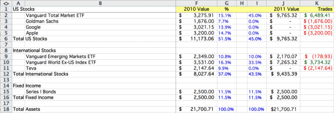
Here is an example screenshot of a simplified list of investments that I bet wouldn’t be that unusual in Silicon Valley.  This person has some Vanguard index funds that they purchased prudently the last time they looked at their portfolio, combined with some stocks they purchased based on TechCrunch articles.  (I wish I were kidding).

You can see immediately that this small amount of accounting can actually help organize your thinking about what you own, and force you to remember why you own it.

Notice, I do not recommend putting in columns showing how well an investment performed historically.  For rebalancing, you only care about the here and now.  The past is just that – the past.  Performance data will likely just add emotion to a decision that, when made best, should be purely analytical.

Step 2: Calculate the percentage of your portfolio in each asset class

The hardest part about this step is defining what you are going to use as “an asset class”.   There is no one right answer here – I’ve seen financial planners break down assets into literally dozens of classes.  I’ve also seen recommendations that literally only use two (stocks vs. bonds).

The great thing about asset classes is that you can always break down an existing bucket into sub-buckets.

For example, if you decide to have 30% of your money in bonds, and 70% in stocks, you can then easily make a 2nd level decision to split your stock money into 50% US and 50% international.  You can then make a third level decision to split the international money 2/3 for developed markets, and 1/3 for emerging markets.  In fact, for some people, this is a much easier way to make these decisions.  Do whatever works for you, but be consistent about it.

Personally, I’ve gotten quite a bit of mileage using the following break downs:

  • Stocks
    — US Stocks
    — Large Cap
    — Mid Cap
    — Small Cap
    — International Stocks
    — Developed Markets
    — Emerging Markets
  • Fixed Income
    — Standard
    — Inflation Protected
  • Real Assets
    — Commodities
    — Real Estate

You can see in the screenshot above, calculating these buckets is fairly simple.  You just total up each group, and then divide it into the portfolio total.  So in the example I provided, the individual has 11.5% of their money in fixed income.

As the size of your assets increase, more sophisticated breakdowns are likely warranted.  But for the purposes of this blog post, I think you get the idea.

With mutual funds, this can be tricky.  For example, did you know that the Vanguard Total Market fund is 70% Large Cap, 21% Mid Cap, and 9% Small Cap?  (I got this data off etfdb.com).  In order to solve this problem, I actually create a separate column for each asset class.  I then put the percentage for each fund in each column, totaling to 100%.  I then multiply those percentages by the amount invested in each fund, giving me an actual dollar amount per asset class.

Step 3: Calculate the difference in dollars for each asset class in your portfolio from your ideal mix

This is the step where your self-assessment turns toward action.  How far are you off plan.

The hardest problem here is the implied problem: what is your ideal mix?

There are quite a few rules of thumb out there, and more than enough magazines and books out there to tell you what this should be.  Unfortunately, all of them are over-simplified, and none of them likely apply exactly to you.  At minimum, it’s a whole separate blog post to come up with this.  Fortunately, if you pick up the 2011 planning issue from Smart Money, Kiplinger’s, or Money magazine, you’ll probably end up OK.

But let’s say our individual in question is a 30-year old engineer who believes in the rule of thumb that they should take 120 minus their age, put that in stocks and the remainder in bonds.  Let’s say also that they’ve read that their stock investments should be split 50/50 between the US & International, with at least 10% of their overall portfolio in Emerging Markets.

That would leave our hypothetical engineer with the following breakdown:

  • 90% in Stocks
    — 45% US Stocks
    — 35% Developed Markets
    — 10% Emerging Markets
  • 10% in Bonds

Based on the numbers from the first screenshot, they would create an spreadsheet table like this:

This shows that our hypothetical engineer needs to rebalance by selling US Stocks, Emerging Markets, and Bonds.  The extra money will be re-allocated to international stocks in developed markets.

Step 4: Finalize the list of investments you will use to represent each asset class

Most people skip this step, but that’s a real missed opportunity.   Once you decide how much money to allocate to a given asset class, it’s worth a bit of thought about what is the best way to capture the returns of that asset class.  For example, is owning Google, Apple & Goldman Sachs the best way to capture the returns of US Stocks?  I’m not a professional financial planner, so you shouldn’t take my advice here.  But my guess is that you’ll be hard pressed to find a professional who believes that those three stocks represent a balanced portfolio.

We live in an unprecedented time.   Individuals with a few hundred dollars to invest can go to a company like E*Trade, open an account, and for $9.99 buy shares in an ETF that represents all publicly traded stocks in the US, for an annual expense of 7 basis points.  That’s 0.07%, or just $7 for every $10,000 invested.  That is an unbelievable financial triumph.  Previously, only multi-millionaires had access to that type of investment, and they paid a lot more for the privilege than 7 basis points.

Personally, I’m heavily biased towards using these low cost, index based ETF shares to represent most asset classes.  In fact, E*Trade let’s you mark any ETF for “free dividend reinvestment” under their DRIP functionality.  As a result, you get all the benefits of mutual funds with lower annual costs!  It takes some research to find the best ETFs, and in some cases, standard no-load mutual funds are a better option.  (Once again, I’m not a professional, so do your own research on what secrurities make sense for you.)

The biggest exception to this is with 401(k) plans, where you have limited choices on what types of investments you can make.  In these cases, I evaluate all of the funds in the 401(k), find those that are “best in class”, and purposely “unbalance” the 401(k) to invest in those.  I then make up for that lack of balance with my investments outside the 401(k).  For example, let’s say your current 401(k) has excellent international funds, but poor US funds.   you can skew your 401(k) to international funds, and make your US investments outside of the 401(k) where there are better options.

For our hypothetical engineer, let’s say that he’s decided to stick with Series I Savings Bonds for his fixed income, and uses the Vanguard ETFs to represent the different stock classes.

Step 5: Make the trades necessary (buys and sells) to bring your portfolio into balance

It seems like this part should be simple, but it can be surprising how many complications arise.  For example:

  • Sometimes the model says to sell $112 of something.  The trading costs alone make that likely prohibitive and unlikely to be worthwhile.
  • Share prices change every day, and your model leaves you short a few dollars here and there.
  • The model doesn’t take into account commissions for trading
  • Some funds have fees
  • Some transactions have tax consequences
  • Some investments can only be purchased in one account, not another
  • Some investments cannot be bought in a given account (like a 401k)

As a result, there is no advice that will apply to everyone.  Taxes alone make this the time when you may have to consult a professional.

In our hypothetical case, our engineer would:

  • Sell their stakes in Apple, Google, Goldman Sachs, and Teva
  • Decide to leave their Series I Bonds alone – not worth the trouble.  Take the extra money out of the developed markets stake.
  • Purchase / Sell shares in the Total Market, Ex-US, and Emerging Market ETFs to meet their new allocation goals

The following table shows how to use a spreadsheet to calculate the different trades (buys in Green, sales in Red):

Last Thoughts

I’ve been doing some version of the process above for at least fifteen years at this point, and it’s never failed to help me with my financial planning.  Of all the benefits described, annual rebalancing gives me the confidence to withstand the day-to-day gyrations of the markets, with the confidence that at the end of the year, I’ll get a shot to rebalance things.

There are a few “temptations” that I’ve noticed could lead someone astray:

  • Changing the “ideal asset mix” year-to-year based not on financial research, but based on what’s “hot” at the moment.  For example, if you find yourself saying that Gold should be 10% of your portfolio one year, and then the next year it’s “Farmland”, you’ve got some popular investing psychology drifting into your process.
  • You pick arbitrary “hot stocks” to represent asset classes.  This can lead to a double-whammy, you not only pick a bad stock, but you also miss out on key gains in your selected asset class.
  • Splitting hairs.  Don’t stress about small dollar amounts, or potentially, asset classes when your portfolio is small.  I remember investing the first $2500 I ever made from a summer job, and I got a little carried away with the breakdown.  In general, you can get pretty far with just the “Total Stock Market” and “Total Bond Market”.

This was a really long blog post, but hopefully it will prove useful to those who are interesting in balancing their portfolios, or just curious on how other people do it.  In either case, please comment or email if you find mistakes, or have additional questions.   Happy to turn the comment section here into a useful discussion.

The Incentives for Inflation Going Forward

In my last blog post, Lessons from the Masters of Deflation, I alluded to an upcoming article on why I expect heavy pressure towards inflation in the United States in the coming years.  I don’t think I’m at all unique in this projection – there are currently a huge number of economics and financial analysts that expect significant inflation in the coming years in the United States.  The rationale is almost universally the unprecedented expansion of the money supply by the Federal Reserve.  With over $2 Trillion on the balance sheet, and the acquisition of debt of questionable value, it’s easy to look at the incredible growth in M2 (a measure of money supply) and project out inflation once the economy recovers.

My rationale for significant inflation in the future is not actually based on these facts, although I don’t dispute them per say.  The rapid deleveraging of our economy argues for short term deflation.  The massive and hastily executed fiscal stimulus and monetary expansion argues for long term inflation.

I’m going to argue instead that you should just follow the incentives.  It is fairly obvious that a vast majority of Americans will benefit in the short term from a significant devaluation of the dollar.  If you believe that this country’s politics (and economics) tend to follow the majority opinion, then it seems like just a matter of time before we talk ourselves into policies that lead to inflation.

For the sake of argument, let’s assume that we could conjure up an instant 25% devaluation of the dollar. In this world, everything that costs $1 now will cost $1.25 tomorrow. Let’s look at some of the large groups of Americans that will benefit from this type of massive devaluation:

  • Homeowners.  A dominant majority of American households are homeowners, and almost all of them carry weighty mortgages.  More importantly, by some counts, almost 20% of those mortgages are underwater.  Inflation to the rescue!  In this world, every $400,000 house is now worth $500,000.  But of course, the mortgages themselves don’t grow, since they were written in the past.  Debtors love inflation, because they get to pay off old debts.
  • Federal Government. This is a two-fer.  First, most of our taxes aren’t indexed to inflation.  Want to keep that promise to tax only people making over $250K?  Devalue the dollar, and now more people will cross that threshold.  Capital Gains taxes?  Booyah, those aren’t indexed to inflation.  Now everyone whose stock just keeps pace with the devalution will owe taxes to boot!  Besides increasing revenue, the devaluation makes it easy to pay off bond holders of those trillions of dollars of debt, since they are all denominated in dollars.  With benefits like these, why stop at a 25% devaluation?  Let’s go for 100%!
  • Consumers in Debt. The average American has thousands of dollars in debt.  Assuming that wage inflation approximates price inflation, consumers can benefit from seeing increased nominal wages, and then paying off debts that were made before the devaluation.

Sense a common theme here?  Debtors.  The United States is a nation of debtors.  Individual households are in debt.  State governments are in debt.  Homeowners are in debt.  The Federal Government is in debt.  Debtors, in the short term, love devaluation because it means they get to pay off old borrowing with inflated currency.  On average, we are in debt, which means, on average, we’re incented to devalue the dollar.

In fact, you could argue that Japan, a nation of savers, has been stuck in a deflationary spiral precisely because, as a nation of savers, they benefit on average from seeing their saved Yen go farther at the market.  Of course, the younger Japanese don’t see those benefits, but thanks to aging demographics, they are outnumbered by older generations who saved massive amounts of wealth.

Yes, I know I am grotesquely oversimplifying the ramifications for all parties involved once an inflationary spiral takes hold.  And believe, me, I do not believe that this is a good outcome for the country (or the world economy).

Of course, I am a saver, so I would be biased against inflation…

Lessons from the Masters of Deflation

You can’t open a decent newspaper these days without coming across an article warning of impending deflation.  (Yes, I know.  How many people still open a decent newspaper?) Deflation, the Bizarro twin of inflation, has been a major concern for the United States since the financial crisis unfolded in 2008, and fears of a Japan-style lost decade emerged.

We’re now two years into the unfolding drama, and fear of deflation has resurged in the past few months as the sovereign debt crisis in Europe has led to a spike in the value in the dollar, a potential for weakening global demand, and the threat of a double-dip recession.  While I personally don’t believe we’ll see an extended period of deflation given the current monetary & fiscal incentives in our country (a blog post on this topic is coming), I do think a few years of borderline deflation may still occur.

From today’s Wall Street Journal:

The old bogeyman of deflation has re-emerged as a worry for the U.S. economy. Here’s something else to fret about: After studying more than a decade of deflation in Japan, economists have slowly realized they have no idea how it works.

Every time you see a piece on deflation, you find references to Japan.  This is not unexpected – Japan is the second-largest economy in the world, and it wasn’t too long ago that many highly educated people thought that it would usurp the US role as the dominant western economy.  This is really the only large-scale modern example of deflation – to find another you have to revisit the 1930s, and too many elements of our system have changed for those analogies to be completely helpful.  In fact, I see some pieces stretch back into the 1890s at times.

Unfortunately, Japan has been a wreck of an example.  They pursued massive borrowing and Keynesian stimulus, running their national debt to over 200% of GDP.  In fact, the most notable thing that they’ve achieved is setting incredible new records for the potential debt a country can take on without completely imploding.  This is similar in some ways to new records being set for over-eating.  Impressive, scary, and not something that inspires you to try it yourself.

However, if you want to understand deflation, and more importantly how to handle deflation, you need to turn to the true masters of deflation.  That’s right, living in our midst, there are huge multi-billion dollar economies that have not only survived a deflationary environment for forty years, they’ve thrived in it.

I’m talking, of course, about the children of Moore’s Law: our high tech industry.  Moore’s Law (circa 1975), loosely put, predicts that the number of circuits that you’ll be able to put in a semiconductor for a fixed cost will double every two years.  This is the equivalent of saying that the price of a circuit will drop by 50% every two years.

That’s deflation of 22.47% per year.  Put that in your pipe and smoke it.

But the industry has thrived, and looking at the financial structure of high tech companies, you can learn a lot about the topsy-turvy logic of deflation and how individuals can cope.

  • Debt is Bad. For decades, high tech companies have resisted the traditional financial wisdom of adding leverage to their balance sheets.  Why?  Theoretically, leverage is one of the key ingredients in Return on Equity, a primary measure of financial performance.  The answer is, when it comes to deflation, debt can kill you.In an inflationary environment, being a lender is tough.  There is a risk that inflation will eat of the gains (or more) of the interest you are charging.  If I loan you $10,000 at 5%, and inflation jumps to 8%, I’m losing 3% on the deal.   $300/year lost purchasing power is tough, but imagine that being $3B on a $100B loan portfolio.  This is because as a lender, my return is the interest rate I charge MINUS the inflation.In a deflationary environment, roles are reversed.  As a lender, I’ll lend you money at 0%!  After all, if deflation increases the value of a dollar by 3%, then I effectively make 3% on a 0% loan.  My return as a lender is the interest rate PLUS the deflation.  But the borrower has the other end of the deal.  Not only do they have to pay the interest, but they have to pay it with higher value dollars in the future.  Ouch.

    Moral of the story: In a deflationary environment, you do not want to owe debt. This is why deflationary environments lead to massive deleveraging.   You do not want to be caught holding a check denominated in low value today dollars, and forced to pay it back with higher value tomorrow dollars.
  • Don’t Buy Today What You Can Buy Tomorrow. This is something that any avid purchaser of computer equipment knows.  You pay a lot for the privilege of buying computing power today.  I guarantee you, it will be cheaper 6 months from now.  Want a 2TB hard drive?  Just wait a few months for significant discounts.  Want that Mac Mini?  It will be cheaper (or faster) in a year.  Same item, same condition, same quality – lower value in the future.  That is what deflation looks like.In a deflationary environment, on average items will cost less in dollars in the future than they do today.  So if you don’t need it now, you should wait.  In fact, you are paid to wait.  Literally.  High tech companies know this – they don’t source components until they absolutely need them to put in boxes.  High tech consumers know this.  Want to buy a 42″ LCD TV?  Wait a year, I promise you that exact same model, brand new in the box, will be a lot cheaper.This may not seem weird to you, but think about it for a second.   It’s not normal.  In order to keep the box the same price, most consumer products companies literally shrunk what they are offering you, or raise the price.   In high tech, they regularly have to double what they give you every two years, just to keep the price the same!  This is also why high tech companies are desperate to unload inventory as soon as possible… within days.  When I was at Apple, we moved our days of inventory on the books from eight week to just under two days!  Dell at the time was at six days.  Just six days of inventory!  That’s how you handle deflation.

    Moral of the story:  If you don’t absolutely need it now, wait. In inflationary environments, we buy now to avoid paying a higher price in the future.  In deflationary environments, the later you buy, the cheaper it is.  So don’t buy it unless you need to use it, immediately.

  • Success Depends on Increasing Value through Innovation. We take this for granted now in the high tech industry, but let’s face it:  high tech is unique.  If the internal combustion engine followed Moore’s law, we wouldn’t be worried about oil usage right now because we’d all be getting over 1M miles to the gallon.What people don’t realize about Moore’s Law is that it isn’t some government regulation.  There is no one handing out 2x performance every two years that high tech companies can just cash in periodically.  Literally hundreds of thousands of brilliant people, across a range of disciplines, degree programs, and commercial ventures are constantly ahead of the curve, inventing the technologies that will deliver that incredible curve.It’s a trap, in a way.  The innovation that makes the deflationary environment a fact is also the path to surviving it.  If you miss the next step on the curve, you’ll find that your products quickly are only worth half as much, and your more innovative competitor will still be collecting full price.

    This is tough to handle at an individual level.  In an inflationary environment, everyone gets some form of raise to “adjust for inflation”.  In a deflationary environment, everyone should get a pay cut to “adjust for deflation”.  However, since employees, managers, unions and even governments hate to see this happen, you tend to see layoffs instead.   It’s a vicious productivity war.  If you want earn the same paycheck next year, and deflation is running at 3%, you have to be 3% more productive to make that math work for the business.   At the company level, you need to see companies that can deliver productivity gains every year at a rate above deflation, just to tread water.

    Moral of the story:  There is no coasting in a deflationary environment, no rising tide that lifts all boats. Inflation may be an illusion of more money, but it’s an illusion that people emotionally depend on.  Deflation forces people to come to terms with a basic economic fact – if you aren’t able to make more with the same cost next year, you’ll likely be worth less next year.

I’ve obviously oversimplified a fairly complicated macroeconomic situation in the comments above.  However, I’m hoping that the insights provided will be helpful to those of you who have trouble visualizing what deflation might look like, in practice.  If there is interest, I may put together another post on what types of investments perform best in a deflationary environment.

Accredited Investors: Fixing the Dumb Money Problem

We’re now days away from the potential passage of significant financial reform, and a particular issue in the bill caught my eye.  This excerpt is from Businessweek:

Currently, a person must have a net worth of $1 million or an annual income of $200,000 if single or $300,000 if married (and filing jointly) to be an accredited investor. The senator’s proposed bill doesn’t say what inflation adjustment will be used to convert these numbers, established in 1982, to today’s dollars. But if we use the Bureau of Labor Statistics inflation calculator to adjust these figures on the basis of the consumer price index, then the annual income requirements for accredited investor status would become $449,000 if the investor were single and $674,000 if the investor were married, while the net worth requirement would become $2.25 million.

This is exceptionally bad news, if it passes, on multiple fronts.  To explain why, let’s review some of the basics.

What is an accredited investor?

Investing in public securities, like stocks and bonds, is heavily regulated.  There is a long standing legal concept, dating back to the 1930s, that individual investors need to be protected from nefarious money raising capitalists.  However, a special exception was carved out for the rich, under the auspice that sufficiently wealthy investors have enough education and resources to protect their own interests.  Thus, for private companies that wish to raise capital from private investors outside these large regulated facilities, there is a concept of an “accredited investor”.

Accredited investor qualifications have changed over the years.  Currently, there are two ways to qualify as an individual:

  • You are single and make $200K/year, or you are married and make $300K/year as a household
  • You have over $1M in liquid assets

When do you need to be an accredited investor?

You need to be an accredited investor to invest money in angel investments, hedge funds, certain private partnerships, and other high risk / unregulated investments.  For example, if Mark Zuckerberg came to you in 2005 and offered to let you put $25,000 into thefacebook.com, you’d need to be an accredited investor to do so.   (BTW If you can go back in time and do this, I highly recommend it).

Who is this going to hurt?

This is really going to hurt two groups – entrepreneurs and individual investors.

Entrepreneurs are going to be hurt by the severe limitation of who they can potentially raise money from at the angel stage.  As the Business week article points out:

Updating Reynolds’ estimate of the share of the adult population who are accredited investors to the 2008 adult population as reported in the Statistical Abstract of the United States, there were 5 million to 7.2 million American adults who were accredited investors in 2008…

Adjusting the income and net worth requirements for accredited investing to those proposed in the Dodd bill would reduce the number of accredited informal investors to 121,000 to 174,000 people.

So if this passes, we are talking about a massive decline in the number of potential angel investors in a new business.  Potentially a 98% decline, if the numbers above are accurate.  Outside of web 2.0 companies in Silicon Valley, raising angel funding is not trivial as it is.  Reducing the pool of investors here is massively disadvantageous to most entrepreneurs.

Individuals are also hurt here – that same 98%.  These are people who make a lot of money – $200K/year individually or $300K/year if married.  Imagine yourself as the founder of a cool web company, which sells to Google for $10M.  Your cut is about $1M after taxes.  Your friend is starting a new company, and you want to make a $50K investment.  You can’t because… the government says you aren’t rich enough?  Really? (I guess you are rich enough for a top tax bracket, just not rich enough to make investment decisions.)

Why do they think this is a good idea?

The amounts to qualify as an accredited investor haven’t been changed in a very long time.  Originally, these amounts were incredibly large, but they were never indexed for inflation.  I don’t think anyone ever envisioned millions of Americans qualifying.

Given the recent scandals around hedge funds and related ponzi schemes, these changes are an attempt to “protect” the public from people who would trick them into investing into shady schemes and poor investments.  The assumption is the same as the original one in 1933 – that in order to be sophisticated about investments, you need to be rich.

Alternatively, you could argue that we just don’t care that much if “rich” people lose their money, but that normal people, even those earning $300K/year, need to be protected from charlatans and rogues who would trick them into unregulated investments.

A better solution: make accredited status earned by knowledge, not income or assets.

We are learning the wrong lessons from the recent financial crisis and scandals.  If anything, recent events have demonstrated that dumb money is bad in large amounts, whether it is aggregated from a bunch of small investors, or funded by large rich investors.

We know from clear evidence that lottery winners, professional athletes, movie stars, and other wealthy people can still be incredibly financially ignorant.  Just because a retiree has accumulated $2M over a lifetime does not mean that they have significant financial education, or that they understand how to evaluate a hedge fund for legitimacy.  We also know that there is significant danger in this money being lost, stolen, or even worse, leveraged and invested in ways that can exacerbate bubbles.

My thesis is as follows:

  • Just because someone has a high income and/or significant wealth, does not mean that they have significant financial education, or will appoint/hire people who have significant financial education.
  • Depriving entrepreneurs and individuals from the opportunity to fund new businesses is completely unfair, and likely counter-productive to goals of encouraging new business formation and entrepreneurship.

My proposal would be as follows:

  • We introduce a new form of license / test that gives you “accredited investor” status for a fixed number of years (3-5 years).
  • We do increase the accredited investor limits – in fact, we eliminate them over time.

Look, we force people to repeatedly take a test to prove that it’s safe for them to drive.  It’s not a big stretch to insist that people who believe they are capable of making unregulated investments have the proper education.

The advantages of this program are clear:

  • Meritocracy.  This allows for anyone with the will to research and learn the ability to become an accredited investor.
  • Education.  This allows the government to ensure that all accredited investors, regardless of wealth, are aware of relevant financial and legal issues around investments.  This would help prevent charlatans from taking advantage of people.  For example, the test could ensure people are aware of their rights, of recent financial returns, of warnings signs, and of recourse for reporting fraud.
  • Self-funding. The government could charge a fee to take this test to help fund the license and potential even some enforcement resources.  It could also charge a licensing fee for institutions that want to offer classes around the license.
  • Centralized verification.  This would ensure that every accredited investor is easily verifiable.

As always, very interested in thoughts and feedback from those familiar with the issue.

Update: Good news.  It looks like some amendments have made it through on the Senate bill that restore much of the status quo.  That means the primary damage will be avoided.  Maybe now there is an opportunity over the next four years to take a different approach to qualifying accredited investors.

Café World Economics: Spiceonomics

I really didn’t think I was going to write another blog post about the economics of Café World.  However, the rollout of the spice rack was just begging for some financial analysis, and so here we are.

gameBig_cafeworld

Since I’ve written three previous articles on the topic:

The Economics of the Spice Rack

The “Spice Rack” is a concept I have advocated previously for Farmville.   A mechanism to purchase items that would accelerate / change the equations for existing actions.  (My original request was for increased levels in Farmville to actually accelerate the length of time it would take you to harvest any crop, like a 10% cut in time, etc.)

Café World has rolled out 7 spices:

  • Mystery Spice – Random improvement (reduce time by 1,2,5 min, +5 or +20 CP, +5% or +10% servings)
  • Super Salt – Increase the number of servings by 5%
  • Power Pepper – Increase the number of servings by 10%
  • One hour Thyme – Speed a dish by one hour
  • Six Hour Thyme – Speed a dish by six hours
  • Instant Thyme – Make a dish ready immediately
  • Salvage Sage – Rescue a spoiled dish

For this analysis, I’ve started with the simplest spices: Super Salt and Power Pepper.

For each dish, I calculated the increase (or decrease) in profit for buying the spice and applying it to one dish for the cycle.  I assume that Café World rounds down when you apply the 5% or 10% increase in number of servings. I express the number as an “Return on Investment” percentage (ROI) on the cost of the spice.

So, for example, if spending 600 coins on Power Pepper yield an extra 150 coins of profit after subtracting the cost of the pepper, I describe that as a “25% ROI” for Pepper for that dish.

Results of Spiceonomics

There are a few very interesting takeaways from the table below:

  • Spices are rarely worth it. Salt & Pepper have negative ROIs for almost all dishes.  In fact, in the history of the game, only 9 dishes are profitable when using the spices.  Interestingly, Grand Tandoori Chicken is net neutral (ROI = 0%).
  • Spices help more advanced players. Almost all the dishes with positive ROI are at the higher levels.
  • Spices help infrequent players more. The way the numbers work out, all the dishes where spices help are longer cooking time dishes.  This is good for players that might only play the game once a day (say, in the evening).

The Spiceonomics Table

Here is the summary table.  As usual, you can find all the supporting data in my Café World Economics spreadsheet on Google Docs.

Dish Salt ROI Pepper ROI
Chinese Candy Box 200.00% 200.00%
Impossible Quiche 153.33% 153.33%
Gingerbread House 124.00% 133.33%
Chicken Pot Pie 84.00% 85.00%
Giant Dino Egg 80.00% 80.00%
V.I.P. Dinner 32.00% 48.50%
Martian Brain Bake 30.00% 30.00%
Ginger Plum Pork Chops 30.00% 30.00%
King Crab Bisque 9.67% 10.83%
Grand Tandoori Chicken 0.00% 0.00%
Steak Dinner -4.00% -2.50%
Homestyle Pot Roast -5.00% -4.17%
Seafood Paella -6.67% -6.67%
Mystical Pizza -8.33% -8.33%
Veggie Lasagne -10.00% -10.00%
Chicken Adobo -18.33% -18.33%
Delicious Chocolate Cake -21.67% -20.83%
Herbed Halibut -25.00% -25.00%
Overstuffed Peppers -28.33% -28.33%
Loco Moco -30.67% -30.00%
Savory Stuffed Turkey -40.00% -40.00%
Crackling Peking Duck -40.00% -40.00%
Lavish Lamb Curry -45.33% -45.33%
Spitfire Roasted Chicken -46.67% -46.67%
Dino Drumstick -50.00% -50.00%
Lemon Butter Lobster -55.00% -55.00%
Voodoo Chicken Salad -56.67% -55.83%
Rackasaurus Ribs -57.33% -56.67%
Stardust Stew -58.00% -58.00%
Bacon and Eggs -58.00% -58.00%
Smoked Salmon Latkes -60.00% -60.00%
Tostada de Carne Asada -60.00% -60.00%
Valentine Cake -60.00% -60.00%
Sweet Seasonal Ham -60.00% -60.00%
Shu Mai Dumplings -61.33% -61.33%
Corned Beef -63.33% -62.50%
Fish n Chips -67.00% -67.00%
White Raddish Cake -68.00% -67.00%
Vampire Staked Steak -68.00% -67.00%
Triple Berry Cheesecake -73.00% -72.50%
Kung Pao Stir Fry -73.33% -73.33%
Tony’s Classic Pizza -78.33% -78.33%
Spaghetti and Meatballs -78.33% -77.50%
Fiery Fish Tacos -80.00% -80.00%
Eggs Benedict -82.00% -81.00%
Pumpkin Pie -82.67% -82.67%
Atomic Buffalo Wings -84.00% -84.00%
Crème Fraiche Caviar -89.33% -89.33%
French Onion Soup -90.00% -90.00%
Belgian Waffles -90.67% -90.00%
Macaroni and Cheese -92.00% -91.50%
Buttermilk Pancakes -93.33% -93.33%
Tikka Masala Kabobs -94.67% -94.00%
Caramel Apples -95.00% -95.00%
Hotdog and Garlic Fries -98.00% -98.00%
Powdered French Toast -98.00% -97.00%
Jammin’ Jelly Donuts -98.00% -98.00%
Super Chunk Fruit Salad -98.33% -98.33%
Chicken Gyro and Fries -98.67% -98.67%
Jumbo Shrimp Cocktail -98.67% -98.00%
Bacon Cheeseburger -100.00% -99.33%
Chips and Guacamole -100.00% -99.50%

Updated Tables for Profits, Café Points, and Real Hourly Wages

Have trouble figuring out whether Mystical Pizza is a good dish?  Deciding on whether to make the Dino Egg or Rackasaurus Ribs?  My Google Doc is now updated with tables for all 62 Cafe World dishes for data, and color coded based the cooking time of each dish, to help make picking the right dish easy.  Rather than cut & paste everything here, I’m going to just link to the doc.

Click here to view the Google Doc

Café World Economics: Alien Invasion & Google Docs

So I take the time to create a whole new post for Café World in 2010, and what does Zynga do?  They roll out some new crazy dishes based on an alien invasion, and now I’m 1.6M Café coins poorer.  Oh well.

gameBig_cafeworld

Since I’ve written three previous articles on the topic:

I find it fairly interesting that Zynga is clearly mapping the same thematic variants from Farmville to their other games.  I remember when they did the space theme for Farmville (I still have 5 alien cows that produce Milktonium as proof…)

I won’t repeat the previous analysis. As a reminder, all of these numbers assume:

  • The numbers are per dish, per stove
  • The numbers assume the cost (15 coins) and experience (+1) of cleaning the stove each cycle
  • Profit & Cafe Points tables assume “instant” cleaning time.
  • Real World Hourly Wages assumes a cleaning time of 1 minute per stove.

You can read my previous posts for the rational behind these assumptions.

Profit per Dish

Here are the dishes, sorted by profitability as measured by profit per dish per day.

Dish Profit / Cycle Cycle Time Profit / Day
V.I.P. Dinner 9,786.00 1,080.00 13,048.00
Bacon Cheeseburger 22.00 5.00 6,336.00
Overstuffed Peppers 2,985.00 720.00 5,970.00
Kung Pao Stir Fry 985.00 240.00 5,910.00
Delicious Chocolate Cake 3,435.00 840.00 5,888.57
Fiery Fish Tacos 490.00 120.00 5,880.00
Lemon Butter Lobster 485.00 120.00 5,820.00
Martian Brain Bake 5,585.00 1,440.00 5,585.00
Shu Mai Dumplings 1,355.00 360.00 5,420.00
King Crab Bisque 5,370.00 1,440.00 5,370.00
Lavish Lamb Curry 1,785.00 480.00 5,355.00
Chips and Guacamole 11.00 3.00 5,280.00
Impossible Quiche 10,185.00 2,880.00 5,092.50
Powdered French Toast 67.00 20.00 4,824.00
Super Chunk Fruit Salad 50.00 15.00 4,800.00
Atomic Buffalo Wings 595.00 180.00 4,760.00
Jammin’ Jelly Donuts 65.00 20.00 4,680.00
Smoked Salmon Latkes 385.00 120.00 4,620.00
Tostada de Carne Asada 1,485.00 480.00 4,455.00
Buttermilk Pancakes 135.00 45.00 4,320.00
Tony’s Classic Pizza 885.00 300.00 4,248.00
Stardust Stew 1,535.00 540.00 4,093.33
Chicken Gyro and Fries 28.00 10.00 4,032.00
Grand Tandoori Chicken 3,985.00 1,440.00 3,985.00
Voodoo Chicken Salad 1,960.00 720.00 3,920.00
Chicken Pot Pie 7,585.00 2,880.00 3,792.50
Herbed Halibut 3,785.00 1,440.00 3,785.00
Sweet Seasonal Ham 1,885.00 720.00 3,770.00
Crackling Peking Duck 2,685.00 1,080.00 3,580.00
Jumbo Shrimp Cocktail 68.00 30.00 3,264.00
Savory Stuffed Turkey 2,885.00 1,320.00 3,147.27
Tikka Masala Kabobs 130.00 60.00 3,120.00
Macaroni and Cheese 245.00 120.00 2,940.00
Crème Fraiche Caviar 57.00 30.00 2,736.00
Spaghetti and Meatballs 910.00 480.00 2,730.00
Gingerbread House 13,485.00 7,200.00 2,697.00
Spitfire Roasted Chicken 2,585.00 1,440.00 2,585.00
French Onion Soup 425.00 240.00 2,550.00
Triple Berry Cheesecake 1,235.00 720.00 2,470.00
Caramel Apples 195.00 120.00 2,340.00
Homestyle Pot Roast 3,935.00 2,880.00 1,967.50
Vampire Staked Steak 1,695.00 1,440.00 1,695.00
Pumpkin Pie 845.00 720.00 1,690.00

Café Points per Dish

Here are the dishes, sorted by café points per dish per day.

Dish Café Points / Cycle Cycle Time Café Points / Day
Bacon Cheeseburger 7.00 5.00 2,016.00
Chicken Gyro and Fries 14.00 10.00 2,016.00
Chips and Guacamole 4.00 3.00 1,920.00
Powdered French Toast 21.00 20.00 1,512.00
Super Chunk Fruit Salad 14.00 15.00 1,344.00
Jammin’ Jelly Donuts 15.00 20.00 1,080.00
Crème Fraiche Caviar 22.00 30.00 1,056.00
Jumbo Shrimp Cocktail 21.00 30.00 1,008.00
Buttermilk Pancakes 31.00 45.00 992.00
Lemon Butter Lobster 68.00 120.00 816.00
Smoked Salmon Latkes 63.00 120.00 756.00
Shu Mai Dumplings 156.00 360.00 624.00
Lavish Lamb Curry 200.00 480.00 600.00
Fiery Fish Tacos 49.00 120.00 588.00
Atomic Buffalo Wings 68.00 180.00 544.00
Tikka Masala Kabobs 22.00 60.00 528.00
Macaroni and Cheese 41.00 120.00 492.00
Delicious Chocolate Cake 273.00 840.00 468.00
Kung Pao Stir Fry 75.00 240.00 450.00
Savory Stuffed Turkey 403.00 1,320.00 439.64
Caramel Apples 35.00 120.00 420.00
Overstuffed Peppers 206.00 720.00 412.00
Grand Tandoori Chicken 403.00 1,440.00 403.00
Stardust Stew 139.00 540.00 370.67
Tostada de Carne Asada 123.00 480.00 369.00
French Onion Soup 61.00 240.00 366.00
Voodoo Chicken Salad 168.00 720.00 336.00
Tony’s Classic Pizza 68.00 300.00 326.40
Martian Brain Bake 314.00 1,440.00 314.00
Spaghetti and Meatballs 100.00 480.00 300.00
Triple Berry Cheesecake 140.00 720.00 280.00
King Crab Bisque 252.00 1,440.00 252.00
V.I.P. Dinner 175.00 1,080.00 233.33
Herbed Halibut 225.00 1,440.00 225.00
Crackling Peking Duck 166.00 1,080.00 221.33
Gingerbread House 1,063.00 7,200.00 212.60
Spitfire Roasted Chicken 210.00 1,440.00 210.00
Sweet Seasonal Ham 102.00 720.00 204.00
Impossible Quiche 351.00 2,880.00 175.50
Chicken Pot Pie 307.00 2,880.00 153.50
Pumpkin Pie 76.00 720.00 152.00
Homestyle Pot Roast 279.00 2,880.00 139.50
Vampire Staked Steak 113.00 1,440.00 113.00

Real World Hourly Wage per Dish

Here are the dishes, sorted by the real world hourly wage for each dish per day, in US dollars.

Dish $ / Hour (Low) $ / Hour (High)
Gingerbread House 121.35 264.23
Impossible Quiche 91.66 199.57
V.I.P. Dinner 88.07 191.75
Chicken Pot Pie 68.26 148.62
Martian Brain Bake 50.26 109.43
King Crab Bisque 48.33 105.22
Grand Tandoori Chicken 35.86 78.08
Homestyle Pot Roast 35.41 77.10
Herbed Halibut 34.06 74.16
Delicious Chocolate Cake 30.91 67.31
Overstuffed Peppers 26.86 58.49
Savory Stuffed Turkey 25.96 56.53
Crackling Peking Duck 24.16 52.61
Spitfire Roasted Chicken 23.26 50.65
Voodoo Chicken Salad 17.64 38.40
Sweet Seasonal Ham 16.96 36.94
Lavish Lamb Curry 16.06 34.98
Vampire Staked Steak 15.25 33.21
Stardust Stew 13.81 30.08
Tostada de Carne Asada 13.36 29.10
Shu Mai Dumplings 12.19 26.55
Triple Berry Cheesecake 11.11 24.20
Kung Pao Stir Fry 8.86 19.30
Spaghetti and Meatballs 8.19 17.83
Tony’s Classic Pizza 7.96 17.34
Pumpkin Pie 7.60 16.56
Atomic Buffalo Wings 5.35 11.66
Fiery Fish Tacos 4.41 9.60
Lemon Butter Lobster 4.36 9.50
French Onion Soup 3.82 8.33
Smoked Salmon Latkes 3.46 7.54
Macaroni and Cheese 2.20 4.80
Caramel Apples 1.75 3.82
Buttermilk Pancakes 1.21 2.65
Tikka Masala Kabobs 1.17 2.55
Jumbo Shrimp Cocktail 0.61 1.33
Powdered French Toast 0.60 1.31
Jammin’ Jelly Donuts 0.58 1.27
Crème Fraiche Caviar 0.51 1.12
Super Chunk Fruit Salad 0.45 0.98
Chicken Gyro and Fries 0.25 0.55
Bacon Cheeseburger 0.20 0.43
Chips and Guacamole 0.10 0.22

Special Bonus: I’ve now moved my spreadsheet over to this Google Spreadsheet.  Now you can see all the rows of calculation for some insight into Café World Economics.  As usual, let me know if you find mistakes or have questions…

Updates:

I’ve added the following posts on Café World Economics since this one.

Café World Economics: Profit & Cafe Points (2010 Edition)

What better way to spend the waning hours of the first day of the new decade than to update all of the tables for the new dishes on Café World?  Zynga has added a number of new dishes over the past few weeks, so it’s about time for updated data on all the dishes.

gameBig_cafeworld

Since I’ve written three previous articles on the topic:

I won’t repeat the previous analysis.  As a reminder, all of these numbers assume:

  • The numbers are per dish, per stove
  • The numbers assume the cost (15 coins) and experience (+1) of cleaning the stove each cycle
  • Profit & Cafe Points tables assume “instant” cleaning time.
  • Real World Hourly Wages assumes a cleaning time of 1 minute per stove.

You can read my previous posts for the rational behind these assumptions.

How to use these tables. For me, I use the tables as follows:  If I know I won’t be able to check on my Café for the next 24 hours, I go down the table I’m trying to optimize for (money or experience) and I look for the first dish in the list that is 1440 minutes AND that I have enough experience to cook.  For example, I’m currently at level 42, so if I’m looking for a “1 day” dish, the first one for experience is Grand Tandoori Chicken.  But since I can’t buy that yet, I have to keep going down until I hit King Crab Bisque.

Table #1:  Profit per dish

Dish Profit / Day Profit / Hour Min Per Cycle
Bacon Cheeseburger 6336.0 264.0 5.0
Overstuffed Peppers 5970.0 248.8 720.0
Kung Pao Stir Fry 5910.0 246.3 240.0
Delicious Chocolate Cake 5888.6 245.4 840.0
Fiery Fish Tacos 5880.0 245.0 120.0
Lemon Butter Lobster 5820.0 242.5 120.0
Shu Mai Dumplings 5420.0 225.8 360.0
King Crab Bisque 5370.0 223.8 1440.0
Lavish Lamb Curry 5355.0 223.1 480.0
Chips and Guacamole 5280.0 220.0 3.0
Impossible Quiche 5092.5 212.2 2880.0
Powdered French Toast 4824.0 201.0 20.0
Super Chunk Fruit Salad 4800.0 200.0 15.0
Atomic Buffalo Wings 4760.0 198.3 180.0
Jammin’ Jelly Donuts 4680.0 195.0 20.0
Smoked Salmon Latkes 4620.0 192.5 120.0
Tostada de Carne Asada 4455.0 185.6 480.0
Buttermilk Pancakes 4320.0 180.0 45.0
Tony’s Classic Pizza 4248.0 177.0 300.0
Chicken Gyro and Fries 4032.0 168.0 10.0
Grand Tandoori Chicken 3985.0 166.0 1440.0
Voodoo Chicken Salad 3920.0 163.3 720.0
Chicken Pot Pie 3792.5 158.0 2880.0
Herbed Halibut 3785.0 157.7 1440.0
Sweet Seasonal Ham 3770.0 157.1 720.0
Crackling Peking Duck 3580.0 149.2 1080.0
Jumbo Shrimp Cocktail 3264.0 136.0 30.0
Savory Stuffed Turkey 3147.3 131.1 1320.0
Tikka Masala Kabobs 3120.0 130.0 60.0
Macaroni and Cheese 2940.0 122.5 120.0
Crème Fraiche Caviar 2736.0 114.0 30.0
Spaghetti and Meatballs 2730.0 113.8 480.0
Gingerbread House 2697.0 112.4 7200.0
Spitfire Roasted Chicken 2585.0 107.7 1440.0
French Onion Soup 2550.0 106.3 240.0
Triple Berry Cheesecake 2470.0 102.9 720.0
Caramel Apples 2340.0 97.5 120.0
Homestyle Pot Roast 1967.5 82.0 2880.0
Vampire Staked Steak 1695.0 70.6 1440.0
Pumpkin Pie 1690.0 70.4 720.0

Table #2: Café Points per dish

Dish CP / Day CP / Hour Min Per Cycle
Chicken Gyro and Fries 2016.0 84.0 10.0
Bacon Cheeseburger 2016.0 84.0 5.0
Chips and Guacamole 1920.0 80.0 3.0
Powdered French Toast 1512.0 63.0 20.0
Super Chunk Fruit Salad 1344.0 56.0 15.0
Jammin’ Jelly Donuts 1080.0 45.0 20.0
Crème Fraiche Caviar 1056.0 44.0 30.0
Jumbo Shrimp Cocktail 1008.0 42.0 30.0
Buttermilk Pancakes 992.0 41.3 45.0
Lemon Butter Lobster 816.0 34.0 120.0
Smoked Salmon Latkes 756.0 31.5 120.0
Shu Mai Dumplings 624.0 26.0 360.0
Lavish Lamb Curry 600.0 25.0 480.0
Fiery Fish Tacos 588.0 24.5 120.0
Atomic Buffalo Wings 544.0 22.7 180.0
Tikka Masala Kabobs 528.0 22.0 60.0
Macaroni and Cheese 492.0 20.5 120.0
Delicious Chocolate Cake 468.0 19.5 840.0
Kung Pao Stir Fry 450.0 18.8 240.0
Caramel Apples 420.0 17.5 120.0
Overstuffed Peppers 412.0 17.2 720.0
Grand Tandoori Chicken 403.0 16.8 1440.0
Tostada de Carne Asada 369.0 15.4 480.0
French Onion Soup 366.0 15.3 240.0
Voodoo Chicken Salad 336.0 14.0 720.0
Tony’s Classic Pizza 326.4 13.6 300.0
Spaghetti and Meatballs 300.0 12.5 480.0
Triple Berry Cheesecake 280.0 11.7 720.0
King Crab Bisque 252.0 10.5 1440.0
Savory Stuffed Turkey 235.6 9.8 1320.0
Herbed Halibut 225.0 9.4 1440.0
Crackling Peking Duck 221.3 9.2 1080.0
Gingerbread House 212.6 8.9 7200.0
Spitfire Roasted Chicken 210.0 8.8 1440.0
Sweet Seasonal Ham 204.0 8.5 720.0
Impossible Quiche 175.5 7.3 2880.0
Chicken Pot Pie 153.5 6.4 2880.0
Pumpkin Pie 152.0 6.3 720.0
Homestyle Pot Roast 139.5 5.8 2880.0
Vampire Staked Steak 113.0 4.7 1440.0

Table #3: Real World Hourly Wages per dish

Dish Hourly Wage (high) Hourly Wage (low)
Gingerbread House $264.23 $121.36
Impossible Quiche $199.57 $91.66
Chicken Pot Pie $148.62 $68.26
King Crab Bisque $105.22 $48.33
Grand Tandoori Chicken $78.08 $35.86
Homestyle Pot Roast $77.10 $35.41
Herbed Halibut $74.16 $34.06
Delicious Chocolate Cake $67.31 $30.91
Overstuffed Peppers $58.49 $26.86
Savory Stuffed Turkey $56.53 $25.96
Crackling Peking Duck $52.61 $24.16
Spitfire Roasted Chicken $50.65 $23.26
Voodoo Chicken Salad $38.40 $17.64
Sweet Seasonal Ham $36.94 $16.96
Lavish Lamb Curry $34.98 $16.06
Vampire Staked Steak $33.21 $15.25
Tostada de Carne Asada $29.10 $13.36
Shu Mai Dumplings $26.55 $12.19
Triple Berry Cheesecake $24.20 $11.11
Kung Pao Stir Fry $19.30 $8.86
Spaghetti and Meatballs $17.83 $8.19
Tony’s Classic Pizza $17.34 $7.96
Pumpkin Pie $16.56 $7.60
Atomic Buffalo Wings $11.66 $5.35
Fiery Fish Tacos $9.60 $4.41
Lemon Butter Lobster $9.50 $4.36
French Onion Soup $8.33 $3.82
Smoked Salmon Latkes $7.54 $3.46
Macaroni and Cheese $4.80 $2.20
Caramel Apples $3.82 $1.75
Buttermilk Pancakes $2.65 $1.21
Tikka Masala Kabobs $2.55 $1.17
Jumbo Shrimp Cocktail $1.33 $0.61
Powdered French Toast $1.31 $0.60
Jammin’ Jelly Donuts $1.27 $0.58
Crème Fraiche Caviar $1.12 $0.51
Super Chunk Fruit Salad $0.98 $0.45
Chicken Gyro and Fries $0.55 $0.25
Bacon Cheeseburger $0.43 $0.20
Chips and Guacamole $0.22 $0.10

Once again, a thank you to Simple Think, which continues to have the most up-to-date raw data on Café World dishes at all levels…

Update: I’ve now posted additional articles on Café World Economics:

Fishville Economics: Points, Experience & Levels Part 3

The traffic to my blog from my first two Fishville blog posts has been staggering. How can I resist? That’s right, it’s time for Yet Another Fishville Post (YAFP). Come on, you know you want to read more…

Screen shot 2009-11-12 at 12.57.13 AM

I’ve been a little surprised to see how few accurate blog posts exist out on the web that break down the profit & experience for Fishville.  For reference you can still find my first two blogs posts here:

Fortunately, I have found at least one new useful resource:

I’m at Level 42 in Fishville, so I can get almost all of the data myself.  However, I’m still missing the data for the last two fish:

  • Blueline Trigger
  • Longhorn Clownfish

If you have the data on either of these two fish, please post here in the comments.

In the past few weeks, Zynga has rolled out a number of new fish.  I’ve updated my Google Doc with all the updated numbers.

The most interesting addition has been a series of fish that you can only purchase with Sand Dollars, which is the Fishville denomination for game money that you have to buy with real money.

This poses a dilemma for my calculations, since I base profitability on coins spent to coins earned.  As a result, I needed a conversion ratio from Sand Dollars to Coins.  Although you can’t buy Sand Dollars with Coins, you can buy both with real US dollars ($) from Zynga with a scaling price table:

Dollars Coins Sand Dollars Coins / $ SD / $ Coins / SD
5 7500 25 1500 5 300.00
10 15800 55 1580 5.5 287.27
20 33300 115 1665 5.75 289.57
40 70600 240 1765 6 294.17

Notice anything strange?

According to this table, the ratio of coins to sand dollars varies between 300 and 287, and in a non-linear fashion.  It’s as if Zynga didn’t compare the volume discount on coins to the volume discount to sand dollars when they generated these prices.

Since it’s non-linear, I decided to take the “average” ratio as my conversion.  So, for the purposes of this blog post, one sand dollar = 292.75 coins.

Using that ratio, I was able to regenerate my graphs.  Here is the graph showing profitability of each fish, per level.  All the assumptions from my second blog post still hold:

What you’ll notice is that some of the “sand dollar” fish are actually money losers for the first two levels.  That’s right, assuming my conversion ratio, you’d be better off just buying coins with your money, rather than buying sand dollars and then growing these fish!

Now, the updated experience points chart tells a different tale:

In this case, you can clearly see that the best fish for experience, excluding the “fast fish”, are the sand dollar fish.  As a result, it’s pretty clear that what you are buying with your sand dollars is a fast path to rise up levels.  If you’re willing to spend the money on Batfish, you’ll be able to climb those levels quickly, and with much less work than minding 5 minute fish…

You can reference the full data in my Google Doc.  Let me know if you see any issues with the calculations.

For reference, I’ll include the Level 1 tables here, just in case there are issues reading the now huge Google Doc.

Profit per Fish when you harvest at Level 1:

Fish Profit / L1 Minutes / L1 Profit / Minute
Sardine 7.00 3 2.33
Mini Dart Goby 11.00 5 2.20
Red Spot Cardinal 23.00 15 1.53
Klunzinger Wrasse 26.00 30 0.87
Bluedot Jawfish 115.00 180 0.64
Bartlett Anthias 21.00 45 0.47
Swissguard Basslet 20.00 60 0.33
Pajama Cardinal 34.00 120 0.28
Blue Green Chromis 46.00 180 0.26
Shy Hamlet 54.00 240 0.23
Longnose Hawkfish 78.00 360 0.22
Purple Firefish 580.75 2880 0.20
Percula Clownfish 81.00 480 0.17
Flame Angelfish 89.00 600 0.15
Blue Hippo Tang 124.00 1080 0.11
Longnose Butterfly 165.00 1440 0.11
Blue Mandarin 125.00 1200 0.10
Royal Dottyback 99.00 960 0.10
Hawaiian Hogfish 72.00 720 0.10
Golden Puffer 423.00 4320 0.10
Scooter Blenny 133.00 1440 0.09
Blue Damsel 195.00 2160 0.09
Blue Spot Grouper 253.00 2880 0.09
Parrotfish 76.50 1440 0.05
Moorish Idol 53.25 1080 0.05
Blackfoot Lionfish -67.50 1080 -0.06
Orbiculate Batfish -238.50 360 -0.66
Clown Triggerfish -149.75 180 -0.83

Experience per Fish when you harvest at Level 1:

Fish XP / Egg XP / L1 Minutes / L1 XP / Minute
Mini Dart Goby 2 8 5 1.60
Sardine 1 4 3 1.33
Red Spot Cardinal 4 16 15 1.07
Orbiculate Batfish 66 330 360 0.92
Blackfoot Lionfish 79 790 1080 0.73
Klunzinger Wrasse 5 20 30 0.67
Clown Triggerfish 23 115 180 0.64
Purple Firefish 181 1810 2880 0.63
Parrotfish 88 880 1440 0.61
Bartlett Anthias 4 20 45 0.44
Moorish Idol 47 470 1080 0.44
Bluedot Jawfish 13 65 180 0.36
Swissguard Basslet 4 20 60 0.33
Pajama Cardinal 8 40 120 0.33
Blue Green Chromis 12 60 180 0.33
Shy Hamlet 15 75 240 0.31
Longnose Hawkfish 22 110 360 0.31
Percula Clownfish 26 134 480 0.28
Flame Angelfish 16 160 600 0.27
Longnose Butterfly 35 350 1440 0.24
Blue Hippo Tang 26 260 1080 0.24
Hawaiian Hogfish 17 170 720 0.24
Royal Dottyback 22 220 960 0.23
Scooter Blenny 29 290 1440 0.20
Blue Damsel 39 390 2160 0.18
Blue Spot Grouper 45 450 2880 0.16
Blue Mandarin 30 130 1200 0.11
Golden Puffer 42 420 4320 0.10

Enjoy.  Happy Holidays.

Café World Economics: Real World Hourly Wages

I’ve been distracted by Fishville lately, but the Zynga team has been busy rolling out new dishes for Café World, so I thought it was time for a new post on Café World Economics.

gameBig_cafeworld

This post is the third in the Café World Economics series:

But before I get to the new tables, I did some additional analysis based on my popular Farmville post, “The Personal Economics of Farmville“.  I’ve produced a table that ranks all the Café World dishes based on the equivalent US $ / hour wage you are valuing your real world time when you play the game.

In order to do this, I needed to find some additional data.  The first was an effective value of Café World coins.  To do this, I used the payment schedule that Zynga has in the game (as of 11/30/2009):

Café Coins Price ($) Coins / $
15280 $4.99 3062.12
45240 $9.99 4528.53
125280 $19.99 6267.13
333300 $49.99 6667.33
1000000 $149.99 6667.11

Note the wide disparity in values!  If you pay the bare minimum ($4.99), you are valuing Café World coins at 3062.12 per dollar.  But if you pay at the high end ($49.99), you get 6667.33 coins per dollar.

Since there is such a wide disparity of values, I decided to calculate both a high and a low estimate for my table.

The second new piece of data needed was the “time spent per dish“.  This is something that I left out of my initial calculations, but makes sense in this context.

Since all of my tables are “per dish per stove per day”, I estimated that you need to spend one (1) minute per cycle to clean the stove, buy the dish, and click through the 3 ingredients, and then get the finished dish.  This might be a tad high, but it’s in the right ballpark.

What this means is that a dish that takes 5 minutes to cook is now estimated to have a cycle time of 6 minutes, with 1 minute of “real world time” spent.  So, 1440 / 6 = 240, which means to cook a 5 minute dish all day you’d need to cook 240 cycles, which implies a sign up for 240 minutes of “real world time”.

This allowed me to do the simple algebra to weigh the profit per dish per day, in Café World coins, and then subtract the real world time, and figure out the effective “hourly wage” of each dish.

As it turns out, whether you use the high value or low value for coins, the sort order is the same.  Here are all Café World dishes, sorted by “hourly wage”:

Dish Hourly Wage (high) Hourly Wage (low)
Impossible Quiche $199.57 $91.66
Chicken Pot Pie $148.62 $68.26
King Crab Bisque $105.22 $48.33
Grand Tandoori Chicken $78.08 $35.86
Homestyle Pot Roast $77.10 $35.41
Herbed Halibut $74.16 $34.06
Delicious Chocolate Cake $67.31 $30.91
Overstuffed Peppers $58.49 $26.86
Savory Stuffed Turkey $56.53 $25.96
Crackling Peking Duck $52.61 $24.16
Spitfire Roasted Chicken $50.65 $23.26
Voodoo Chicken Salad $38.40 $17.64
Lavish Lamb Curry $34.98 $16.06
Vampire Staked Steak $33.21 $15.25
Tostada de Carne Asada $29.10 $13.36
Shu Mai Dumplings $26.55 $12.19
Triple Berry Cheesecake $24.20 $11.11
Kung Pao Stir Fry $19.30 $8.86
Spaghetti and Meatballs $17.83 $8.19
Tony’s Classic Pizza $17.34 $7.96
Pumpkin Pie $16.56 $7.60
Atomic Buffalo Wings $11.66 $5.35
Fiery Fish Tacos $9.60 $4.41
French Onion Soup $8.33 $3.82
Caramel Apples $3.82 $1.75
Buttermilk Pancakes $2.65 $1.21
Tikka Masala Kabobs $2.55 $1.17
Jumbo Shrimp Cocktail $1.33 $0.61
Powdered French Toast $1.31 $0.60
Super Chunk Fruit Salad $0.98 $0.45
Chicken Gyro and Fries $0.55 $0.25
Bacon Cheeseburger $0.43 $0.20
Chips and Guacamole $0.22 $0.10

Now, these figures are a little misleading, because the dishes that result in high profit (like the Impossible Quiche) and that have long cycle times result in very low amounts of real world time. As a result, if you can make $2 in a minute, you effectively get $120/hour. Still, it makes a point. If you are trying to minimize time spent in Café World for maximum profit, this is a pretty good list to go by.

First thing you’ll notice, is that Chips & Guacamole may build your Café World coin stash, but they are not valuing your time very highly.  In fact, you have to get to Kung Pao Stir Fry to break above the living wage in California, at the low valuation for coins.

However, it also shows that the economics of these coin values are unsustainable. If Zynga allowed people to convert coins to US $ at these rates, then the value of opening up 50 Facebook accounts and cooking Impossible Quiche all day would beat most jobs.  ($200/hour = approx $400K per year!)

Just one of the interesting things you find when you crunch the numbers.

For those of you looking for updated tables with the new dishes, see below.

Café World dishes, sorted by profit per dish per day:

Dish Profit / Day Profit / Hour Min Per Cycle
Bacon Cheeseburger 6336.0 264.0 5.0
Overstuffed Peppers 5970.0 248.8 720.0
Kung Pao Stir Fry 5910.0 246.3 240.0
Delicious Chocolate Cake 5888.6 245.4 840.0
Fiery Fish Tacos 5880.0 245.0 120.0
Shu Mai Dumplings 5420.0 225.8 360.0
King Crab Bisque 5370.0 223.8 1440.0
Lavish Lamb Curry 5355.0 223.1 480.0
Chips and Guacamole 5280.0 220.0 3.0
Impossible Quiche 5092.5 212.2 2880.0
Powdered French Toast 4824.0 201.0 20.0
Super Chunk Fruit Salad 4800.0 200.0 15.0
Atomic Buffalo Wings 4760.0 198.3 180.0
Tostada de Carne Asada 4455.0 185.6 480.0
Buttermilk Pancakes 4320.0 180.0 45.0
Tony’s Classic Pizza 4248.0 177.0 300.0
Chicken Gyro and Fries 4032.0 168.0 10.0
Grand Tandoori Chicken 3985.0 166.0 1440.0
Voodoo Chicken Salad 3920.0 163.3 720.0
Chicken Pot Pie 3792.5 158.0 2880.0
Herbed Halibut 3785.0 157.7 1440.0
Crackling Peking Duck 3580.0 149.2 1080.0
Jumbo Shrimp Cocktail 3264.0 136.0 30.0
Savory Stuffed Turkey 3147.3 131.1 1320.0
Tikka Masala Kabobs 3120.0 130.0 60.0
Spaghetti and Meatballs 2730.0 113.8 480.0
Spitfire Roasted Chicken 2585.0 107.7 1440.0
French Onion Soup 2550.0 106.3 240.0
Triple Berry Cheesecake 2470.0 102.9 720.0
Caramel Apples 2340.0 97.5 120.0
Homestyle Pot Roast 1967.5 82.0 2880.0
Vampire Staked Steak 1695.0 70.6 1440.0
Pumpkin Pie 1690.0 70.4 720.0

Café World dishes, sorted by Café World points per dish per day:

Dish CP / Day CP / Hour Min Per Cycle
Bacon Cheeseburger 2016.0 84.0 5.0
Chicken Gyro and Fries 2016.0 84.0 10.0
Chips and Guacamole 1920.0 80.0 3.0
Powdered French Toast 1512.0 63.0 20.0
Super Chunk Fruit Salad 1344.0 56.0 15.0
Jumbo Shrimp Cocktail 1008.0 42.0 30.0
Buttermilk Pancakes 992.0 41.3 45.0
Shu Mai Dumplings 624.0 26.0 360.0
Lavish Lamb Curry 600.0 25.0 480.0
Fiery Fish Tacos 588.0 24.5 120.0
Atomic Buffalo Wings 544.0 22.7 180.0
Tikka Masala Kabobs 528.0 22.0 60.0
Delicious Chocolate Cake 468.0 19.5 840.0
Kung Pao Stir Fry 450.0 18.8 240.0
Savory Stuffed Turkey 439.6 18.3 1320.0
Caramel Apples 420.0 17.5 120.0
Overstuffed Peppers 412.0 17.2 720.0
Grand Tandoori Chicken 403.0 16.8 1440.0
Tostada de Carne Asada 369.0 15.4 480.0
French Onion Soup 366.0 15.3 240.0
Voodoo Chicken Salad 336.0 14.0 720.0
Tony’s Classic Pizza 326.4 13.6 300.0
Spaghetti and Meatballs 300.0 12.5 480.0
Triple Berry Cheesecake 280.0 11.7 720.0
King Crab Bisque 252.0 10.5 1440.0
Herbed Halibut 225.0 9.4 1440.0
Crackling Peking Duck 221.3 9.2 1080.0
Spitfire Roasted Chicken 210.0 8.8 1440.0
Impossible Quiche 175.5 7.3 2880.0
Chicken Pot Pie 153.5 6.4 2880.0
Pumpkin Pie 152.0 6.3 720.0
Homestyle Pot Roast 139.5 5.8 2880.0
Vampire Staked Steak 113.0 4.7 1440.0

Enjoy.

Update: I’ve now published updated information on Cafe World Economics.

Fishville Economics: Points, Experience & Levels Part 2

The traffic to my blog from my first Fishville post has been staggering.  How can I resist?  That’s right, it’s time for Yet Another Fishville Post (YAFP).  Come on, you know you want to read more…

Screen shot 2009-11-12 at 12.57.13 AM

I’ve been a little surprised to see how few accurate blog posts exist out on the web that break down the profit & experience for Fishville.  Based on comments to my original post, I made some mistakes.  As a result, I’m posting this follow up to help address the most common concerns:

  • What about Level 5 (and 6 and 7…). I classify my charts based on the completion of levels, which is a little confusing because in Fishville, your fish is “Level 1” until it completes the level, and then it is Level 2, etc.  As a result, you don’t get the “Level 1” experience until your fish reaches Level 2.  Confusing.  Even more confusing, after completing Level 4, your fish can continue to go up levels… it just won’t be worth anything more.  As a result, I ignore all levels above 4.
  • Why doesn’t my experience number match yours? It’s because I’m including the experience you get from dropping the egg in the tank, not just the experience you get from harvesting.
  • Level 4 doesn’t take the same time as the other levels. Oops.  This is correct.  I still don’t have accurate info on whether the “Level 4” time is the same for all fish (2 days) or different.  For this post, I use the 2 day number, which changes the economics considerably.  (Hint: It’s not worth your time to ever let this happen)
  • Can you post a Google Doc of all your tables & charts? See the end of this post.  First time for everything.

To recap, here are the assumptions for my tables & charts:

  1. I assume harvesting & buying fish is instantaneous. Yes, I know its not.  Fodder for a future post.
  2. All profits are calculated per fish. Same with experience
  3. Total Experience = Experience from dropping egg + Experience from the level(s) of growth
  4. Total Profit = Revenue from harvesting the fist – Cost of the egg

In my last post, I described how your “profit per minute” increases with levels, but your “experience per minute” falls with levels.  A lot of people didn’t understand this, so I decided to try some charts to illustrate.

Here is a chart I made in Google Docs showing the effect of increasing levels on Profit / Minute.  Because there is a fixed cost to buying a new fish, the linear increase in profit per level helps your profit / minute.  Of course, it falls off a cliff once you hit Level 4, and it takes up to 2 days to complete.

Fishville Profit Per Minute Per Level

This means that, from a profit per minute perspective, it’s better to let your fish grow to complete Level 1, Level 2, and Level 3 before harvesting.

But there is a catch.  Because you get XP every time to buy an egg, the effect on experience points per minute is the opposite.  Every level you go, your experience points per minute drops!  See this chart to visualize:

Fishville XP Per Minute Per Level

Based on the comments to my original blog post, it’s very obvious that most players continue to ignore the experience points you get for dropping an egg in your tank – choosing instead to focus only on the experience points you get when you harvest the fish.  Big mistake, because this leads you to keep fish around too long.

Since my last post, I’ve also been able to complete my tables for all current fish.

Here is the profit table for Level 1 profits:

Fish Profit / L1 Minutes / L1 Profit / Minute
Sardine 7 3 2.33
Mini Dart Goby 11 5 2.2
Red Spot Cardinal 23 15 1.53
Inland Silverside 16 30 0.53
Bartlett Anthias 21 45 0.47
Swissguard Basslet 17 60 0.28
Pajama Cardinal 34 120 0.28
Blue Green Chromis 46 180 0.26
Shy Hamlet 54 240 0.23
Longnose Hawkfish 78 360 0.22
Percula Clownfish 81 480 0.17
Annularis Angelfish 89 600 0.15
Blue Hippo Tang 124 1080 0.11
Royal Dottyback 99 960 0.1
Hawaiian Hogfish 72 720 0.1
Scooter Blenny 133 1440 0.09
Blue Damsel 195 2160 0.09

Here is the experience table for Level 1 experience.  Note that I included the experience you get for dropping the egg, as well as the total experience you get for completing level 1.  Remember, Total = Dropping Egg + Level XP:

Fish XP / Egg XP / L1 Minutes / L1 XP / Minute
Mini Dart Goby 2 8 5 1.6
Sardine 1 4 3 1.33
Red Spot Cardinal 4 16 15 1.07
Inland Silverside 4 16 30 0.53
Bartlett Anthias 4 20 45 0.44
Swissguard Basslet 4 20 60 0.33
Pajama Cardinal 8 40 120 0.33
Blue Green Chromis 12 60 180 0.33
Shy Hamlet 15 75 240 0.31
Longnose Hawkfish 22 110 360 0.31
Percula Clownfish 27 135 480 0.28
Annularis Angelfish 16 160 600 0.27
Hawaiian Hogfish 17 170 720 0.24
Royal Dottyback 22 220 960 0.23
Scooter Blenny 29 290 1440 0.2
Blue Damsel 39 390 2160 0.18
Blue Hippo Tang 26 52 1080 0.05

As promised, here is a link to the Google Doc with all my tables and charts.  Please post additional info, corrections, or data in the comments below.

Updates:  I’ve now posted additional columns on Fishville: